Cem Olcay

CocoaPods trunk is moving to be read-only. Read more on the blog, there are 5 months to go.
42pods
Easy to use AutoLayout wrapper around NSLayoutConstraints.
ruby
!use_frameworks
pod 'ALKit'
Copy the ALKit folder into your project
Initialzes autolayout ready views.
swift
convenience init (withAutolayout: Bool) {
self.init(frame: CGRect.zero)
translatesAutoresizingMaskIntoConstraints = false
}
swift
class func AutoLayout() -> UIView {
let view = UIView(frame: CGRect.zero)
view.translatesAutoresizingMaskIntoConstraints = false
return view
}
The main function of all kit.
Wraps addConstraint: method of autolayout.
swift
public func pin(
edge: NSLayoutAttribute,
toEdge: NSLayoutAttribute,
ofView: UIView?,
withInset: CGFloat = 0) {
guard let view = superview else {
return assertionFailure("view must be added as subview in view hierarchy")
}
view.addConstraint(NSLayoutConstraint(
item: self,
attribute: edge,
relatedBy: .Equal,
toItem: ofView,
attribute: toEdge,
multiplier: 1,
constant: withInset))
}
```
override func viewDidLoad() { super.viewDidLoad()
// setup views
let box = UIView.AutoLayout() box.backgroundColor = UIColor.greenColor() view.addSubview(box)
let blue = UIView.AutoLayout() blue.backgroundColor = UIColor.blueColor() box.addSubview(blue)
let red = UIView.AutoLayout() red.backgroundColor = UIColor.redColor() box.addSubview(red)
let yellow = UIView.AutoLayout() yellow.backgroundColor = UIColor.yellowColor() box.addSubview(yellow)
// setup constraints
box.fill(toView: view)
blue.pinTop(toView: box, withInset: 10) blue.fillHorizontal(toView: box, withInset: 10) blue.pinHeight(90)
red.pinBottom(toView: box, withInset: 10) red.fillHorizontal(toView: box, withInset: 10) red.pinHeight(90)
yellow.pinToTop(ofView: red, withOffset: 10) yellow.pinCenterX(toView: red) yellow.pinSize(width: 50, height: 50) }
```
License: MIT
single line UITableView creation in Swift with power of the closures
Copy & paste BlockTableView.swift into your project.
let table = BlockTableView (frame: self.view.frame, numberOfRowsInSection: { (section) -> Int in return dataSource.count }, cellForRowAtIndexPath: { (tableView, indexPath) -> UITableViewCell in var cell = UITableViewCell (style: .Default, reuseIdentifier: "Identifer")
let current = dataSource[indexPath.row] cell.textLabel.text = current
return cell }, didSelectRowAtIndexPath: { (tableView, indexPath) -> () in let selected = dataSource[indexPath.row] println("(selected) selected")
tableView.deselectRowAtIndexPath(indexPath, animated: true) } )
convenience init(frame: CGRect, numberOfRowsInSection : (section: Int) -> Int, cellForRowAtIndexPath : (tableView: UITableView, indexPath: NSIndexPath) -> UITableViewCell, didSelectRowAtIndexPath : (tableView: UITableView, indexPath: NSIndexPath) -> ())
convenience init(frame: CGRect, numberOfSections : Int, titleForHeaderInSection : (section: Int) -> String, numberOfRowsInSection : (section: Int) -> Int, cellForRowAtIndexPath : (tableView: UITableView, indexPath: NSIndexPath) -> UITableViewCell, didSelectRowAtIndexPath : (tableView: UITableView, indexPath: NSIndexPath) -> ())
convenience init(frame: CGRect, registeredCells : [String: AnyClass], numberOfRowsInSection : (section: Int) -> Int, cellForRowAtIndexPath : (tableView: UITableView, indexPath: NSIndexPath) -> UITableViewCell, didSelectRowAtIndexPath : (tableView: UITableView, indexPath: NSIndexPath) -> ())
init(frame: CGRect, registeredCells : [String: AnyClass]?, numberOfSections : Int?, titleForHeaderInSection : ((section: Int) -> String)?, numberOfRowsInSection : (section: Int) -> Int, cellForRowAtIndexPath : (tableView: UITableView, indexPath: NSIndexPath) -> UITableViewCell, didSelectRowAtIndexPath : (tableView: UITableView, indexPath: NSIndexPath) -> ())
UITableViewDelegate/UITableViewDataSource methodsSearch bar implementation never been easier
func addSearchBar (searchResultTableView tableView: BlockTableView, didSearch: (String)->())
Just create another BlockTableView for displaying results and implement the filtering or searching function in didSearch, like
var filtered: [String]! // search result dataSource
table.addSearchBar(searchResultTableView: BlockTableView (frame: self.view.frame, numberOfRowsInSection: { (section) -> Int in return filtered.count }, cellForRowAtIndexPath: { (tableView, indexPath) -> UITableViewCell in var cell = tableView.dequeueReusableCellWithIdentifier("Cell", forIndexPath: indexPath) as UITableViewCell cell.textLabel?.text = filtered[indexPath.row] return cell }, didSelectRowAtIndexPath: { (tableView, indexPath) -> () in return } ), didSearch: { searchText in filtered = filter (dataSource) { $0.rangeOfString(searchText) != nil } } )
License: MIT
Horizontal or vertical slider view for choosing categories. Add any UIView type as category item view. Fully customisable
Copy CategorySliderView.h/m files into your project.
UILabel *category1 = ......
UILabel *category2 = ......
UILabel *category3 = ......
...

CategorySliderView *sliderView = [[CategorySliderView alloc] initWithSliderHeight:60 andCategoryViews:@[category1, category2, category3] categorySelectionBlock:^(UIView *categoryView, NSInteger categoryIndex) {
    UILabel *selectedView = (UILabel *)categoryView;
    NSLog(@""%@" cateogry selected at index %d", selectedView.text, categoryIndex);
}];
[self.view addSubview:sliderView];
you can add as many items as you want
UIView *newCategoryView = .....
[sliderView addCategoryView:newCategoryView];
shouldAutoScrollSlider: scrolls to closest category item after dragging ends
shouldAutoSelectScrolledCategory: selects the closest category item after dragging ends
categoryViewPadding: padding between category item views
backgroundImage: background image for slider
License: MIT
UIKit toolset for quick prototyping and rapid development https://github.com/cemolcay/CEMKit-Swift/blob/master/README.md
License: MIT
Universal CATextLayer subclass that centers its text.
use_frameworks!
pod 'CenterTextLayer'
It's just a regular CATextLayer subclass that center its text.
Use it like any CATextLayer
let textLayer = CenterTextLayer()
textLayer.frame = bounds
textLayer.string = "Center Text!"
License: MIT
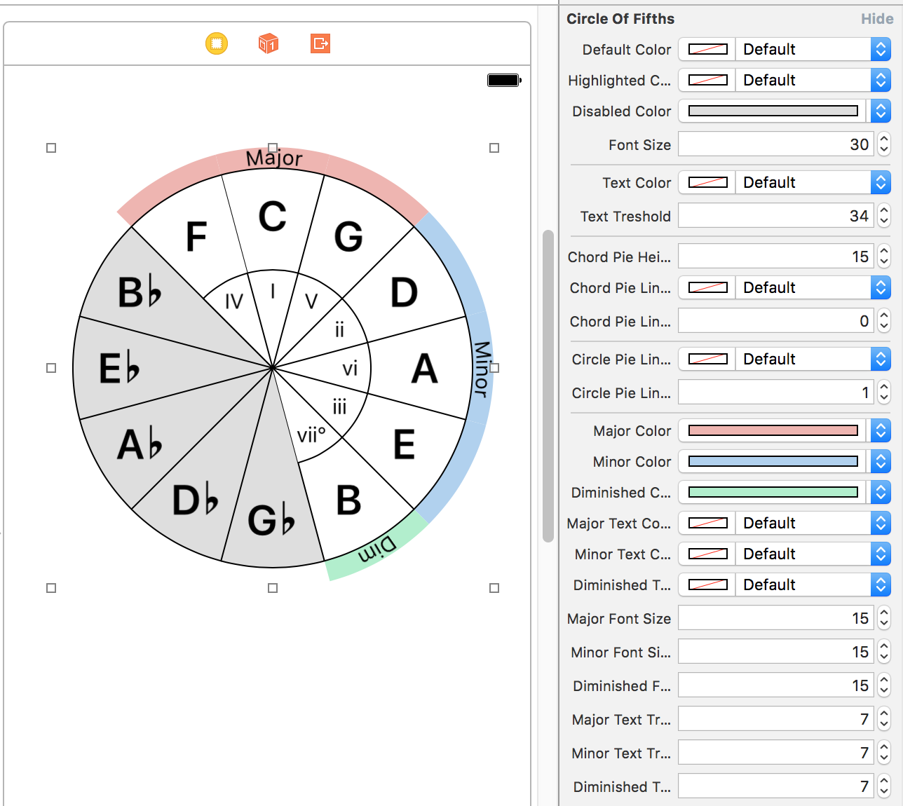
Fully customisable IBDesignable circle of fifths implementation.
pod 'CircleOfFifths'
You need to add this post installer script to your podfile in order to use @IBDesignable libraries with pods. More information on this cocoapods issue
post_install do |installer|
installer.pods_project.build_configurations.each do |config|
config.build_settings['LD_RUNPATH_SEARCH_PATHS'] = ['$(FRAMEWORK_SEARCH_PATHS)']
end
end
UIView subclass with custom CALayer drawing with customisable @IBInspectable properties.Scale type in any key of this music theory library.scale parameter in order to change scale and/or key of circle.License: MIT
A color palette grid view for iOS.

ruby
pod 'ColorPalette'
Create a ColorPaletteView either from storyboard or programmatically.
Set rowCount and columnCount to setup palette grid. (Defaults 2x10).
Implement delegate and dataSource.
Use this data source method to fill palette with colors.
func colorPalette(_ colorPalette: ColorPaletteView, colorAt index: Int) -> UIColor?
Use this delegate method to inform about color selection changes.
func colorPalette(_ colorPalette: ColorPaletteView, didSelect color: UIColor, at index: Int)
You can also observe colorPalette.selectedColor dynamic property to create bindings.
This is a basic struct with border, corner radius, and background color properties of palette items with their selected or unselected states.
You can use either colorPalette.paletteItemDisplayOptions property to set each property or use the @IBInspectable bridge properties from storyboard.

License: MIT
Combinatorics contains static functions to generate k-permutations and k-combinations (in both cases either with or without repetition) of the 'n' elements in an array.
License: MIT
A custom picker lets you pick an option from its auto scrolling menu without lifting your finger up.
You can either use the @IBDesignable picker button DragMenuPicker or create your own with DragMenuView which implements all picker logic.

pod 'DragMenuPicker'
Create a DragMenuPicker from either storyboard or programmatically.
Set its title and items property to shown in menu.
Set its didSelectItem property or implement dragMenuView(_ dragMenuView: DragMenuView, didSelect item: String, at index: Int) delegate method to set your action after picking.
You can also set its direction, either horizontal or vertical with margins to screen edges.
swift
horizontalDragPicker?.title = "Horizontal Picker"
horizontalDragPicker?.items = ["First", "Second", "Third", "Fourth", "Other", "Another", "Item 2", "Item 3"]
horizontalDragPicker?.direction = .horizontal
horizontalDragPicker?.margins = 20
horizontalDragPicker?.menuDelegate = self
horizontalDragPicker?.didSelectItem = { item, index in
print("(item) selected at index (index)")
}
DragMenuPicker shows DragMenuView with DragMenuItemViews inside when you touch down the picker. It disappears after you pick something from menu or cancel picking by lifting your finger up outside of the menu.
They are heavily customisable. You can set applyStyle property which callbacks you prototype menu and item that you can style and it applies it to menu.
Also there are @IBInspectable properties on DragMenuPicker that you can style basic properties inside storyboard.
License: MIT
⌨️ Simplest custom keyboard generator for iOS ever!
KeyboardLayoutEngine is all about laying out keyboard buttons dynamically in a rectangle in a custom style easily but in fashion of original keyboard. For the sake of flexiblity, KeyboardLayoutEngine provides:
KeyboardLayout: For laying out rows with custom paddings, colors.KeyboardRow: For laying out buttons or another set of KeyboardRow's inside.KeyboardButton: For rendering buttons in rows. Also provides flexible width, type and other very useful API's for flexiblty.UIViews and handles their layout in their layoutSubviews function.CGFrame you want apply a keyboard layout.KeyboardLayoutStyle, KeyboardRowStyle and KeyboardButtonStyle structs handles pretty much everything about styling.KeyboardLayoutDelegate for inform about button presses.DefaultKeyboard provided out of box, a good start point for figuring out how it works other than being of fully functional original keyboard.``` ruby use_frameworks!
pod 'KeyboardLayoutEngine' ```
``` swift let keyboardLayout = KeyboardLayout( style: DefaultKeyboardLayoutStyle, rows: [ KeyboardRow( style: DefaultKeyboardRowStyle, characters: [ KeyboardButton(type: .Key("Q"), style: DefaultKeyboardKeyButtonStyle), KeyboardButton(type: .Key("W"), style: DefaultKeyboardKeyButtonStyle), KeyboardButton(type: .Key("E"), style: DefaultKeyboardKeyButtonStyle), KeyboardButton(type: .Key("R"), style: DefaultKeyboardKeyButtonStyle), KeyboardButton(type: .Key("T"), style: DefaultKeyboardKeyButtonStyle), KeyboardButton(type: .Key("Y"), style: DefaultKeyboardKeyButtonStyle), KeyboardButton(type: .Key("U"), style: DefaultKeyboardKeyButtonStyle), KeyboardButton(type: .Key("I"), style: DefaultKeyboardKeyButtonStyle), KeyboardButton(type: .Key("O"), style: DefaultKeyboardKeyButtonStyle), KeyboardButton(type: .Key("P"), style: DefaultKeyboardKeyButtonStyle), ] ) ] )
override func viewDidLoad() { super.viewDidLoad() view.addSubview(keyboardLayout) }
override func viewDidLayoutSubviews() { super.viewDidLayoutSubviews() keyboardLayout.setNeedsLayout() } ```
KeyboardLayoutDelegate for get information about the button presses.swift
@objc public protocol KeyboardLayoutDelegate {
optional func keyboardLayoutDidStartPressingButton(keyboardLayout: KeyboardLayout, keyboardButton: KeyboardButton)
optional func keyboardLayoutDidPressButton(keyboardLayout: KeyboardLayout, keyboardButton: KeyboardButton)
}
swift
public enum KeyboardButtonWidth {
case Dynamic
case Static(width: CGFloat)
case Relative(percent: CGFloat)
}
.Dynamic which is default by the way, every button in a row, it will calculate their width by KeyboardRowStyle.buttonPadding and total width of row and figure out equal widths with equal buttonPaddings.swift
public enum KeyboardButtonType {
case Key(String)
case Text(String)
case Image(UIImage?)
}
Key, Text or Image.textDocumentProxy.insertTextoperation.init function of a style struct, it will be loaded with its default value.Definition:
swift
public struct KeyboardLayoutStyle {
public var topPadding: CGFloat
public var bottomPadding: CGFloat
public var rowPadding: CGFloat
public var backgroundColor: UIColor
}
Example:
swift
let DefaultKeyboardLayoutStyle = KeyboardLayoutStyle(
topPadding: 10,
bottomPadding: 5,
rowPadding: 13,
backgroundColor: UIColor(red: 208.0/255.0, green: 213.0/255.0, blue: 219.0/255.0, alpha: 1))
Definition:
swift
public struct KeyboardRowStyle {
public var leadingPadding: CGFloat
public var trailingPadding: CGFloat
public var buttonsPadding: CGFloat
}
Example:
swift
let DefaultKeyboardRowStyle = KeyboardRowStyle(
leadingPadding: 5,
trailingPadding: 5,
buttonsPadding: 6)
Definition:
``` swift public struct KeyboardButtonStyle { public var backgroundColor: UIColor public var cornerRadius: CGFloat
// Border public var borderColor: UIColor public var borderWidth: CGFloat
// Shadow public var shadowColor: UIColor public var shadowOpacity: Float public var shadowOffset: CGSize public var shadowRadius: CGFloat public var shadowPath: UIBezierPath?
// Text public var textColor: UIColor public var font: UIFont
// Image public var imageSize: CGFloat?
// Popup public var showsPopup: Bool public var popupWidthMultiplier: CGFloat public var popupHeightMultiplier: CGFloat } ```
Example:
swift
let DefaultKeyboardDarkImageButtonStyle = KeyboardButtonStyle(
backgroundColor: UIColor(red: 180.0/255.0, green: 188.0/255.0, blue: 201.0/255.0, alpha: 1),
imageSize: 18,
showsPopup: false)
Default iOS Keyboard implementation with KeyboardLayoutEngine.
textDocumentProxy integrations with DefaultKeyboardDelegateKeyboardViewControllerswift
override func viewDidLoad() {
super.viewDidLoad()
DefaultKeyboardLayoutStyle.backgroundColor = UIColor.redColor()
DefaultKeyboardRowStyle.buttonsPadding = 5
defaultKeyboard = DefaultKeyboard()
defaultKeyboard.delegate = self
view.addSubview(defaultKeyboard)
}
KeyboardLayoutStyleKeyboardRowStyleKeyboardRowStyleKeyboardRowStyleKeyboardButtonStyleKeyboardButtonStyleKeyboardButtonStyleKeyboardButtonStyleKeyboardButtonStyleKeyboardButtonStyleKeyboardButtonStyleswift
@objc public protocol DefaultKeyboardDelegate {
optional func defaultKeyboardDidPressKeyButton(defaultKeyboard: DefaultKeyboard, key: String)
optional func defaultKeyboardDidPressSpaceButton(defaultKeyboard: DefaultKeyboard)
optional func defaultKeyboardDidPressBackspaceButton(defaultKeyboard: DefaultKeyboard)
optional func defaultKeyboardDidPressGlobeButton(defaultKeyboard: DefaultKeyboard)
optional func defaultKeyboardDidPressReturnButton(defaultKeyboard: DefaultKeyboard)
}
License: MIT
Create a MaterialCardView
swift
let c = MaterialCardView (
x: 10,
y: StatusBarHeight + 10,
w: ScreenWidth-20)
view.addSubview (c)
And start to add MaterialCardCells
swift
func addHeader (title: String)
func addHeader (view: UIView)
swift
addCell (text: String, action: (()->Void)? = nil)
addCell (view: UIView, action: (()->Void)? = nil)
addCell (cell: MaterialCardCell)
swift
func addFooter (title: String)
func addFooter (view: UIView)
Material Card will update its frame size when you add or remove
MaterialCardCells. This is why you don't set itsheightvalue when initilize it.
License: MIT
MIDI Sequencer that sends MIDI events to other apps. Built top on AKSequencer of AudioKit for iOS and macOS. Create smart MIDI sequencer instruments with just focus on notes.
ruby
pod 'MIDISequencer'
MIDISequencer built top on AudioKit's AKSequencer with MusicTheory library to create sequences just focusing on notes with multiple track support.
MIDISequencer instance.swift
let sequencer = MIDISequencer(name: "Awesome Sequencer")
MIDISequencerTrack and add it to sequencer's tracks.swift
let track = MIDISequencerTrack(
name: "Track 1",
midiChannel: 1)
MIDISequencerSteps to track's stepsswift
track.steps = [
MIDISequencerStep(
note: Note(type: .c, octave: 4),
noteValue: NoteValue(type: .quarter),
velocity: .standard(100)),
MIDISequencerStep(
note: Note(type: .d, octave: 4),
noteValue: NoteValue(type: .quarter),
velocity: .standard(100)),
MIDISequencerStep(
note: Note(type: .e, octave: 4),
noteValue: NoteValue(type: .quarter),
velocity: .standard(100)),
MIDISequencerStep(
note: Note(type: .f, octave: 4),
noteValue: NoteValue(type: .quarter),
velocity: .standard(100)),
]
``` MIDISequencerStep( chord: Chord(type: .maj, key: .c), octave: 4, noteValue: NoteValue(type: .quarter), velocity: .standard(60))
MIDISequencerStep( notes: [Note(type: .c, octave: 4), Note(type: .d, octave: 4)], octave: 4, noteValue: NoteValue(type: .quarter), velocity: .standard(60))
MIDISequencerStep( notes: Chord(type: .maj, key: .c).notes(octave: 4) + [Note(type: .c, octave: 4), Note(type: .d, octave: 4)], noteValue: NoteValue(type: .quarter), velocity: .standard(60)) ```
isMuted property to true to mute any MIDISequencerStep.License: MIT
Customisable and editable time table grid for showing midi or audio related data with a measure.

pod 'MIDITimeTableView'
Create a MIDITimeTableView either programmatically or from storyboard and implement its MIDITimeTableViewDataSource and MIDITimeTableViewDelegate methods.
You need a data object to store each row and its cells data.
swift
var rowData: [MIDITimeTableRowData] = [
MIDITimeTableRowData(
cells: [
MIDITimeTableCellData(data: "C7", position: 0, duration: 4),
MIDITimeTableCellData(data: "Dm7", position: 4, duration: 4),
MIDITimeTableCellData(data: "G7b5", position: 8, duration: 4),
MIDITimeTableCellData(data: "C7", position: 12, duration: 4),
],
headerCellView: HeaderCellView(title: "Chords"),
cellView: { cellData in
let title = cellData.data as? String ?? ""
return CellView(title: title)
}),
]
MIDITimeTableViewDataSource is very likely to UITableViewDataSource or UICollectionViewDataSource API. Just feed the row data, number of rows, time signature and you are ready to go.
``` swift func numberOfRows(in midiTimeTableView: MIDITimeTableView) -> Int { return rowData.count }
func timeSignature(of midiTimeTableView: MIDITimeTableView) -> MIDITimeTableTimeSignature { return MIDITimeTableTimeSignature(beats: 4, noteValue: .quarter) }
func midiTimeTableView(_ midiTimeTableView: MIDITimeTableView, rowAt index: Int) -> MIDITimeTableRowData { let row = rowData[index] return row } ```
You can customise the measure bar, the grid, each header and data cell. Check out the example project.
MIDITimeTableCellView's are editable, you can move around them on the grid, resize their duration or long press to open a delete menu. Also, you need to subclass yourself to present your own data on it.
You can set the minMeasureWidth and maxMeasureWidth to set zoom levels of the time table.
License: MIT
A music theory library with Note, Interval, Scale and Chord representations in swift enums.
pod 'MusicTheorySwift'
MusicTheory adds a bunch of basic enums and structs that you can define pretty much any music related data. Most importants are Note, Scale and Chord.
NoteType and NoteNoteType enum.Notes with NoteTypes and octaves.Notes with MIDI note index.+ and - custom operators defined for making calulations easier.swift
let d: NoteType = .d
let c = Note(type: .c, octave: 0)
IntervalIntegerLiteral and you can make add/subsctract them between themselves, notes or note types.ScaleType and ScaleScaleType enum defines a lot of readymade scales.ScaleType.custom(intervals: [Interval], description: String)Scale defines a scale with a scale type and root key.HarmonicField of a scale.swift
let c: NoteType = .c
let maj: ScaleType = .major
let cMaj = Scale(type: maj, key: c)
ChordType and ChordChordType is a struct with ChordParts which are building blocks of chords.ChordType.ChordType.ChordPart protocol.Chord defines chords with type and a root key.swift
let m13 = ChordType(
third: .minor,
seventh: .dominant,
extensions: [
ChordExtensionType(type: .thirteenth)
])
let cm13 = Chord(type: m13, key: .c)
Tempo and TimeSignatureNoteValue of each beat.NoteValue.You can find unit tests in MusicTheoryTests target.
Press ⌘+U for running tests.
License: MIT
https://github.com/cemolcay/PullToRefreshCoreText/blob/master/README.md
License: MIT
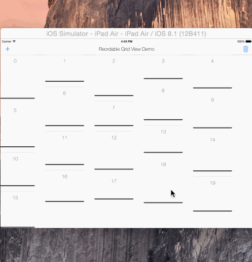
reorderable grid view solution implemented with swift.
its UIScrollView subclass, its not a collection view layout.
automatically sets horizontal item spacing by item widths. so items must be fixed-width.
also sets automatically its content size.
if you call gridView?.invalidateLayout() after orientation changed, it will lays out the grid by new orientation.
copy & paste the ReorderableGridView.swift into your project.
  gridView = ReorderableGridView(frame: self.view.frame, itemWidth: 180, verticalPadding: 20)
  self.view.addSubview(gridView!)
Grid view ready !
now you can add it ReorderableView instances
  let itemView = ReorderableView (x: 0, y: 0, w: 180, h: 250)
  ...
  gridView?.addReorderableView(itemView)

  // or
  let pos = GridPosition (x: 0, y: 1)
  gridView?addReorderableView (itemView, gridPosition: pos)
or remove them
gridView?.removeReorderableViewAtGridPosition(GridPosition (x: 0, y: 0))

// or
gridView?.removeReorderableView (itemView)
Design Tip View itself don't have any margin padding. It uses all frame width to calculate how many
ReorderableViews can fit and what should be their horizontal padding in a row. Padding between columns (vertical padding) can be set in init method, which is 10 by default. You can have a container view and use something likeCGRectInset (containerView.frame, marginX, marginY)when init grid with margin
  var reorderable : Bool = true
  var draggable : Bool = true
  var draggableDelegate: Draggable?
set them if you want your grid editable or not
Draggable Protocol
func didDragStartedForView (reorderableGridView: ReordableGridView, view: ReordableView)
func didDraggedView (reorderableGridView: ReordableGridView, view: ReordableView)
func didDragEndForView (reorderableGridView: ReordableGridView, view: ReordableView)
set gridView.draggableDelegate = self and implement Draggable protocol functions if you want to access info about dragging actions in grid.
This can be useful for multiple grid layouts.
Example included in second tab of demo.
License: MIT
A simple object for adding/removing shadows from your CALayers or UIViews.
You don't need to define or edit all shadow properties line by line anymore.
ruby
use_frameworks!
pod 'Shadow'
swift
// Create default shadow.
let shadow = Shadow()
// Add shadow
view.applyShadow(shadow: shadow)
// Remove shadow
view.applyShadow(shadow: nil)
License: MIT
Device specific UITraitCollection helper with split view detection for iOS.

use_frameworks!
pod 'SizeClasser'
SizeClasser is an OptionSet type struct.
You can initilize it with your viewController's traitCollection property to identify your current device specific orientation and split view status.
/// Screen height is bigger than width. Portrait mode in all devices.
public static let portrait = SizeClasser(rawValue: 1 << 0)
/// Screen width is bigger than height. Landscape mode in all devices.
public static let landscape = SizeClasser(rawValue: 1 << 1)
/// Portrait mode for iPhone devices.
public static let iPhonePortrait = SizeClasser(rawValue: 1 << 2)
/// Landscape mode for iPhone devices.
public static let iPhoneLandscape = SizeClasser(rawValue: 1 << 3)
/// Portrait mode for iPad devices.
public static let iPadPortrait = SizeClasser(rawValue: 1 << 4)
/// Landscape mode for iPad devices.
public static let iPadLandscape = SizeClasser(rawValue: 1 << 5)
/// Split mode 1/3 of visible area in iPad devices.
public static let iPadSplitOneThird = SizeClasser(rawValue: 1 << 8)
/// Split mode 1/2 of visible area in iPad devices.
public static let iPadSplitHalf = SizeClasser(rawValue: 1 << 9)
/// Split mode 2/3 of visible area in iPad devices.
public static let iPadSplitTwoThird = SizeClasser(rawValue: 1 << 10)
For example, if you want to detect iPad split view 1/3 on landscape orientation, simply:
guard let trait = SizeClasser(traitCollection: traitCollection ?? super.traitCollection) else { return }
if trait.contains([.iPadLandscape, .iPadSplitOneThird]) {
// You are on iPad, landscape and 1/3 split view mode
if SizeClasser.isiPadPro {
// You are on 12.9" iPad
} else {
// You are on regular iPad / iPad mini
}
}
Also you can use SizeClasser.isiPadPro to detect 12.9" iPad Pro if you want to layout your views more specificly.
traitCollectionDidChange:previousTraitCollection function:This function only get called if traitCollection changes.
If you are on iPad, either portrait or landscape mode, it won't change 1/3 split view to 2/3 split view transitions.
iOS calculates them both compact width regular height mode.
So, I recommend to use viewDidLayoutSubviews: function to detect split view changes specificly.

License: MIT
uiscrollview with strechy and parallax top view
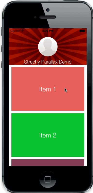
Copy StrechyParallaxScrollView.h/m files to your project.
//create the top view
UIView *topView = [UIView new];
...

//create scroll view with top view just created
StrechyParallaxScrollView *strechy = [[StrechyParallaxScrollView alloc] initWithFrame:self.view.frame andTopView:topView];

//add it to your controllers view
[self.view addSubview:strechy];
CGFloat parallaxWeight: parallax speed of top view
BOOL strechs: enable/disable streching behaviour (enabled default)
BOOL parallax: enable/disable parallax behaviour (enabled default)
License: MIT
Category on NSString to return a UIBezierPath of the string in a font of your choice, using Core Text.
License: MIT
Painless custom transitioning. Easy extend, easy setup, just focus on animations.
Copy & paste TransitionManager.swift into your project.
TransitionManager object.TransitionManagerAnimationtransitioningDelegate.``` swift
var transition: TransitionManager!

override func viewDidLoad() {
   super.viewDidLoad()

   transition = TransitionManager (transitionAnimation: FadeTransitionAnimation())
   navigationController?.delegate = transition
}
```
Create a subclass of TransitionManagerAnimation
``` swift class FadeTransitionAnimation: TransitionManagerAnimation {
}
```
TransitionManagerAnimation class implements TransitionManagerDelegate protocol.
``` swift
protocol TransitionManagerDelegate {

    func transition (
        container: UIView,
        fromViewController: UIViewController,
        toViewController: UIViewController,
        duration: NSTimeInterval,
        completion: ()->Void)

    var interactionTransitionController: UIPercentDrivenInteractiveTransition? { get set }
}
```
For transition animation, we should override transition func and write our custom animation in it.
``` swift
class FadeTransitionAnimation: TransitionManagerAnimation {
override func transition (
    container: UIView,
    fromViewController: UIViewController,
    toViewController: UIViewController,
    duration: NSTimeInterval,
    completion: ()->Void) {

        let fromView = fromViewController.view
        let toView = toViewController.view

        container.addSubview(toView)
        toView.alpha = 0

        UIView.animateWithDuration(
            duration,
            animations: {
                toView.alpha = 1
            },
            completion: { finished in
                completion ()
        })
}
}
```
One important part is completion() must be called because the TransitionManager finishes transition after it gets called.
Create a TransitionManagerAnimation subclass and write an initilizer with UINavigationController parameter.
Add its view a pan gesture
``` swift class LeftTransitionAnimation: TransitionManagerAnimation {
    var navigationController: UINavigationController!

    init (navigationController: UINavigationController) {
        super.init()

        self.navigationController = navigationController
        self.navigationController.view.addGestureRecognizer(UIPanGestureRecognizer (target: self, action: Selector("didPan:")))
    }

}
```
We will update interactionTransitionController variable in TransitionManagerDelegate in gesture handler.
``` swift func didPan (gesture: UIPanGestureRecognizer) { let percent = gesture.translationInView(gesture.view!).x / gesture.view!.bounds.size.width
    switch gesture.state {
    case .Began:
        interactionTransitionController = UIPercentDrivenInteractiveTransition()
        navigationController.popViewControllerAnimated(true)

    case .Changed:
        interactionTransitionController!.updateInteractiveTransition(percent)

    case .Ended:
        if percent > 0.5 {
            interactionTransitionController!.finishInteractiveTransition()
        } else {
            interactionTransitionController!.cancelInteractiveTransition()
        }
        interactionTransitionController = nil

    default:
        return
    }
}
```
Interaction transition has 3 parts:
* Init interactionTransitionController and either pop or push navigation controller when gesture (interaction) starts.
* Calculate your percents on gesture change and updateInteractiveTransition: with that percent
* When gesture ended, decide if your transition complete or not and give information to your interactionTransitionController with finishInteractiveTransition () and cancelInteractiveTransition ()
TransitionManager setupYou can create a TransitionManagerAnimation container enum and give it all your animations
swift
    enum TransitionManagerAnimations {
        case Fade
        case Left
    }
Write a func that returns correct transition animation in enum
``` swift enum TransitionManagerAnimations { case Fade case Left (UINavigationController)
    func transitionAnimation () -> TransitionManagerAnimation {
        switch self {
        case .Fade:
            return FadeTransitionAnimation()

        case .Left (let nav):
            return LeftTransitionAnimation(navigationController: nav)

        default:
            return TransitionManagerAnimation()
        }
    }
}
```
Extend TransitionManager and write a new init method like
``` swift
extension TransitionManager {

    convenience init (transition: TransitionManagerAnimations) {
        self.init (transitionAnimation: transition.transitionAnimation())
    }
}
```
Now you can create TransitionManager in your view controller like
swift
    transition = TransitionManager (transition: .Left(navigationController!))
    navigationController?.delegate = transition
License: MIT
Container view controller with left and right drawer controlling by pan gesture for tvOS. inspired by the zova tvos app.
shrinks = false
shrinks = true
ruby
pod 'TVOSSlideViewController'
TVOSSlideViewController and set your view controller instantce's class to your subclass in IB.TVOSSlideViewControllers @IBInspectable properties in interface builder without touching codesetup(contentViewController:) function in your subclass for setup content view.Different from storyboard implementation, you can initilze TVOSSlideViewController directly with:
swift
public init(contentViewController: UIViewController, leftView: UIView?, rightView: UIView?)
TVOSSlideViewConroller.amount: CGFlaot returns the drawers visibility range between 0-1 for easier drawer animation implementation.swift
@objc public protocol TVOSSlideViewControllerDelegate {
optional func slideViewControllerDidBeginUpdateLeftDrawer(slideViewController: TVOSSlideViewController)
optional func slideViewControllerDidBeginUpdateRightDrawer(slideViewController: TVOSSlideViewController)
optional func slideViewControllerDidUpdateLeftDrawer(slideViewController: TVOSSlideViewController, amount: CGFloat)
optional func slideViewControllerDidUpdateRightDrawer(slideViewController: TVOSSlideViewController, amount: CGFloat)
optional func slideViewControllerDidEndUpdateLeftDrawer(slideViewController: TVOSSlideViewController, amount: CGFloat)
optional func slideViewControllerDidEndUpdateRightDrawer(slideViewController: TVOSSlideViewController, amount: CGFloat)
optional func slideViewControllerDidSelectLeftDrawer(slideViewController: TVOSSlideViewController)
optional func slideViewControllerDidSelectRightDrawer(slideViewController: TVOSSlideViewController)
}
License: MIT
Apple Watch WKInterfaceImage and WKInterfaceGroup extension for showing activity indicators on them quickly.
ruby
target 'your_watch_extension_target'
platform :watchos, 2.0
pod 'WatchActivityIndicator'
end
Call startActivityIndicator and stopActivityIndicator functions on any WKInterfaceImage or WKInterfaceGroup instance for default activity indicator.
swift
// start
imageView?.startActivityIndicator()
group?.startActivityIndicator()
// stop
imageView?.stopActivityIndicator()
group?.stopActivityIndicator()
You can set parameters of startActivityIndicator for custom animation sequance and duration.
swift
imageView?.startActivityIndicator(
imageNamed: "CustomAnimation",
animationRange: NSMakeRange(0, frameCount),
duration: customAnimationDuration)
License: MIT
Android style segmented control written in swift. Fully customisable.
Copy & paste YSSegmentedControl.swift in your project
ruby
use_frameworks!
pod 'YSSegmentedControl'
Create YSSegmentedControl with frame and titles.
You can either use delegation or callback initilization
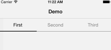
``` swift let segmented = YSSegmentedControl( frame: CGRect( x: 0, y: 64, width: view.frame.size.width, height: 44), titles: [ "First", "Second", "Third" ], action: { control, index in println ("segmented did pressed (index)") })
```
swift
let segmented = YSSegmentedControl(
frame: CGRect(
x: 0,
y: 64,
width: view.frame.size.width,
height: 44),
titles: [
"First",
"Second",
"Third"
])
Setup the delegate and you are ready to go !
swift
segmented.delegate = self
``` swift @objc protocol YSSegmentedControlDelegate { optional func segmentedControlWillPressItemAtIndex (segmentedControl: YSSegmentedControl, index: Int) optional func segmentedControlDidPressedItemAtIndex (segmentedControl: YSSegmentedControl, index: Int) }
```
``` swift struct YSSegmentedControlAppearance {
var backgroundColor: UIColor var selectedBackgroundColor: UIColor
var textColor: UIColor var font: UIFont
var selectedTextColor: UIColor var selectedFont: UIFont
var bottomLineColor: UIColor var selectorColor: UIColor
var bottomLineHeight: CGFloat var selectorHeight: CGFloat } ```
The default appearance is
``` swift appearance = YSSegmentedControlAppearance(
backgroundColor: UIColor.clearColor(), selectedBackgroundColor: UIColor.clearColor(),
textColor: UIColor.grayColor(), font: UIFont.systemFontOfSize(15),
selectedTextColor: UIColor.blackColor(), selectedFont: UIFont.systemFontOfSize(15),
bottomLineColor: UIColor.blackColor(), selectorColor: UIColor.blackColor(),
bottomLineHeight: 0.5, selectorHeight: 2) ```
You can change appearance by
``` swift segmented.appearance = YSSegmentedAppearance (...)
// or
segmented.appearance.titleColor = ... ```
License: MIT
Create flat design tutorial pages quickly. It can read page data from json file, no coding required for pages ! Fully customisable.
License: MIT