ConcentricProgressRingView 2.0.1
| TestsTested | ✓ |
| LangLanguage | SwiftSwift |
| License | Apache 2 |
| ReleasedLast Release | Mar 2018 |
| SPMSupports SPM | ✗ |
Maintained by Dan Loewenherz.
- By
- Dan Loewenherz
- lionheartsw
Fully customizable, circular progress bar written in Swift.
Example
To run the example project, clone the repo, and run pod install from the Example directory first. You can also view the example app at Appetize.io.
Usage
At the top of your file, make sure to import "ConcentricProgressRingView"
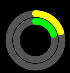
import ConcentricProgressRingViewThen, instantiate ConcentricProgressRingView in your view controller:
func viewDidLoad() {
    super.viewDidLoad()

    let fgColor1 = UIColor.yellow
    let bgColor1 = UIColor.darkGray
    let fgColor2 = UIColor.green
    let bgColor2 = UIColor.darkGray

    let rings = [
        ProgressRing(color: fgColor1, backgroundColor: bgColor1, width: 18),
        ProgressRing(color: fgColor2, backgroundColor: bgColor2, width: 18),
    ]

    let margin: CGFloat = 2
    let radius: CGFloat = 80
    let progressRingView = ConcentricProgressRingView(center: view.center, radius: radius, margin: margin, rings: rings)

    view.addSubview(progressRingView)
}
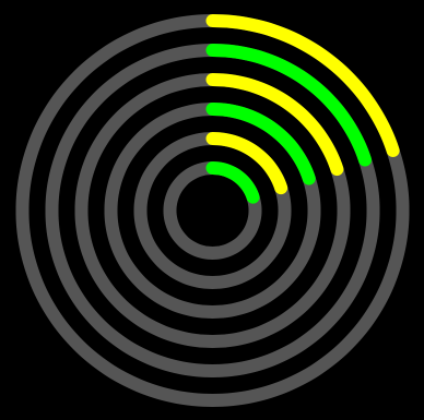
You can customize the width, margin, and radius, along with the number of rings. Here's another example with 6 progress rings, with a smaller bar width, larger margin between rings, and a larger radius:
let rings = [
    ProgressRing(color: fgColor1, backgroundColor: bgColor1, width: 10),
    ProgressRing(color: fgColor2, backgroundColor: bgColor2, width: 10),
    ProgressRing(color: fgColor1, backgroundColor: bgColor1, width: 10),
    ProgressRing(color: fgColor2, backgroundColor: bgColor2, width: 10),
    ProgressRing(color: fgColor1, backgroundColor: bgColor1, width: 10),
    ProgressRing(color: fgColor2, backgroundColor: bgColor2, width: 10),
]

let margin: CGFloat = 10
let radius: CGFloat = 120
let progressRingView = ConcentricProgressRingView(center: view.center, radius: radius, margin: margin, rings: rings)
Repeating widths can get a bit tedious, so you can omit them---but you'll still need to provide default values to the initializer. If you don't, the compiler will warn you that there's a problem. The initializer can throw if you provide invalid parameters, so you'll need to handle that.
let rings = [
    ProgressRing(color: fgColor1, backgroundColor: bgColor1),
    ProgressRing(color: fgColor2, backgroundColor: bgColor2),
    ProgressRing(color: fgColor1, backgroundColor: bgColor1),
    ProgressRing(color: fgColor2, backgroundColor: bgColor2),
    ProgressRing(color: fgColor1, backgroundColor: bgColor1),
    ProgressRing(color: fgColor2, backgroundColor: bgColor2),
]

let margin: CGFloat = 10
let radius: CGFloat = 120
let width: CGFloat = 8
let progressRingView = try? ConcentricProgressRingView(center: view.center, radius: radius, margin: margin, rings: rings, defaultColor: nil, defaultWidth: width)
Rings can have varying widths, colors, and background colors.
let rings = [
    ProgressRing(color: UIColor(.RGB(160, 255, 0)), backgroundColor: UIColor(.RGB(44, 66, 4)), width: 40),
    ProgressRing(color: UIColor(.RGB(255, 211, 0)), backgroundColor: UIColor(.RGB(85, 78, 0)), width: 20),
    ProgressRing(color: UIColor(.RGB(255, 28, 93))),
]
let progressRingView = try! ConcentricProgressRingView(center: view.center, radius: radius, margin: margin, rings: rings, defaultWidth: 30)
Updating Progress
To animate a progress update, use setProgress.
ring.arcs[1].setProgress(0.5, duration: 2)You can also use subscripts to access the individual arcs.
ring[1].setProgress(0.5, duration: 2)If you just want to change the progress, just set the progress on the ring, and it'll change immediately.
ring[1].progress = 0.5If you'd like to update multiple rings simulataneously, you can iterate over ConcentricProgressRingView since it conforms to SequenceType.
for ring in progressRingView {
    ring.progress = 0.5
}
Requirements
Installation
ConcentricProgressRingView is available through CocoaPods. To install
it, simply add the following line to your Podfile:
pod "ConcentricProgressRingView"TODO
- Swift 3
- Documentation
- Tests
Author
Dan Loewenherz, [email protected]
License
ConcentricProgressRingView is available under the Apache 2.0 license. See the LICENSE file for more info.


