TabCollectionView


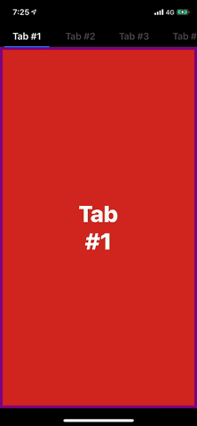
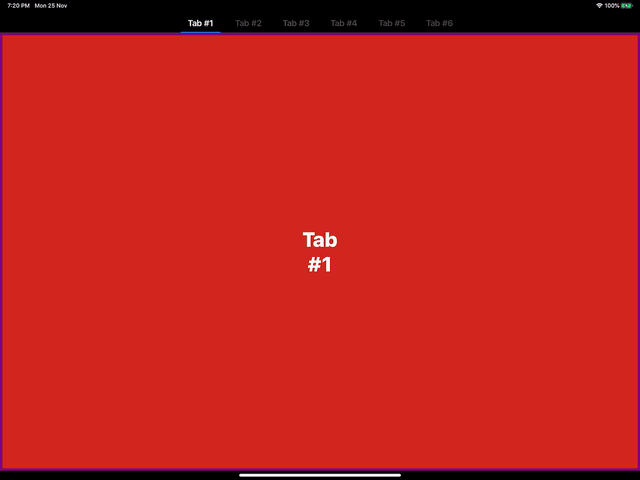
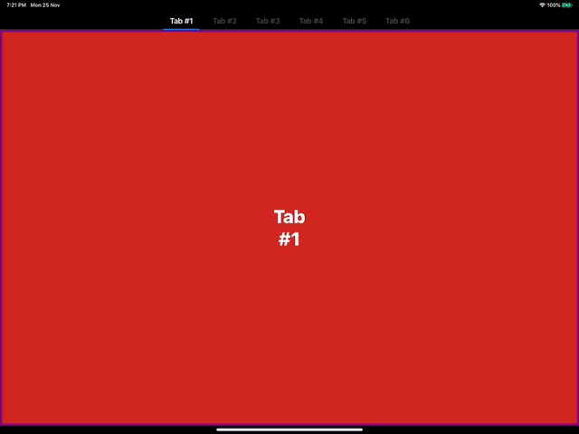
Tabbed Screens are one of most popular designs followed to show multiple pages on a single screen neatly. With UIKit this component doesn't come for free. TabCollectionView helps you create complex Tabbed Screens with just few lines of code. TabCollectionView is completely written on Swift and is very light as it is based on UICollectionView under the hood. TabCollectionView supports lazy loading of ViewController giving you flexibility of controlling the memory. It uses delegation architecture just like any other Collection data based View of UIKit, so its easy to adapt and implement.

Kick in and start swiping!!
Requirements
- iOS 11.0+
- XCode 10.2+
- Swift 5.0+
Installation
TabCollectionView is available through CocoaPods. To install it, simply add the following line to your Podfile:
pod 'TabCollectionView'Example
To run the example project, clone the repo, and run pod install from the Example directory first.
Usage
TabCollectionViewController
TabCollectionViewController is the controller modal of the view TabCollectionView. It can be accessed with the property tabCollectionView. Pass the controllers you wish to add as child viewControllers to the property viewControllers.
let controller = TabCollectionViewController()
controller.viewControllers = [...]  // Your View Controllers
... // Present the controller, the way you want...
Boom! That's it! Your Tabbed View is ready.
You can subclass TabCollectionViewController to get control over the datasource and delegate methods.
TabCollectionView
TabCollectionView is the core component used for the layout. It consists of two collectionViews - headerCollectionView and contentCollectionView, maintaining the header and the content respectively. Both of these collectionViews can be accessed with corresponding properties to customize.
weak var datasource: TabCollectionViewDataSource?
weak var delegate: TabCollectionViewDelegate?
TabCollectionView gets information to populate data and manage scrolling from these two properties. Conform your object to these protocol and pass the object to these properties to manage the TabCollectionView
public var tabHeaderCellWidth: CGFloat = 100  // Header Cell width. This property is used as default value if delegate method not implemented
public var tabHeaderHeight: CGFloat = 44  // Header Height. Defines the height of the top section.
public var isTabHeaderHidden: Bool = false  // Bool indicating the visibility of header section

public var tabHeaderFollowsReadableLayoutGuide: Bool = true  // Bool to tell the layout engine to follow readable width on large screen
public var headerAlignment: HeaderAlignment = .leading  // Defines the alignment of header cells in the toop section

public var normalHeaderColor: UIColor = .tertiaryLabel  // Header title color. Works only with LabelHeaderCell.
public var selectedHeaderColor: UIColor = .label  // Selected Header title color. Works only with LabelHeaderCell.

public var tintColor: UIColor = .systemBlue  // Defines the color of the Selected tab bar indicator.
Use reloadData() method to refresh all the data of the view Use reloadLayout() method to refresh complete layout of the view
TabCollectionViewDataSource
var tabHeaderCellType: UICollectionViewCell.Type { get }
var tabContentCellType: UICollectionViewCell.Type { get }
func numberOfItems(_ tabCollectionView: TabCollectionView) -> Int
func tabCollectionView(_ tabCollectionView: TabCollectionView, setupHeader header: UICollectionViewCell, at index: Int, selectedTab: Bool)
func tabCollectionView(_ tabCollectionView: TabCollectionView, setupContentCell cell: UICollectionViewCell, at index: Int)
func tabCollectionView(_ tabCollectionView: TabCollectionView, titleForTabAt index: Int) -> String?  // Optional
func tabCollectionView(_ tabCollectionView: TabCollectionView, viewControllerAt index: Int) -> UIViewController?  // Optional
The Header Cell Type and Content Cell Type are all completely custimizable. If you wish to use your own UICollectionViewCell Type for Header and Content, pass their value through tabHeaderCellType and tabContentCellType respectively. tabCollectionView(_:setupHeader:at:selectedTab) and tabCollectionView(_:setupContentCell:at:) are called each time when correspoonding cell data population happens.
Child ViewController Population
To use UIViewController as each screen, pass the tabContentCellType of datasource as ViewCell.self, and set the parentViewController property of TabCollectionView with the container ViewController of the current TabCollectionView. This property helps to add the viewControllers as child viewControllers to the current viewController, thus maintaining the life-cycle effectively.
class ViewController: UIViewController, TabCollectionViewDataSource {

    lazy var tabCollectionView: TabCollectionView = {
        let view = TabCollectionView()
        view.parentViewController = self
        view.datasouce = self
        ...
        return view
    }()

    var tabContentCellType: UICollectionView.Type {
        return ViewCell.self
    }

    func tabCollectionView(_ tabCollectionView: TabCollectionView, setupContentCell cell: UICollectionViewCell, at index: Int) {
        let controller: UIViewController = ...  // ViewController to display
        guard let contentCell = cell as? ViewCell else { assert() }
        contentCell.setupCell(with: controller)
    }

    ...

}
Adaptive
TabCollectionView is completely adaptive to screen size changes automatically. For force layout updates, just call reloadLayout() method of TabCollectionView

Author
Akaash Dev, [email protected]
License
TabCollectionView is available under the MIT license. See the LICENSE file for more info.