TNInfoBubble 1.0.1
| TestsTested | ✓ |
| LangLanguage | SwiftSwift |
| License | MIT |
| ReleasedLast Release | Aug 2016 |
| SPMSupports SPM | ✗ |
Maintained by Frederik Jacques.
TNInfoBubble 1.0.1
- By
- Frederik Jacques
- thenerd_be
TNInfoBubble

What
TNInfoBubble is a component written in Swift to create a Prisma-like info bubble. The looks of the info bubble can be changed. It works with Storyboards & code.
Example
To run the example project, clone the repo, and run pod install from the Example directory first.
Installation
TNInfoBubble is available through CocoaPods. To install it, simply add the following line to your Podfile:
pod "TNInfoBubble"How to use
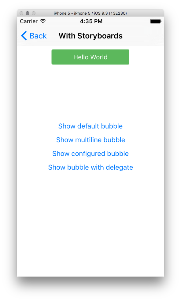
Storyboards
- Drag a UIView on your scene
- Go to the Identity Inspector and change the class to
TNInfoBubbleView - Add constraints to position the bubble
- Create an
IBOutletso you can reference the bubble in your code. - Call one of the
show()methods
Programmatically
- Create an instance of
TNInfoBubbleView - Add the view to your view hierarchy & add constraints
- Call one of the show methods
Configuration
Out of the box this component uses the same style as the info bubble in the Prisma app (black background, white text color & 3px of corner radius).
It is possible to change these settings.
- Create an instance of the
TNInfoBubbleConfigurationstruct - Change the properties you want
- Pass the struct instance to the
configproperty of theTNInfoBubbleViewinstance
var config = TNInfoBubbleConfiguration()
config.autoRemoveFromSuperView = true

self.bubble.config = config
| Property | Explanation |
|---|---|
| backgroundColor | The background color of the view. Default: black |
| cornerRadius | The corner radius of the view. Default: 3px |
| labelFont | The font of the info label. Default: System font 14pt |
| labelTextColor | The text color of the info label. Default: white |
| labelTextAlignment | The text alignment of the info label. Default: centered |
| labelLineBreakMode | The wrapping mode of the info label. Default: word |
| labelNumberOfLines | The number of lines that the info label can show. Default: 0 |
| autoHide | Autohide the info bubble. Default: true |
| numberOfSecondsToAutoHide | The number of seconds before the info bubbles hides itself. Default: 3 |
| autoRemoveFromSuperView | Remove the view from the superviews view hierarchy. Default: false |
Delegate
If you want to be updated when the bubble is shown or hidden, you can set your own object as the delegate by conforming to the TNInfoBubbleViewDelegate protocol.
self.infoBubble.delegate = self
...

// MARK: TNInfoBubbleViewDelegate methods
func didShowInfoBubble( infoBubble:TNInfoBubbleView ) {

    print("Did show info bubble")

}

func didHideInfoBubble( infoBubble:TNInfoBubbleView ) {

    print("Did hide info bubble")

}
Completion block
If you dont want to use delegates, you can also use the completionHandler property and set your own callback.
self.infoBubble.completionHandler = {
  print("Completed")
}
Author
Frederik Jacques, [email protected]
License
TNInfoBubble is available under the MIT license. See the LICENSE file for more info.