
A lightweight, configurable tooltip for iOS supporting both UIKit and SwiftUI.
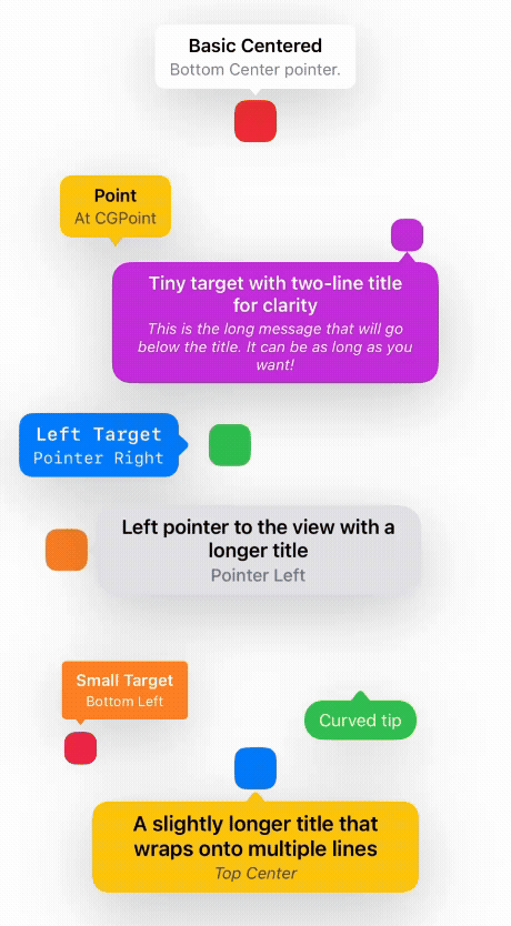
- Pointers on all sides: top/bottom (left/center/right) and left/right
- Dismiss behaviors: everywhere, outside bubble, on target only, or manual
- Click-through overlay (allowed) or blocking overlay
- Appearance options: colors, fonts, corner radius, paddings, shadow, pointer size/style
- Animations: optional continuous outward motion (linear or spring); fade for appear/dismiss
- SwiftUI ViewModifier for seamless integration
Swift Package Manager
- File > Add Packages…
- Enter repository URL: https://github.com/dinhquan/SwiftTooltip
- Add the product "SwiftTooltip" to your target
Or Package.swift
dependencies: [
  .package(url: "https://github.com/dinhquan/SwiftTooltip", from: "0.1.0")
],
targets: [
  .target(name: "YourApp", dependencies: ["SwiftTooltip"])
]
CocoaPods Add to your Podfile:
pod 'SwiftTooltip'Then run pod install.
UIKit
// Show pointing to a target view
let tooltip = SwiftTooltip.show(
  title: "Title",
  text: "Message goes here",
  to: someButton,               // target view
  pointerPosition: .bottomCenter
)

// Dismiss programmatically
tooltip.dismiss()

// Dismiss all
SwiftTooltip.dismissAll()
SwiftUI
@State private var showTip = false

Image(systemName: "info.circle")
  .tooltip(
    title: "Title",
    text: "Message",
    isPresented: $showTip,
    pointerPosition: .bottomCenter
  )

Button("Toggle") { showTip.toggle() }_ = SwiftTooltip.show(
title: "Title",
text: "Message",
to: someView,
pointerPosition: .bottomCenter,
onTapTarget: {
// Called when user taps the target view (only when using `to:`)
},
onDismiss: {
// Called after the tooltip fades out and is removed
}
)Create a configuration with sensible defaults and customize as needed.
var config = SwiftTooltip.Configuration(
  color: .systemBackground,
  backgroundColor: .clear,
  cornerRadius: 8,
  horizontalPadding: 12,
  verticalPadding: 8,
  verticalSpacing: 2,
  maxWidth: 280,
  shadowColor: .label,
  shadowOffset: .init(width: 0, height: 15),
  shadowOpacity: 0.2,
  shadowRadius: 30,
  textColor: .label,
  titleColor: .label,
  textFont: .systemFont(ofSize: 15),
  titleFont: .boldSystemFont(ofSize: 17),
  pointerSize: .init(width: 14, height: 8),
  pointerHorizontalPadding: 12,
  pointerStyle: .straight,
  dismissBehavior: .dismissOnTapTargetView,
  clickThroughBehavior: .allowed,
  appearAnimationDuration: 0.25,
  disappearAnimationDuration: 0.25,
  animation: .none
)- Pointer positions:
.topLeft,.topCenter,.topRight,.bottomLeft,.bottomCenter,.bottomRight,.left,.right - Pointer style:
.straight(triangle) or.curved(rounded tip only) - Dismiss behavior:
.dismissOnTapEverywhere: any tap.dismissOnTapOutside: taps outside the bubble only.dismissOnTapTargetView: taps on the target view only.dismissManually: programmatic only
- Click-through overlay:
.allowed: touches pass through outside the bubble.blocked: overlay intercepts touches
- Animations while visible:
.none: static.movingLinear(distance:duration:): continuous outward linear motion.movingSpring(distance:duration:): continuous outward spring-like motion
Apply a default configuration app-wide:
SwiftTooltip.configure(
  .init(pointerStyle: .curved, dismissBehavior: .dismissOnTapOutside)
)
Any call to show() without an explicit config uses the global one.
- The modifier computes the target view frame in global coordinates and aims the pointer at the midpoint of the relevant side.
- For scrolling or moving targets, re-trigger
isPresentedto reposition; live tracking can be added if needed. - To prevent duplicate overlays, the modifier guards against rapid re-entrancy and uses a stable id per modifier.
- Parent container is optional: if
in:is omitted ornil, the tooltip automatically attaches to the key window. - You can target by view or by point:
to:aUIViewto have the pointer align to that view.at:aCGPointin window coordinates for absolute positioning.
- Pointer offset:
pointerOffset: CGPoint = .zerolets you nudge the bubble relative to the target along the pointer axis.
Examples:
// Attach to a view (no parent container needed)
SwiftTooltip.show(
  title: "Title",
  text: "Message",
  to: someView,
  pointerPosition: .bottomCenter,
  pointerOffset: CGPoint(x: 0, y: 4)
)

// Attach to an absolute point (window coordinates)
SwiftTooltip.show(
  title: nil,
  text: "At a point",
  at: CGPoint(x: 200, y: 400),
  pointerPosition: .topCenter
)This repo includes a demo with two tabs showcasing SwiftUI and UIKit usage:
- SwiftUI:
SwiftUIExamplesView - UIKit:
UIKitExamplesView
- iOS 14+
- Swift 5.7+
- Appear and dismiss are always fade animations using
appearAnimationDurationanddisappearAnimationDuration. - Continuous motion (if enabled) starts after appear completes and stops before dismiss.
- Left/Right pointers automatically swap pointer width/height for proper orientation.
SwiftTooltip.show(title: "Title", text: "Message")