SwiftAlertView
A powerful customizable Alert View library written in Swift.
SwiftAlertView is the best alternative for UIAlertController and SwiftUI alert.
With SwiftAlertView, you can easily make your desired Alert View in some lines of code.
Installation
CocoaPods
CocoaPods is a dependency manager for Cocoa projects. To integrate SwiftAlertView into your Xcode project using CocoaPods, specify it in your Podfile:
pod 'SwiftAlertView', '~> 2.2.1'Carthage
Carthage is a decentralized dependency manager that builds your dependencies and provides you with binary frameworks. To integrate SwiftAlertView into your Xcode project using Carthage, specify it in your Cartfile:
github "https://github.com/dinhquan/SwiftAlertView" ~> 2.2.1
Swift Package Manager
The Swift Package Manager is a tool for automating the distribution of Swift code and is integrated into the swift compiler.
Once you have your Swift package set up, adding SwiftAlertView as a dependency is as easy as adding it to the dependencies value of your Package.swift.
dependencies: [
    .package(url: "https://github.com/dinhquan/SwiftAlertView", .upToNextMajor(from: "2.2.1"))
]
Manually
Drag and drop the file named SwiftAlertView inside Source in your project and you are done.
Highlight Features
- Change the alert background color, background image, border radius.
- Change the title font, color, margin, visibility.
- Change the message font, color, margin, visibility.
- Change the button font, color.
- Change the alert appearance behaviour.
- Add text fields (like UIAlertController)
- Support dark mode
- Initialize the alert view with a custom view.
- Initialize the alert view with a xib file.
- Callbacks for handling button touched events.
- And many more ...
Usage
Showing an alert
SwiftAlertView.show(title: "Title", message: "Message", buttonTitles: "Cancel", "OK")Customization
SwiftAlertView.show(title: "Title",
                    message: "Message",
                    buttonTitles: "OK", "Cancel") { alert in
    alert.backgroundColor = .yellow
    alert.cancelButtonIndex = 1
    alert.buttonTitleColor = .blue
}
Handle button clicked events
SwiftAlertView.show(title: "Title",
                    message: "Message",
                    buttonTitles: "OK", "Cancel") {
    $0.style = .dark
}
.onButtonClicked { _, buttonIndex in
    print("Button Clicked At Index \(buttonIndex)")
}
Add text fields
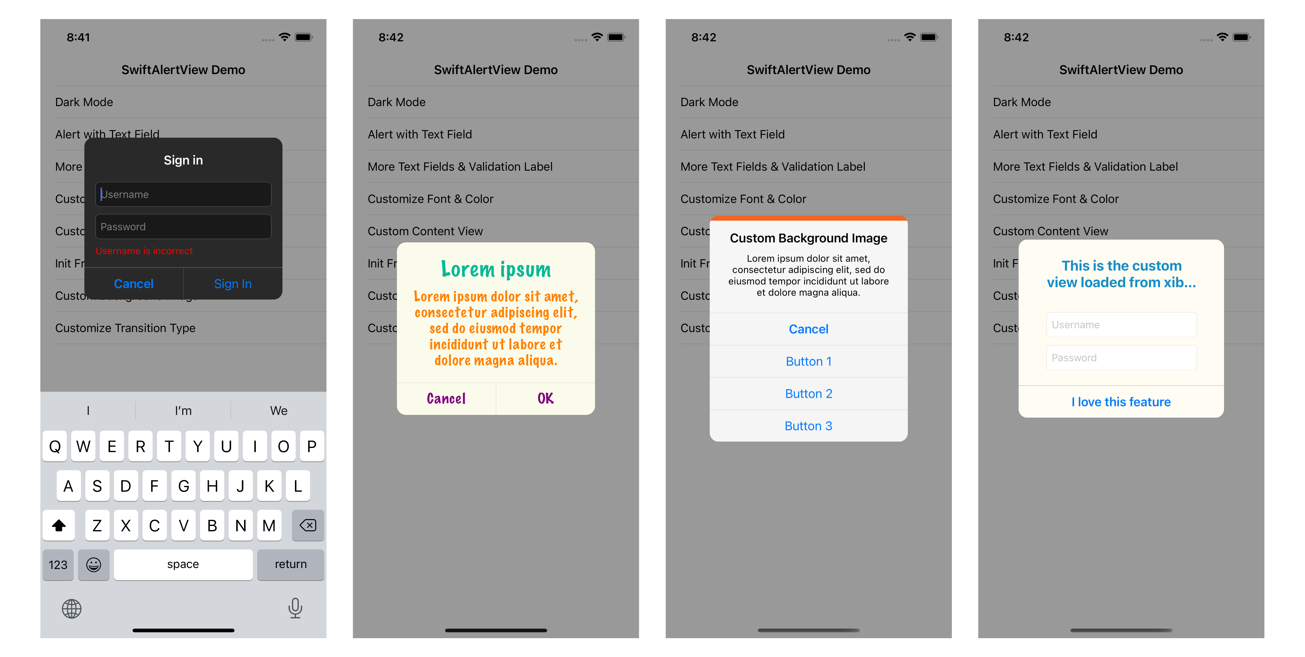
SwiftAlertView.show(title: "Sign in", buttonTitles: "Cancel", "Sign In") { alertView in
    alertView.addTextField { textField in
        textField.placeholder = "Username"
    }
    alertView.addTextField { textField in
        textField.placeholder = "Password"
    }
    alertView.isEnabledValidationLabel = true
    alertView.isDismissOnActionButtonClicked = false
}
.onActionButtonClicked { alert, buttonIndex in
    let username = alert.textField(at: 0)?.text ?? ""
    if username.isEmpty {
        alert.validationLabel.text = "Username is incorrect"
    } else {
        alert.dismiss()
    }
}
.onTextChanged { _, text, index in
    if index == 0 {
        print("Username text changed: ", text ?? "")
    }
}
You can show alert with custom content view
// with xib file
SwiftAlertView.show(nibName: "CustomView", buttonTitles: "OK")

// with custom UIView
SwiftAlertView.show(contentView: customView, buttonTitles: "OK")
Programmatically creating an alert
Initialize an alert
let alertView = SwiftAlertView(title: "Title", message: "Message", buttonTitles: "Cancel", "Button 1", "Button 2", "Button 3")

let alertView = SwiftAlertView(contentView: customView, buttonTitles: "OK")

let alertView = SwiftAlertView(nibName: "CustomView", buttonTitles: "OK")
Show or dismiss
// Show at center of screen
alertView.show()

// Show at center of a view
alertView.show(in: view)

// Programmatically dismiss the alert view
alertView.dismiss()
Handle button clicked event
alertView.onButtonClicked = { buttonIndex in
    print("Button Clicked At Index \(buttonIndex)")
}
alertView.onCancelButtonClicked = {
    print("Cancel Button Clicked")
}
alertView.onActionButtonClicked = { buttonIndex in
    print("Action Button Clicked At Index \(buttonIndex)")
}
If you don't want to use closures, make your view controller conform SwiftAlertViewDelegate and use delegate methods:
alertView.delegate = self

func alertView(_ alertView: SwiftAlertView, clickedButtonAtIndex buttonIndex: Int) {
    println("Button Clicked At Index \(buttonIndex)")
}

func didPresentAlertView(_ alertView: SwiftAlertView) {
    println("Did Present Alert View")
}

func didDismissAlertView(_ alertView: SwiftAlertView) {
    println("Did Dismiss Alert View")
}
Customization
SwiftAlertView can be customized with the following properties:
public var style: Style = .auto // default is based on system color

public var titleLabel: UILabel! // access titleLabel to customize the title font, color
public var messageLabel: UILabel! // access messageLabel to customize the message font, color

public var backgroundImage: UIImage?
// public var backgroundColor: UIColor? // inherits from UIView

public var cancelButtonIndex = 0 // default is 0, set this property if you want to change the position of cancel button
public var buttonTitleColor = UIColor(red: 0, green: 0.478431, blue: 1, alpha: 1) // to change the title color of all buttons
public var buttonHeight: CGFloat = 44.0

public var separatorColor = UIColor(red: 196.0/255, green: 196.0/255, blue: 201.0/255, alpha: 1.0) // to change the separator color
public var isHideSeparator = false
public var cornerRadius: CGFloat = 12.0

public var isDismissOnActionButtonClicked = true // default is true, if you want the alert view will not be dismissed when clicking on action buttons, set this property to false
public var isHighlightOnButtonClicked = true
public var isDimBackgroundWhenShowing = true
public var isDismissOnOutsideTapped = false
public var dimAlpha: CGFloat = 0.4
public var dimBackgroundColor: UIColor? = .init(white: 0, alpha: 0.4)

public var appearTime = 0.2
public var disappearTime = 0.1

public var transitionType: TransitionType = .default

// customize the margin & spacing of title & message
public var titleSideMargin: CGFloat = 20.0
public var messageSideMargin: CGFloat = 20.0
public var titleTopMargin: CGFloat = 20.0
public var messageBottomMargin: CGFloat = 20.0
public var titleToMessageSpacing: CGFloat = 20.0

// customize text fields
public var textFieldHeight: CGFloat = 34.0
public var textFieldSideMargin: CGFloat = 15.0
public var textFieldBottomMargin: CGFloat = 15.0
public var textFieldSpacing: CGFloat = 10.0
public var isFocusTextFieldWhenShowing = true
public var isEnabledValidationLabel = false
public var validationLabel: UILabel! // access to validation label to customize font, color
public var validationLabelTopMargin: CGFloat = 8.0
public var validationLabelSideMargin: CGFloat = 15.0
Contributing
Contributions for bug fixing or improvements are welcomed. Feel free to submit a pull request. If you have any questions, feature suggestions or bug reports, please send me an email to [email protected].