


SheetKit


SheetKit lets you create bottom sheets with just few lines of code. It also provides a modern Card-styled UI for action sheet for both iPad and iPhone. And yes, it supports dark mode just like any other UIView in UIKit does.

SheetKit supports ActionItem types like button, title, header, cancelButton, destructiveButton and separator. You can also create a custom styled item for the sheet. The color, image, imageTintColor of button is all customizable. A button with no image is also supported.
SheetKit also provides BottomSheets called as PreviewViewController in the kit. These components interactively grow on dragging, occupying the required space on both brief and detail mode. The heights of each mode is completely customizable.

Example
To run the example project, clone the repo, and run pod install from the Example directory first.
Requirements
- iOS 11.0+
- Xcode 10.2+
- Swift 5.0+
Installation
SheetKit is available through CocoaPods. To install it, simply add the following line to your Podfile:
pod 'SheetKit'Usage
PreviewViewController
PreviewViewController can be used just like any other UIViewController. There is no specific modifications to do before using it.
Add and constraint your views to contentView property of the Controller instead of view property.
Dont forgot to constraint top anchor and bottom anchor of the content with the contentView. This is required to calculate the contentHeight automatically by the autolayout engine. Just like how the scrollView works.
let controller = PreviewViewController()

let infoView = FriendsInfoView()
infoView.translatesAutoresizingMaskIntoConstraints = false
controller.contentView.addSubview(infoView)
infoView.fillSuperView()    // Util method to anchor all four constraints with superview

present(controller, animated: true)
Boom! Your BottomSheet is ready!
PreviewViewController can be stopped at three levels. These heights are determined by minimumPreviewHeight, maximumPreviewHeight and preferredPreviewHeight property of the PreviewViewController.
public var minimumPreviewHeight: Dimension? = .fractional(0.54)
public var maximumPreviewHeight: Dimension = .fill(-10)
public var preferredPreviewHeight: Dimension? = nil
Dimension is a enum property that dynamically calculates the value relative to the superview dimension. Passing nil to the property will omit that level.
The initial presentation mode is determined by the property initialPosition
controller.initialPosition = .collapsedAppActionSheetController
AppActionSheetController contains all the above mentioned height controling property with it.
Like UIActionItem of UIAlertController, AppActionSheetController contains AppActionItem, which defines each item in the sheet.
It can be of types button, title, header, destructiveButton, cancelButton, separator and custom
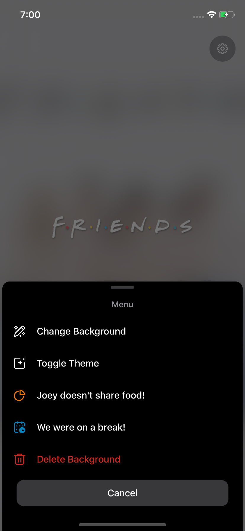
let controller = AppActionSheetController()
controller.addTitle("Menu")
controller.addActionItem(
    AppActionItem(
        type: .button,
        title: "Change Background",
        image: UIImage(named: "action-button-wallpaper"),
        handler: { _ in self.handleChangeBackgroundAction() }
    )
)
controller.addActionItem(
    AppActionItem(
        type: .button,
        title: "Toggle Theme",
        image: UIImage(named: "action-button-theme"),
        handler: { _ in self.handleToggleThemeAction() }
    )
)
controller.addActionItem(
    AppActionItem(
        type: .button,
        title: "Joey doesn't share food!",
        image: UIImage(named: "action-button-share"),
        imageTintColor: .flatOrange
    )
)
controller.addActionItem(
    AppActionItem(
        type: .button,
        title: "We were on a break!",
        image: UIImage(named: "action-button-break"),
        imageTintColor: .flatBlue
    )
)
controller.addActionItem(
    AppActionItem(
        type: .destructiveButton,
        title: "Delete Background",
        image: UIImage(named: "action-button-delete"),
        handler: { _ in self.wallpaperImageView.image = nil }
    )
)
controller.addCancelButton()
SheetKit is completely adaptive for all screens and multitasking windows. To use the adaptive version ActionSheetController use AppActionSheetPopViewController and pass the sourceView that prompts the popOver. It uses popOverPresentationController to adaptive present for various screens.
let controller = AppActionSheetPopViewController(sourceView: settingsButton)
present(controller, animated: true)
Author
Akaash Dev
[email protected]
License
SheetKit is available under the MIT license. See the LICENSE file for more info.