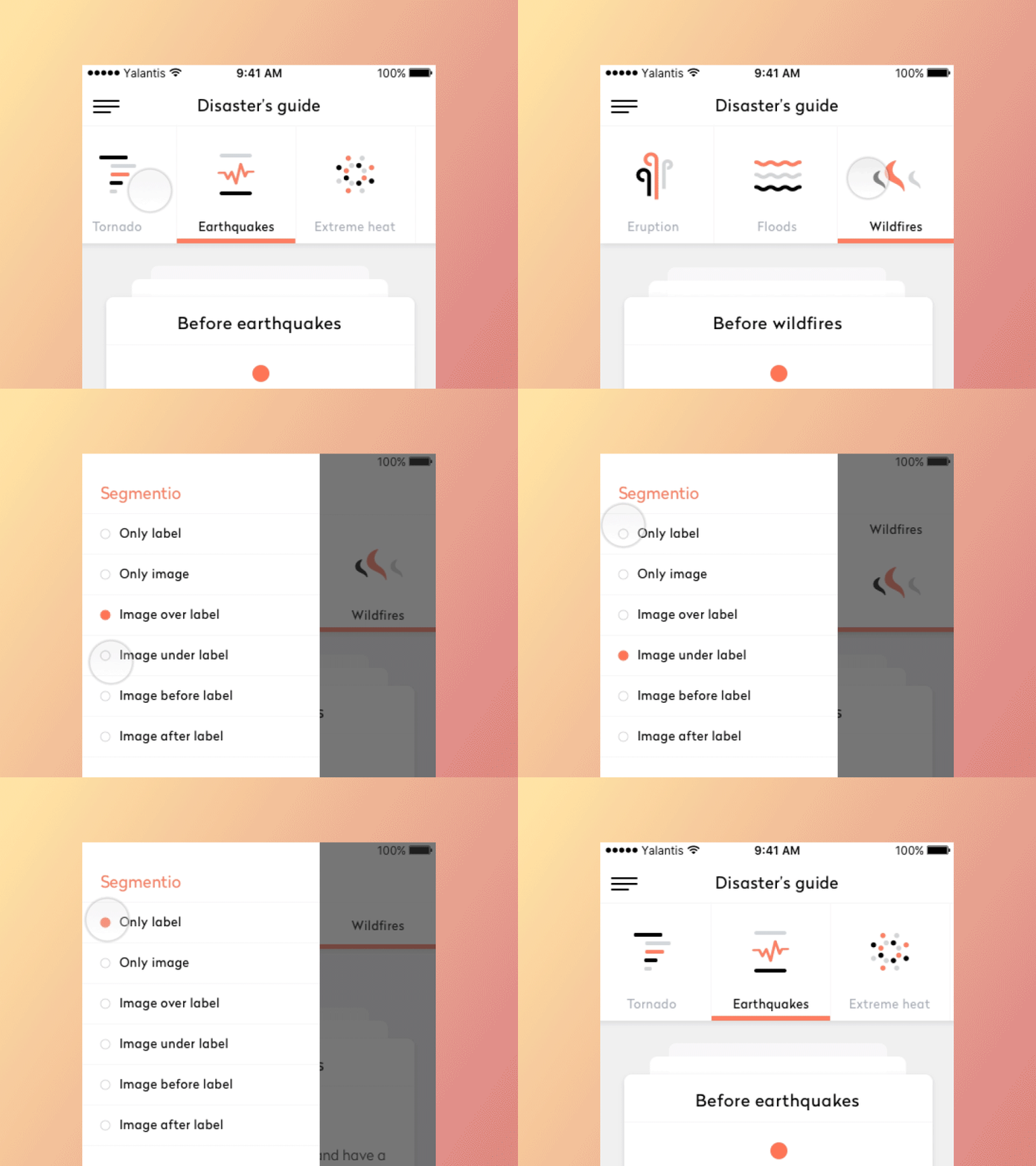
Segmentio
Animated top/bottom segmented control written in Swift.
Check this project on dribbble.
Requirements
- Xcode 10
- iOS 8.x+
- Swift 5.0
Installation
CocoaPods
use_frameworks!

pod 'Segmentio'
CocoaPods v1.1.0 or later required
Carthage
github "Yalantis/Segmentio"Usage
Import Segmentio module
import SegmentioInit
You can initialize a Segmentio instance from code:
var segmentioView: Segmentio!

let segmentioViewRect = CGRect(x: 0, y: 0, width: UIScreen.main.bounds.width, height: 125)
segmentioView = Segmentio(frame: segmentioViewRect)
view.addSubview(segmentioView)
or
add a UIView instance in your .storyboard or .xib, set Segmentio class and connect IBOutlet:
@IBOutlet weak var segmentioView: Segmentio!Setup Segmentio
segmentioView.setup(
	content: [SegmentioItem],
	style: SegmentioStyle,
	options: SegmentioOptions?
)
To start with default options you can just pass nil to the options parameter.
segmentioView.setup(
	content: [SegmentioItem],
	style: SegmentioStyle,
	options: nil
)
Configuring items
In order to set items you need to create an array of SegmentioItem instances:
var content = [SegmentioItem]()

let tornadoItem = SegmentioItem(
	title: "Tornado",
	image: UIImage(named: "tornado")
)
content.append(tornadoItem)
Handling selection
You can specify selected item manually:
segmentioView.selectedSegmentioIndex = 0Handling callback
segmentioView.valueDidChange = { segmentio, segmentIndex in
	print("Selected item: ", segmentIndex)
}
Customization
Segmentio can be customized by passing an instance of SegmentioOptions struct:
SegmentioOptions(
            backgroundColor: .white,
            segmentPosition: SegmentioPosition,
            scrollEnabled: true,
            indicatorOptions: SegmentioIndicatorOptions,
            horizontalSeparatorOptions: SegmentioHorizontalSeparatorOptions,
            verticalSeparatorOptions: SegmentioVerticalSeparatorOptions,
            imageContentMode: .center,
            labelTextAlignment: .center,
            segmentStates: SegmentioStates
)
Segment width rely on SegmentioPosition enum. Width can be fixed according to maximum visible items or dynamic according to segment's content size:
enum SegmentioPosition {
    case dynamic
    case fixed(maxVisibleItems: Int)
}
Selection indicator can be customized by passing an instance of SegmentioIndicatorOptions:
SegmentioIndicatorOptions(
            type: .bottom,
            ratio: 1,
            height: 5,
            color: .orange
)
Horizontal borders can be customized by passing an instance of SegmentioHorizontalSeparatorOptions:
SegmentioHorizontalSeparatorOptions(
            type: SegmentioHorizontalSeparatorType.topAndBottom, // Top, Bottom, TopAndBottom
            height: 1,
            color: .gray
)
Separators between segments can be customized by passing an instance of SegmentioVerticalSeparatorOptions:
SegmentioVerticalSeparatorOptions(
            ratio: 0.6, // from 0.1 to 1
            color: .gray
)
In order to set SegmentioStates you need to create a tuple of SegmentioState instances:
SegmentioStates(
            defaultState: SegmentioState(
                backgroundColor: .clear,
                titleFont: UIFont.systemFont(ofSize: UIFont.smallSystemFontSize),
                titleTextColor: .black
            ),
            selectedState: SegmentioState(
                backgroundColor: .orange,
                titleFont: UIFont.systemFont(ofSize: UIFont.smallSystemFontSize),
                titleTextColor: .white
            ),
            highlightedState: SegmentioState(
                backgroundColor: UIColor.lightGray.withAlphaComponent(0.6),
                titleFont: UIFont.boldSystemFont(ofSize: UIFont.smallSystemFontSize),
                titleTextColor: .black
            )
)
Let us know!
We’d be really happy if you sent us links to your projects where you use our component. Just send an email to [email protected] And do let us know if you have any questions or suggestion regarding the animation.
P.S. We’re going to publish more awesomeness wrapped in code and a tutorial on how to make UI for iOS (Android) better than better. Stay tuned!
License
The MIT License (MIT)
Copyright © 2019 Yalantis
Permission is hereby granted, free of charge, to any person obtaining a copy of this software and associated documentation files (the "Software"), to deal in the Software without restriction, including without limitation the rights to use, copy, modify, merge, publish, distribute, sublicense, and/or sell copies of the Software, and to permit persons to whom the Software is furnished to do so, subject to the following conditions:
The above copyright notice and this permission notice shall be included in all copies or substantial portions of the Software.
THE SOFTWARE IS PROVIDED "AS IS", WITHOUT WARRANTY OF ANY KIND, EXPRESS OR IMPLIED, INCLUDING BUT NOT LIMITED TO THE WARRANTIES OF MERCHANTABILITY, FITNESS FOR A PARTICULAR PURPOSE AND NONINFRINGEMENT. IN NO EVENT SHALL THE AUTHORS OR COPYRIGHT HOLDERS BE LIABLE FOR ANY CLAIM, DAMAGES OR OTHER LIABILITY, WHETHER IN AN ACTION OF CONTRACT, TORT OR OTHERWISE, ARISING FROM, OUT OF OR IN CONNECTION WITH THE SOFTWARE OR THE USE OR OTHER DEALINGS IN THE SOFTWARE.


