RxAlertViewable 


RxAlertViewable is created for developing the MVVM app with RxSwift.
It supports to show a simple alert from the view model class using the signal Observable<RxAlert>.
Installation
RxAlertViewable is available through CocoaPods. To install it, simply add the following line to your Podfile:
pod 'RxAlertViewable'Run Demo
To run the demo application, install the dependencies with CocoaPods and open the project by .xcworkspace.
pod install
open RxAlertViewable.xcworkspace
Documentaion
To use RxAlertViewable, confirm the RxAlertViewable protocol in your view controller class at first.
class ViewController: UIViewController, RxAlertViewable {}Alert
Prepare a PublishSubject alert in your view model class.
let alert = PublishSubject<RxAlert>()Then, bind it in the view controller class which implemented the protocol RxAlertViewable.
viewModel.alert.bind(to: rx.alert).disposed(by: disposeBag)RxAlertViewable supports the following basic alert types.
tip(_ message:, onConfirm:, controllerType:)warning(_ message:, onConfirm:, controllerType:)error(_ message:, onConfirm:, controllerType:)confirm(_ message:, onConfirm:, onDeny:, controllerType:)
To show an alert, just send a singal to alert.
alert.onNext(.tip("Hello"))or just using the wrapper method like:
alert.onNextTip("Hello")From the version 0.8.4, using the wrapper methods for RxAlert and RxActionSheet is recomended.
From the version 1.1, alert with multiple actions was supported.
alert.onNextMultiple(
    title: "Multiple",
    message: "Multiple actions alert",
    .destructive(title: "destructive") {
        self.alert.onNextTip("destructive")
    },
    .default(title: "default") {
        self.alert.onNextTip("default")
    },
    .customCancel(title: "customCancel")
)
Customized default title, button name and tint color.
Customize your own strings and tint color using the following code.
RxAlertConfig.current = RxAlertConfig(
tip: "My Tip",
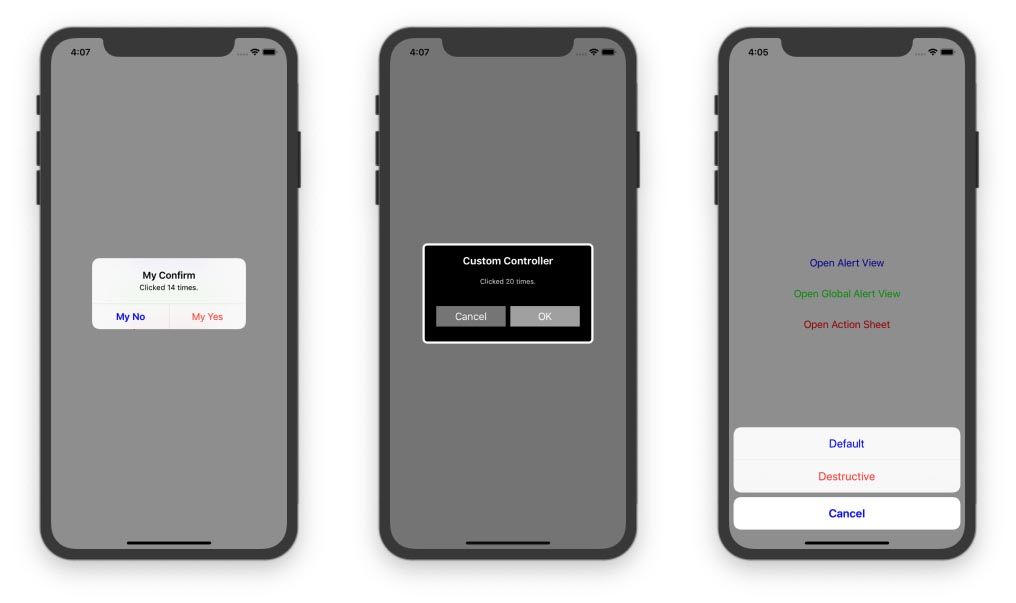
confirm: "My Confirm",
warning: "My Warning",
error: "My Error",
yes: "My Yes",
no: "My No",
ok: "My OK",
cancel: "My Cancel",
tintColor: .blue
)Customized alert controller
RxAlertViewable supports to customize button names and style of the tip and confirm alert.
customTip(title:, message:, item:, onConfirm:)customConfirm(title:, message:, item:, onConfirm:, onDeny:)customConfirm(title:, message:, confirmTitle:, denyTitle:, onConfirm:, onDeny:)
To use a customized alert, a data type which implements the RxAlertItem protocol,
and a view controller which implements the RxAlertController protocol show be prepared.
A demo custom alert controller is here https://github.com/lm2343635/RxAlertViewable/blob/master/Example/RxAlertViewable/CustomAlertController.swift
struct CustomAlertItem: RxAlertItem {
    static var controllerType: RxAlertController.Type = CustomAlertController.self

    var name: String
    var avatar: URL?
}

extension CustomAlertController: RxAlertController {

    static func create(title: String?, message: String?) -> Self {
        return self.init(title: title, message: message)
    }

    func setAction(for category: RxAlertCategory, item: RxAlertItem?) {
        switch category {
        case .single(let confirm):
            confirmButton.setTitle("OK", for: .normal)
            onConfirm = confirm
            denyButton.isHidden = true
        case .double(let confirm, let deny):
            confirmButton.setTitle("Yes", for: .normal)
            denyButton.setTitle("Cancel", for: .normal)
            denyButton.isHidden = false
            onConfirm = confirm
            onDeny = deny
        }

        guard let customAlertItem = item as? CustomAlertItem else {
            return
        }
        avatarImageView.kf.setImage(with: customAlertItem.avatar)
        nameLabel.text = customAlertItem.name
    }

}
To show an alert with customzied alert controller, the item should be indicated.
alert.onNextCustomConfirm(
    title: "Custom Controller",
    message: "Custom alert",
    item: CustomAlertItem(name: "Meng Li", avatar: URL(string: "https://avatars0.githubusercontent.com/u/9463655")),
    onConfirm: nil,
    onDeny: nil
)
Global Alert
RxAlertViewable supports to show a global alert view in a new UIWindow instance above the current window, by binding to the rx.globalAlert singal from any class.
viewModel.globalTip.bind(to: rx.globalAlert).disposed(by: disposeBag)Action sheet.
Using action sheet is nearly same as using alert.
Prepare a PublishSubject alert in your view model class.
let actionSheet = PublishSubject<RxActionSheet>()Then, bind it in the view controller class which implemented the protocol RxAlertViewable.
viewModel.actionSheet.bind(to: rx.actionSheet).disposed(by: disposeBag)To show an action sheet, just send a singal to actionSheet.
The parameter sourceView must be indicated if the action sheet will be shown on iPad devices.
Otherwise, the app will be crashed before showing the action sheet.
actionSheet.onNextActions(
    sourceView: view,
    title: "Test title",
    message: "Test message",
    .default(title: "Default") {
        print("Default")
    },
    .destructive(title: "Destructive") {
        print("Destructive")
    },
    .cancel
)
Author
lm2343635, [email protected]
License
RxAlertViewable is available under the MIT license. See the LICENSE file for more info.