Notie 1.0.4
| TestsTested | ✗ |
| LangLanguage | SwiftSwift |
| License | MIT |
| ReleasedLast Release | Dec 2015 |
| SPMSupports SPM | ✗ |
Maintained by Thi Doan, Thi Doan.
Notie 1.0.4
- By
- Doan Truong Thi
Notie
Undistracted in-app notification in Swift, with added buttons and input box.
Installation
Usage
Example
Show a notification with Confirm style
let notie = Notie(view: self.view, message: "Are you sure you want to do that?", style: .Confirm)

notie.leftButtonAction = {
    // Add your left button action here
    notie.dismiss()
}

notie.rightButtonAction = {
    // Add your right button action here
    notie.dismiss()
}

notie.show()
Parameters
The following parameters can be modified to customize the appearance of the notification.
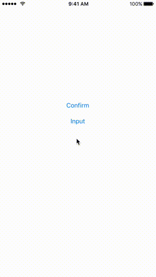
style: The style of the notification..Confirmstyle includes message view and two confirm buttons..Inputstyle adds an extra input text field. Default to.Confirm.leftButtonAction: A block to call when the user taps on the left button.rightButtonAction: A block to call when the user taps on the right button.leftButtonTitle: The title of the left button. Default toOK.rightButtonTitle: The title of the left button. Default toCancel.placeholder: The placeholder of the input text field. Default tonil.animationDuration: How long the slide down animation should last.messageBackgroundColor: The background color of the message view.messageTextColor: The text color of the message view. Default to white color.inputFieldBackgroundColor: The background color of the input text field. Default to white color.inputFieldTextColor: The text color of the input text field. Default to dark gray.leftButtonBackgroundColor: The background color of the left button.leftButtonTextColor: The text color of the left button. Default to white color.rightButtonBackgroundColor: The background color of the right button.rightButtonTextColor: The text color of the right button. Default to white color.
Requirements
iOS 9 or greater.
License
Notie is released under the MIT license. See LICENSE for details.