MJRFlexStyleComponents
Sliding components and containers with easy layout options written in Swift.

Installation
CocoaPods
Install CocoaPods if not already available:
$ [sudo] gem install cocoapods
$ pod setup
Go to the directory of your Xcode project, and Create and Edit your Podfile and add MJRFlexStyleComponents:
$ cd /path/to/MyProject
$ touch Podfile
$ edit Podfile
source 'https://github.com/CocoaPods/Specs.git'
platform :ios, ‘10.0’

use_frameworks!
pod ‘MJRFlexStyleComponents’
Install into your project:
$ pod installOpen your project in Xcode from the .xcworkspace file (not the usual project file):
$ open MyProject.xcworkspaceYou can now import MJRFlexStyleComponents framework into your files.
Note: If you need to use the ShapeStyle class in your project, then remember to ‘import StyledShape’ as well
The Components
There is an example project included in the source, which shows many of the features.
Each component has styling options, which are configured in the same way and with the same values, in order to easily have the same look and feel for the entire UI. The goal for these components was to have very compact and still flexible components for designing a UI with a minimum amount of explaining labels.
The example shows the sliding components, where the components themselves are used to manipulate the others in order to see many of the features. Any component can of course be used separately.
FlexSwitch
A switch very similar to UISwitch
Example:
    let switch = FlexSwitch()
    switch.switchDelegate = self

    func switchStateChanged(flexSwitch: FlexSwitch, on: Bool) {
	. . .
    }
FlexSlider
A slider very similar to UISlider
Example:
	let slider = FlexSlider()
        slider.backgroundColor = .clear
        slider.minimumValue = 1
        slider.maximumValue = 4
        slider.value = 2
        slider.thumbText = nil
        slider.numberFormatString = "%.0f"
        slider.maximumTrackText = "Series"
        slider.valueChangedBlock = {
            (value, index) in
		. . .
        }
FlexDoubleSlider
This is a slider with two thumbs instead of one. The lower value cannot be larger than the upper at any time.
Example:
	let slider = FlexDoubleSlider()
        slider.backgroundColor = UIColor.clear
        slider.direction = .vertical
        slider.minimumValue = 0
        slider.maximumValue = 100
        slider.thumbRatio = 0.1
        slider.hintStyle = .rounded
        slider.thumbText = nil
        slider.numberFormatString = "%.1f"
        slider.value = 0
        slider.value2 = 100

        slider.valueChangedBlock = {
            (value, index) in
            if index == 0 {
		. . .
            }
            else {
		. . .
            }
        }
FlexFlickButton
The Flick Button is a special slider that acts like a button with more than one action. The button can have vertical or horizontal direction and you can assign text and images to the upper, primary and lower actions.
See the following example:
        self.horizUtilButton = FlexFlickButton(frame: CGRect(x: 10, y: 50, width: 48, height: 48))
        self.horizUtilButton?.borderColor = UIColor.MKColor.BlueGrey.P700
        self.horizUtilButton?.borderWidth = 1
        self.horizUtilButton?.style = FlexShapeStyle(style: .rounded)
        self.horizUtilButton?.styleColor = UIColor.MKColor.BlueGrey.P100
        self.horizUtilButton?.thumbStyle = FlexShapeStyle(style: .box)
        self.horizUtilButton?.direction = .horizontal
        self.horizUtilButton?.upperActionItem.text = "<"
        self.horizUtilButton?.upperActionItem.textMaxFontSize = 28
        self.horizUtilButton?.upperActionItem.textSizingType = .relativeToSlider(minSize: 8)
        self.horizUtilButton?.primaryActionItem.text = "Cn"
        self.horizUtilButton?.primaryActionItem.textMaxFontSize = 18
        self.horizUtilButton?.lowerActionItem.text = ">"
        self.horizUtilButton?.lowerActionItem.textMaxFontSize = 28
        self.horizUtilButton?.lowerActionItem.textSizingType = .relativeToSlider(minSize: 8)
        self.view.addSubview(self.horizUtilButton!)
The example button has 3 states and operates horizontally. The primary action has the text “Cn” and is activated by pressing the button. The upper action is “<“ and activated by swiping to the right. The lower action is “>” and is activated by swiping to the left.
Actions are called by a handler:
        self.horizUtilButton?.actionActivationHandler = {
            action in
            switch action {
            case .upper:
                NSLog("upper action triggered")
            case .primary:
                NSLog("primary action triggered")
            case .lower:
                NSLog("lower action triggered")
            }
        }
The Flick Button utilised the slider feature of automatic text and icon sizing of the GenericStyleSlider components. As you can see in the example above, the text is sized relative to the slider components (the Flick Button size in this case) and the minimum and maximum font size is specified. You may want to use NSAttributed strings instead. The GenericStyleSlider delegate methods for thumb and separator texts can be used for this.
FlexSnapStepper
The Snap Stepper is a stepper components based on the GenericStyleSlider. You can use the upper/left part of the stepper to count down and the lower/right part to count up. The Snap Stepper can have vertical or horizontal layout direction.
Example:
        self.stepper = FlexSnapStepper(frame: <some size>)
        self.stepper?.stepValueChangeHandler = {
            newValue in
            NSLog("new value is \(newValue)")
        }
        self.stepper?.thumbFactory = { index in
            let thumb = MutableSliderThumbItem()
            thumb.color = UIColor.MKColor.BlueGrey.P100
            return thumb
        }
        self.stepper?.style = FlexShapeStyle(style: .rounded)
        self.stepper?.borderColor = UIColor.MKColor.BlueGrey.P700
        self.stepper?.borderWidth = 1
Use the thumb and separator factory to style the inner components of the stepper.
The parameters of the stepper are described in the class:
    /// The value of the stepper
    open var value: Double = 0.0
    /// The stepper min value. This is the value updated by the relative motion of the slider and pressing the minus and plus areas.
    open var minStepperValue: Double = 0
    /// The stepper max value. This is the value updated by the relative motion of the slider and pressing the minus and plus areas.
    open var maxStepperValue: Double = 1
    /// Use the value steps in order to control the fractional amount of change when pressing plus and minus. For example, if you specify 10, then it will take 10 taps on the plus button to step from minStepperValue to maxStepperValue.
    open var valueSteps: Double = 10
    /// Use the value slider factor in order to control the 'speed' of the value updates.
    open var valueSlideFactor: Double = 10.0
FlexMenu

FlexMenu has three different layout types:
- Compact
- Equally Spaced
- Dynamically Spaced
The compact menu has a thumb shortcut text and a menu title for an arbitrary number of FlexMenuItems. You can swipe the thumbs to change the selected menu item or press the thumbs.
The equally and dynamically spaced layouts are similar to the familiar Toolbar or NavigationBar from iOS.
All menu layouts support vertical layout and you can specify the gravity of the text labels in order to rotate the text
flexMenuExample.menuItemGravity: FlexMenuItemGravity = .normal // .left or .rightSimple example for the compact style (from the example project):
var styleMenuItems: [FlexMenuItem] = []
let styleMenuSelector = FlexMenu()
func setupStyleMenuSelectionSlider() {
let col1 = FlexMenuItem(title: "Box", titleShortcut: "B", color: UIColor.MKColor.Grey.P200, thumbColor: UIColor.MKColor.Grey.P500)
let col2 = FlexMenuItem(title: "Rounded", titleShortcut: "R", color: UIColor.MKColor.Grey.P200, thumbColor: UIColor.MKColor.Grey.P500)
let col3 = FlexMenuItem(title: "Tube", titleShortcut: "T", color: UIColor.MKColor.Grey.P200, thumbColor: UIColor.MKColor.Grey.P500)
self.styleMenuItems.append(col1)
self.styleMenuItems.append(col2)
self.styleMenuItems.append(col3)
self.styleMenuSelector.menuDataSource = self
}
// MARK: - FlexMenuDataSource
func numberOfMenuItems(menu: FlexMenu) -> Int {
return self.styleMenuItems.count
}
func menuItemForIndex(menu: FlexMenu, index: Int) -> FlexMenuItem {
return self.styleMenuItems[index]
}
func menuItemSelected(menu: FlexMenu, index: Int) {
switch index {
case 0:
self.setStyleOfDemoControls(.box)
case 1:
self.setStyleOfDemoControls(.rounded)
case 2:
self.setStyleOfDemoControls(.tube)
default:
break
}
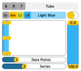
}FlexSeriesView
A component using FlexSlider controls for showing and editing value graphs
Example (from the example project):
    let sliderGraphView = FlexSeriesView()

    func setupSliderGraphView() {
        // Standard iOS UI
        self.sliderGraphView.layer.borderWidth = 1.0
        self.sliderGraphView.layer.borderColor = UIColor.black.cgColor
        self.sliderGraphView.layer.masksToBounds = true
        self.sliderGraphView.layer.cornerRadius = 10

        // The graph setup
        self.sliderGraphView.itemSize = 24
        self.sliderGraphView.backgroundColor = UIColor.clear
        self.sliderGraphView.dataSource = self
        self.sliderGraphView.reloadData()
    }

    // MARK: - FlexSeriesViewDataSource

    func dataOfSeriesAtPoint(flexSeries: FlexSeriesView, series: Int, point: Int) -> Double {
        return self.dataSeries[series][point]
    }

    func dataChangedOfSeriesAtPoint(flexSeries: FlexSeriesView, series: Int, point: Int, data: Double) {
        self.dataSeries[series][point] = data
    }

    func numberOfSeries(flexSeries: FlexSeriesView) -> Int {
        return self.numSeries
    }

    func numberOfDataPoints(flexSeries: FlexSeriesView) -> Int {
        return self.numDataPoints
    }
FlexView

This view is similar to a UIView, but has support for header and footer labels. You can use the same styling for the view, the header and the footer as for all the other components and the header/footer can also appear on the left or right side. Margins allow the header and footer to be detached of the background, if that is desired.
The FlexView can have FlexViewMenu menus, which are added by using:
    viewMenu = ... (Omitted the code. See example from the FlexMenu section)
    flexViewMenu = FlexViewMenu(menu: viewMenu, size: CGSize(width: 100, height: 18), hPos: .center, vPos: .top)
    flexView.addMenu(flexViewMenu)
The size of the FlexViewMenu is relevant, if you do not fill the menu. The height in the size will be the height of the menu. The horizontal position (hPos) can be .Left, .Right, .Center and .Fill. The vertical position (vPos) can be .Header, .Top, .Bottom and .Footer and places the menu inside the FlexView at that location. The headerSize and footerSize of the FlexView is used as the vertical offset when you choose .Bottom (ie. above the footer) or .Top (below the header)
Example (from the example project):
        rightFlexView.headerPosition = .right
        rightFlexView.backgroundInsets = UIEdgeInsetsMake(0, 15, 0, 20)
        rightFlexView.headerText = "Right"
        rightFlexView.footerText = "Right Footer"
        rightFlexView.styleColor = UIColor.MKColor.Amber.P100
        rightFlexView.header.styleColor = UIColor.MKColor.Amber.P500
        rightFlexView.headerSize = 16
        rightFlexView.header.style = FlexShapeStyle(style: .tube)
        rightFlexView.headerClipToBackgroundShape = false
        rightFlexView.header.caption.labelFont = UIFont.boldSystemFont(ofSize: 10)
        rightFlexView.footer.caption.labelFont = UIFont.systemFont(ofSize: 10)
        rightFlexView.header.caption.labelTextAlignment = .center
        rightFlexView.footer.caption.labelTextAlignment = .center
        rightFlexView.footerClipToBackgroundShape = false
        rightFlexView.footer.styleColor = .clear
        rightFlexView.header.caption.labelTextColor = UIColor.white
        rightFlexView.footer.caption.labelTextColor = UIColor.black
        rightFlexView.style = FlexShapeStyle(style: .custom(path: UIBezierPath(roundedRect: rightFlexView.bounds, cornerRadius: 10)))
This example also shows the custom style option, where an arbitrary UIBezierPath is used to define the background style.
FlexImageView

The FlexImageView is a specialisation of the FlexView. This is both a lightweight component to view images and serves also as an example on how to extend the Flex Style components.
Beside the FlexView features, the FlexImageView exposes a simple interface directly to the contained UIImageView in order to set and layout the image:
        flexView.imageView.image = UIImage(named: "DemoImage")
        flexView.imageView.contentMode = .scaleAspectFit
Use imageViewMargins: UIEdgeInsets to add insets to the image inside the display rect of the FlexView.
FlexTextView
This is another lightweight component of a UITextView inside a FlexView.
FlexCollectionView
The specialised collection view is a larger extension and consists not only of a FlexView extension embedding a collection view, but also of a number of cells and a collection item model. You can register new FlexCollectionItem and FlexCollectionViewCell in order to use your own model and cells. The example contained in the project results in the view shown above. These are the cells currently available in the FlexCollectionView. Images and text are all optional in these cells. The layout will adjust accordingly. The cells contain a FlexView as the container view. The flex style with the header is also configurable. Just don’t set the header text if you do not want a cell header.
An example for the FlexCollectionView can be found in the demo project class FlexCollectionDemoViewController
Collection delegate
The FlexCollectionViewDelegate has two functions in order to react on selection and re-ordering:
    func onFlexCollectionItemMoved(view: FlexCollectionView, item: FlexCollectionItem) {
    }

    func onFlexCollectionItemSelected(view: FlexCollectionView, item: FlexCollectionItem) {
    }
Collection sections
The addSection() is used to add a section to your FlexCollectionView. The function returns a section reference which is used when you add the items. You can furthermore pass a title and use getSection(reference) for adjusting the section layout.
Register own cells and items
When you want to add your own items and cells, please use the registerCell(itemClass: AnyClass, cellClass: AnyClass). The classes must inherit from FlexCollectionItem and FlexCollectionViewCell.
GenericStyleSlider
This is the class used by all other slider classes, either as superclass or in the case of the FlexSeriesView as sub components. You can use the generic slider directly or make other subclasses from it.
MJRFlexBaseControl
This is the base class for all flex style controls. Extend this control, if you want to create a control based on the same styles and principles as the other components in this library.
Acknowledgements
Derived from SnappingStepper by Yannick Loriot (https://github.com/yannickl/SnappingStepper.git) and inspirations from BEMSimpleLineGraph by Boris Emorine and Sam Spencer (https://github.com/Boris-Em/BEMSimpleLineGraph)
License
MJRFlexStyleComponents is available under the MIT license. See the LICENSE file for more info.