LoadingPlaceholderView
Animated gradient placeholder with zero effort

| Mixed UI Components | Table View | Collection View |
|---|---|---|
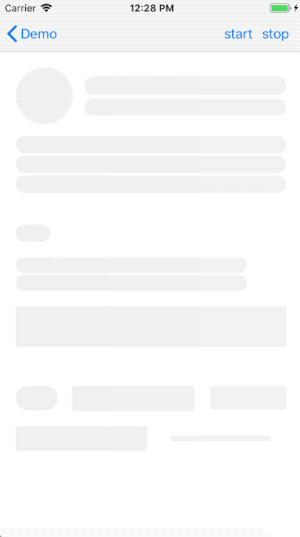 |
 |
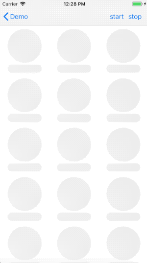 |
Features
- Plug and play
- Supports all UIKit components and it's open to user-defined ones.
- Supports landscape mode and runtime screen resize
- Highly customizable
- Swift 4 and iOS 9.0+
How it works
LoadingPlaceholderView extracts all the subviews that conforms the protocol Coverable from viewToCover and then creates an animated gradient layer combining all the coverablePath provided by each of those subviews.
Setup
Add pod 'LoadingPlaceholderView' to your Podfile or copy the content of the LoadingPlaceholderView folder into your project
How to use
-
Create an instance of
LoadingPlaceholderViewlet loadingPlaceholderView = LoadingPlaceholderView()Usually this would be a property of your view controller.
-
Show the view with
loadingPlaceholderView.cover(_ viewToCover: UIView, animated: Bool) -
Hide the view with
loadingPlaceholderView.uncover(animated: Bool)
UITableView/UICollectionView
By design LoadingPlaceholderView doesn't interfere with DataSource and/orDelegate by injecting mocked data but it leaves the resposability to decide what to show and how to the user; in that way unwanted side effects are limited.
-
Preload the tableView/collectionView with "mocked" cells.
UITableViewCellandUICollectionViewCellalready conformsCoverable -
Show the view with
loadingPlaceholderView.cover(_ viewToCover: UIView, animated: Bool) -
Hide the view and refresh the tableView/collectionView
loadingPlaceholderView.uncover(animated: Bool)tableView/collectionView.reloadData()
Note:
It is possible to set coverableCellsIdentifiers (just for UITableView) - in this way the current tableView state will be ignored and the coverablePath (and therefore the gradient) is generated using the provided cells identifies. In this way it is possible to skip the first step of the previous list because populating the tableView with mocked cells is no more required.
Customization
You can customize the component behavior by setting the followings properties:
fadeAnimationDuration: TimeInterval
The duration of the animation performed by the methods
cover(_ viewToCover: UIView, animated: Bool = true)
uncover(animated: Bool = true)
when animated istrue
gradientColor: UIColor
The main color of the gradient. Once it has been set
gradientConfiguration.backgroundColor,gradientConfiguration.primaryColorandgradientConfiguration.secondaryColorwill be calculated based on this color.
gradientiConfiguration.width: Double
The width of the primary color in the gradient expressed as the percentage of the gradient size.
gradientiConfiguration.animationDuration: TimeInterval
The duration of the animation of the gradient.
gradientiConfiguration.backgroundColor: UIColor
The backgroundColor of the gradient.
gradientiConfiguration.primaryColor: UIColor
The primaryColor of the gradient.
gradientiConfiguration.secondaryColor: UIColor
The secondaryColor of the gradient.
Demo
In this repository you can also find a demo.
Info
If you like this git you can follow me here or on twitter :) @MarioIannotta
Cheers from Italy!