LGSegmentedControl


LGSegmentedControl is a highly customizable and therefor prettier version of UISegmentedControl.

Requirements
- written in pure Swift 4.2
- iOS 9.0 and higher
Attribution
- not a requirement but highly appreciated: add your app to the list of apps using this library
Installation
LGSegmentedControl is available through CocoaPods. To install it, simply add the following line to your Podfile:
pod 'LGSegmentedControl'Storyboard
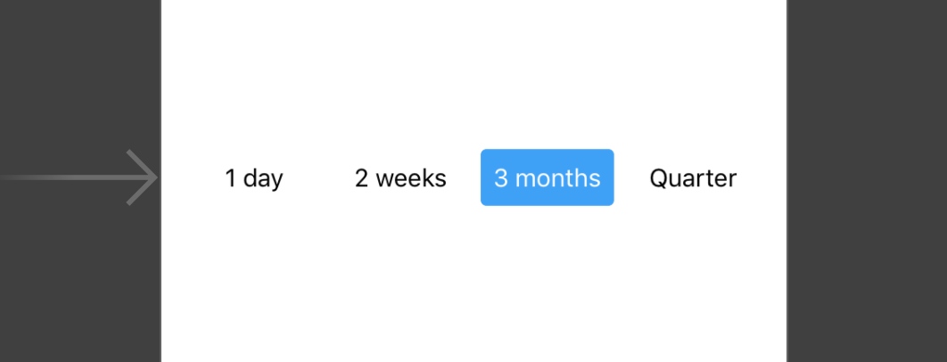
Drag a view into your storyboard and set its class to LGSegmentedControl.
You'll be able to customize your segmented control from there, as well as provide static segment data:

And the best? It supports live rendering in interface builder!

Then, create an @IBAction in your view controller and link to it using the valueChanged action.
Programmatically
Instantiate a new view:
let control = LGSegmentedControl(frame: CGRect(x: 50, y: 50, width: 100, height: 30))
view.addSubview(control)
...then add the segments data:
control.segments = [
    LGSegment(title: "1 day"),
    LGSegment(title: "3 weeks"),
    LGSegment(title: "2 months"),
    LGSegment(title: "Quarter")
]
Lastly, define the selected segment:
control.selectedIndex = 1 // selects: "3 weeks"To track user interaction, add a target and link to a method in your view controller using the .valueChanged action:
control.addTarget(self, action: #selector(selectedSegment(_:)), for: .valueChanged)

@objc func selectedSegment(_ segmentedControl: LGSegmentedControl) {
    // selectedSegment may be nil, if selectedIndex was set to nil (and hence none was selected)
    guard let segment = segmentedControl.selectedSegment else { return }
    let title = segment.title // ex: "3 weeks"
}
Badge Counts
You can add badge counts to segments, by assigning an Int value:
segment.badgeCount = 3This will result in:

Note, that setting the badge to 0 will still show a badge count with a value of 0.
If you want to hide a badge, simply set the count nil:
segment.badgeCount = nilCustomization
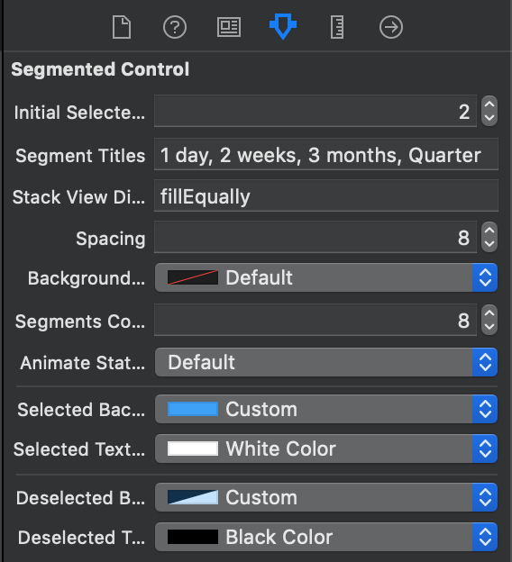
You can customize many aspects of your control:
// StackView distribution, set to .fill to have each segment be as wide as required; set to .fillEqually, to have all segments be the same width
// default: .fill
public var distribution: UIStackView.Distribution

// StackView spacing
// default: 8
@IBInspectable public var spacing: CGFloat

// Background color of the whole segment
// default: .clear
@IBInspectable override public var backgroundColor: UIColor?
More options using LGSegmentOptions:
// Corner radius of the segments
// default: 6
var cornerRadius: CGFloat
// Determines whether there should be a short fade animation when selecting a segment
// default: true
var animateStateChange: Bool
// Background & text color of the selected segment
// default: .blue-ish (#389FF9), .white
var selectedColor: (background: UIColor, text: UIColor)
// Background & text color of the deselected segment
// default: .clear, .black
var deselectedColor: (background: UIColor, text: UIColor)
// Background & text color of the selected segment
// default: .red, .white
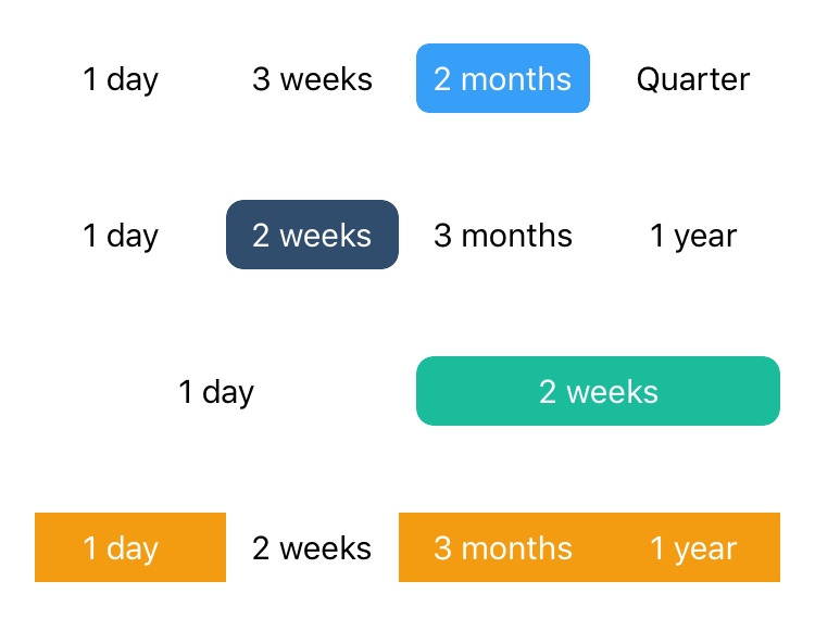
var badgeColor: (background: UIColor, text: UIColor)There are many different ways to style a control with given options, here is a few examples:

Contribution
If you find any bugs, please open a new issue.
If you want to contribute changes and features, please open a pull request and I'll happily merge it!
Author
LGSegmentedControl is written and maintained by Linus Geffarth (me). If you want to say hi, reach out to me via twitter @linusgeffarth, or email [email protected].
License
LGSegmentedControl is available under the MIT license. See the LICENSE file for more info.