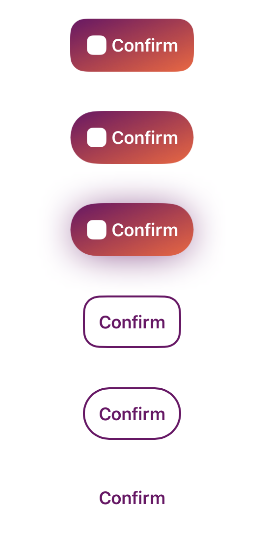
GlossButtonNode
A composable button component for Texture
Bringing a button UI-Component with composable flexibility that fits your product.
Why needs this
Texture(AsyncDisplayKit) provides many advantages to the app.
Although, It does not have functional button components. There is just ASButtonNode, and this is NOT bad things.
It means Texture avoids providing too much stuff.
This library GlossButtonNode gives a button component into Texture world.
GlossButtonNode's functions are:
- With separated structure,
- Customizable surface style (filled, stroked, blurred)
- Customizable animations each surface style
- Applying the style by the descriptor(Value-Type) object
These things would be helpful in the app that has a modern UI design.
First looks
let buttonNode = GlossButtonNode()

let descriptor = GlossButtonDescriptor(
  title: ...,
  image: ...,
  bodyStyle: .init(layout: .horizontal()),
  surfaceStyle: .fill(
    .init(
      cornerRound: .circle,
      backgroundColor: .gradient(
        colorAndLocations: [
          ...,
          ...,
        ],
        startPoint: .init(x: 0, y: 0),
        endPoint: .init(x: 1, y: 1)
      ),
      dropShadow: ...
    )
  )
)

buttonNode.setDescriptor(descriptor, for: .normal)

buttonNode.onTap = {
  ...
}

// or use addAction() as a normal approach.
Using this like API inline in production would be a bit verbosity.
This API is designed for fine-grained tuning.
If your product has UI design system, you can define factory functions for the descriptor.
For example, like followings.
extension GlossButtonDescriptor {
  static func primary(tintColor: UIColor) -> Self {
    ..
  }

  static func secondary(tintColor: UIColor) -> Self {
    ..
  }
}
let buttonNode = GlossButtonNode()
buttonNode.setDescriptor(.primary(tintColor: myColor), for: .normal)Structure
- Button
- Body
- Title
- Image
- Surface
- Styles
- Body
Body
Body has title and image node.
The layout of body and highlighted animation are constructed by GlossButtonBodyStyle.
Technically,
GlossButtonBodyLayout constructs body layout.
GlossButtonHighlightAnimation<T> animates highlighted state.
GlossButtonBodyStyle(
  layout: .vertical(), // or .horizontal()
  highlightAnimation: .basic()
)
Body layout customization
GlossButtonBodyLayout is a wrapper object of closure that returns ASLayoutSpec contains title and image node.
This means .vertical() and .horizontal() are factory functions.
Therefore, you can define any layout with writing ASLayoutSpec if you need to get another layout.
About highlight animation, it uses the same approach.
You can see the detail of that from GlossButtonHighlightAnimation
Surface
Surface node will be displayed behind Body node with padding.
Mainly, GlossButtonNode supports these 2 types of surface:
Filled
Configurations are in GlossButtonFilledStyle
Stroked
Configurations are in GlossButtonStrokedStyle
Installation
Currently, only supports CocoaPods
In your Podfile
pod 'GlossButtonNode'
LICENSE
GlossButtonNode Framework is released under the MIT License.
