FYSliderView 1.1.0
| TestsTested | ✗ |
| LangLanguage | SwiftSwift |
| License | MIT |
| ReleasedLast Release | Mar 2017 |
| SwiftSwift Version | 3.0 |
| SPMSupports SPM | ✗ |
Maintained by angulo.
FYSliderView 1.1.0
- By
- Angelo
使用UICollectionView实现的swift轮播图FYSliderView
- 带有动画效果的pageControl,可自定义pageControl元素之间的间距/大小/位置
- 可自定义文字标题的字体大小/颜色/内边距
- 有两种风格的文字标题遮罩背景(渐变色背景/半透明背景)
- 文字轮播
- 动态改变数据源,可以实时更新轮播图显示内容
项目结构
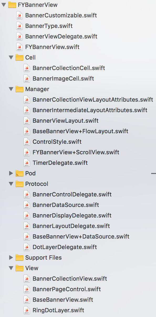
目录说明
├── FYSliderView  #核心库文件夹,如果不使用 CocoaPods 集成,请直接将这个文件夹拖拽到你的项目中
    └── FYCollectionViewCell.swift 内容视图,包括遮罩和半透明样式图层,图片展示,文字标题展示
    └── FYSliderView.swift 核心类
    └── FYContentViewStyle.swift 内容视图的配置
    └── FYPageControl.swift 自定义的PageControl类
    └── FYPageControlStyle.swift  pageControl的样式配置
    └── FYAnimatedLayer.swift 组成自定义pageControl元素的图层
    └── FYSliderViewCustomizable.swift 参数配置
    └── FYDataModel.swift 数据模型
使用FYSliderView
第二步:遵守FYSliderViewCustomizable协议,并在初始化方式中指定为自己
class ViewController: UIViewController,FYSliderViewCustomizable {
    var sliderView:FYSliderView!
    func setupSliderView(){
        sliderView = FYSliderView(frame: CGRect(x: 0, y: 0, width: view.bounds.size.width, height: 200),option:self)
        view.addSubview(sliderView)
    }
}
第三步:为sliderView指定数据源
//声明成员变量
var dataSource:[FYImageObject]!

//请求数据,存到dataSource数组中
…

//指定为数据源
sliderView.imageObjectGroup = dataSource
第四步:指定代理,实现当点击图片会触发回调方法(可选的)
//指定代理对象为self
sliderView.delegate = self

//遵守协议FYSliderViewDelegate,代理方法如下
extension ViewController:FYSliderViewDelegate{
    //轮播图滚动过程中会触发此方法,检索位置
    func sliderView(didScrollToIndex index: Int) {
        print("滚到了\(index)")
    }
    //用户点击图片,检索位置
    func sliderView(didSelectItemAtIndex index: Int) {
        print("点了\(index)")
    }
}
参数说明
    //默认背景图
    var placeholderImage:UIImage

    //是否需要无限循环
    var infiniteLoop:Bool

    //是否自动滚动
    var autoScroll:Bool

    //默认滚动间隔时间
    var scrollTimeInterval:NSTimeInterval

    //滚动方向
    var scrollDirection:UICollectionViewScrollDirection

    //图片的填充方式
    var imageContentMode:UIViewContentMode

    //只有一个元素时就隐藏pageControl
    var hidesForSinglePage:Bool

    //分页控件的类型
    var controlType:FYPageControlType

    //文字背景遮罩样式
    var maskType:FYSliderCellMaskType

    //文字样式
    var titleStyle:FYTitleStyle
1.pageControl相关
其中分页控件的类型有:
- custom 自定义有动画效果的pageControl(默认)
- system 使用系统自带的pageControl
效果如图


使用方法:
1.在ViewController类中,只需重写controlType属性,将返回值改为.system并按照参数要求补齐完整即可切换成系统样式
var controlType:FYPageControlType{
    return .system(currentColor: UIColor(red: 1, green: 1, blue: 1, alpha: 1),
                   normalColor:UIColor(red: 1, green: 1, blue: 1, alpha: 0.8),
                   point:(x:.centerX,y:.bottom(10)))
}
2.你想改变动画样式的pageControl元素之间的间距或者大小,仅仅只需重写controlType属性,将返回值改为.custom并按照参数要求补齐完整即可
var controlType:FYPageControlType{
    return .custom(currentColor: UIColor(red: 1, green: 1, blue: 1, alpha: 1),
                   normalColor:UIColor(red: 1, green: 1, blue: 1, alpha: 0.8),
                   layout:[.point(x:.right(10), y:.bottom(16)),
                           .size(borderWidth:2,circleWidth:10),
                           .margin(12)
                                ])
}
3.如果我不想要pageControl了,想把它隐藏掉,那么只需要这样就可以
var controlType:FYPageControlType{
    return .none
}
4.我想自定义pageControl的位置,如果我用的是系统的pageControl的话,我只需要改变参数point的值即可,它分为x轴和y轴, x轴方向可表示为:
- .left(20) 到sliderView试图左边距离20个单位
- .centerX 相对于sliderView水平居中
- .right(10)到sliderView试图右边距离10个单位
y轴方向可表示为:
- .top(10) 到sliderView试图顶部距离10个单位
- .centerY 相对于sliderView垂直居中
- .bottom(20)到sliderView试图底部距离20个单位
效果如图


2.带文字效果的轮播图,介绍关于遮罩视图的不同选择样式
其中遮罩试图的类型有:
- translucent 半透明
- gradient 渐变色(默认)
效果如图


使用方法:
1、设置成为渐变色的遮罩样式
var maskType:FYSliderCellMaskType{
    return .gradient(backgroundColors: [UIColor(red: 0, green: 0, blue: 0, alpha: 0),
                                        UIColor(red: 0, green: 0, blue: 0, alpha: 0.5)],
                     offsetY: 100)
}
2、设置成为半透明的遮罩样式
var maskType:FYSliderCellMaskType{
    return .translucent(backgroundColor:UIColor(red: 0, green: 0, blue: 0, alpha: 0.5))
}
注:如果传入数据源中的title字段为空,将不再显示遮罩背景
3.带文字效果的轮播图,介绍关于设置文字标题的字体大小/内边距/字体颜色
var titleStyle:FYTitleStyle{
    return [.fontSize(16)]
}
注:返回的是数组样式,数组元素存在枚举类型FYTitleLabelStyle中,可传入多个或单个例如:
//我想改变字体大小和字体颜色:
var titleStyle:FYTitleStyle{
    return [.fontSize(16),textColor(UIColor.redColor())]
}
版本更新:
- 1.0.8
- 1.0.7 修复后台实时添加/删除轮播图数据,APP刷新数据源没有即时改变轮播图展示
- 1.0.6 增加pageControlWidth属性,配合titleStyle属性设置,避免文字视图将pageControl覆盖掉 > 有任何疑问,欢迎加入QQ群:428463531讨论及分享