EasyDialogs 0.9.3
| TestsTested | ✗ |
| LangLanguage | SwiftSwift |
| License | MIT |
| ReleasedLast Release | Jan 2017 |
| SwiftSwift Version | 3.0 |
| SPMSupports SPM | ✗ |
Maintained by Junior B..
EasyDialogs 0.9.3
- By
- Junior B.
- bontoJR
EasyDialogs
EasyDialogs is a simple library inspired by MaterialDialogs for Android. The main goal is to give a powerful library to create high customizable, but simple, alert views for iOS projects.
Table of Contents (Core)
Quick Sample
Here’s a quick sample of an alert view with two texfields to authenticate a user via username and password.
EasyDialog.Builder(self)
            .title(title: "Hello World") // tag -> 1
            .textField(placeholder: "Username") // tag -> 2
            .textField(placeholder: "Password", secure: true) // tag -> 3
            .addButton(title: "Ok") { dialog in

                let tfUsername = dialog.view.viewWithTag(2) as! UITextField
                let tfPassword = dialog.view.viewWithTag(3) as! UITextField

                print("\(tfUsername.text ?? "") \(tfPassword.text ?? "")" )

                dialog.dismiss(animated: true)
            }
            .addButton(title: "Cancel") { dialog in
                dialog.dismiss(animated: true)
            }
            .build()
            .show()

Project Status
This project is under active development by @bontoJR and is in a very early stage.
Roadmap
- [x] Basic builder
- [x] Basic style
- [x] Basic theming
- [x] Document advanced usage
- [ ] Advanced custom theming
- [ ] Cool Animations
- [ ] Elegant loading with transition
Installation
Installation is straightforward with Cocoapods or manually. If you need Carthage support please take in consideration creating a PR to support it.
Manually
If you don’t want to import this project using Cocoapods or Cartaghe, you can simply import the EasyDialog.swift file in your project.
Usage
EasyDialogs aims to create a simple and customizable alert view chaining functions and callbacks. Here’s some examples.
Simple dialog
This is the code to create a simple dialog with an “Ok” button:
EasyDialog.Builder(self)
    .title(title: "Hello World") // tag -> 1
    .text(content: "This is a basic dialog")
    .space(ofSize: 4)
    .addButton(title: "Ok") { dialog in
        dialog.dismiss(animated: true)
    }
    .build()
    .show()
Rating dialog
Creating a simple rating dialog is pretty simple and looks like this:
EasyDialog.Builder(self)
    .title(title: "Rating") // tag -> 1
    .label(text: "If you like this app, please consider rate us.", textAlignment: .center)
    .positiveButton(title: "Yes") { dialog in

        print("process now")

        dialog.dismiss(animated: true)
    }
    .addButton(title: "Remind me later") { dialog in

        print("remind later")

        dialog.dismiss(animated: true)
    }
    .destructiveButton(title: "Not now")
    .build()
    .show()
Advanced
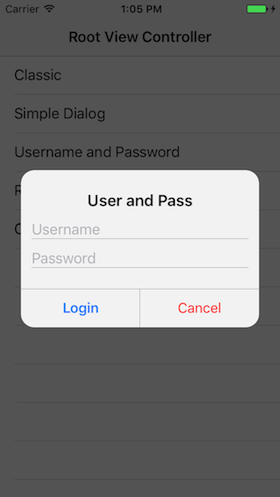
Creating an advanced dialog is done in the following way:
EasyDialog.Builder(self)
    .title(title: "User and Pass") // tag -> 1
    .textField(placeholder: "Username") // tag -> 2
    .textField(placeholder: "Password", secure: true) // tag -> 3
    .view(view: UIActivityIndicatorView(activityIndicatorStyle: .gray)) // tag -> 4
    .positiveButton(title: "Login") { dialog in

    let tfUsername = dialog.view.viewWithTag(2) as! UITextField
    let tfPassword = dialog.view.viewWithTag(3) as! UITextField
    let ai = dialog.view.viewWithTag(4) as! UIActivityIndicatorView

    tfUsername.isUserInteractionEnabled = false
    tfPassword.isUserInteractionEnabled = false

    ai.startAnimating()
    print("\(tfUsername.text ?? "") \(tfPassword.text ?? "")" )

    DispatchQueue.main.asyncAfter(deadline: .now() + 2.0) {
    dialog.dismiss(animated: true)
    }
    }
    .destructiveButton(title: "Cancel")
    .build()
    .show()
Every single time a view is added to the dialog, a tag is assigned in an incremental way starting from 1. So the title view in this case has tag 1, the text field for the username 2, the password 3 and so on. This makes this library pretty flexible and in the previous example, an activity indicator is added to the dialog and is displayed and animated when necessary.
Theming
To theme the dialog there are 2 ways:
- Set the default theme
EasyDialog.Builder.defaultTheme = myCustomTheme - Pass the theme when building the dialog
EasyDialog.Builder(self, theme: customTheme)
The first case has to be used to give a style which will be preserved in the application and is the recommended way. The second case is usually a good alternative when a special dialog requires a different them. It’s recommended to not abuse this method, creating different sytles, making the app visually inconsistent.
To theme the Dialog there’s a dedicate struct:
public struct Theme {
    let textColor: UIColor
    let titleColor: UIColor
    let titleFont: UIFont
    let textFont: UIFont
    let alertBackgroudColor: UIColor
    let cornerRadius: CGFloat
    let maskViewAlpha: CGFloat
    let separatorColor: UIColor
    let positiveButton: Button
    let destructiveButton: Button
    let regularButton: Button

    // [...]

    public struct Button {
        let backgroundColor: UIColor
        let selectedBackgroundColor: UIColor
        let textColor: UIColor
        let font: UIFont
        // [...]
   }
}
Buttons have a dedicated structure to enforce modularity and avoid writing repetitive code which usually leads to bugs.
Contributing
Please feel free to open issues or create pull-requests (on develop branch!). Any kind of constructive contribution is more than welcomed, examples (thanks to Moya for the list):
- Finding (and reporting!) bugs.
- New feature suggestions.
- Answering questions on issues.
- Documentation improvements.
- Reviewing pull requests.
- Helping to manage issue priorities.
- Fixing bugs/new features.
License
EasyDialogs is released under an MIT license. See License.md for more information.