
EZProgressHUD


As we said in short description, this is a very cool customizable and easy to use activity indicator for iOS applications


How to use?
If you wanna use the default EZProgressHUD just follow this👇🏻:
import EZProgressHUDlet options = EZProgressOptions()
let hud = EZProgressHUD.setProgress(with: options) And now you can show or dismiss the hud by :
hud.show()                   // for show it
hud.dismiss(completion: nil) // for dismiss it
Customization
There is two way to do the customization👇🏻:
First Way: Creating an empty instance of EZProgressOptions
let options = EZProgressOptions()

options.radius = 120                                            // by default is 115
options.firstLayerStrokeColor = .lightGray                      // by default is UIColor(red: 220/255, green: 20/255, blue: 60/255, alpha: 1)
options.secondLayerStrokeColor = .white                         // by default is UIColor(red: 220/255, green: 20/255, blue: 60/255, alpha: 1), FYI it's always transparent ;)
options.thirdLayerStrokeColor = .darkGray                       // by default is .gray
options.strokeWidth = 12                                        // by default is 12.0
options.font =  UIFont(name: "AvenirNext-Regular", size: 18)!   // by default is Papyrus size 18
options.title = "EZProgressHUD"                                 // by default is "Please Wait..."
options.titleTextColor = .white                                 // by default is white
options.transViewBackgroundColor = .black                       // by default is black
options.animationOption = EZAnimationOptions.lordOfTheRings     // by default is EZAnimationOptions.heartBeat
Second Way: Using Closure
let options = EZProgressOptions { (option) in

    option.radius = 115                                                                               // by default is 115
    option.firstLayerStrokeColor = UIColor(red: 10/255, green: 101/255, blue: 171/255, alpha: 1.0)    // by default is UIColor(red: 220/255, green: 20/255, blue: 60/255, alpha: 1)
    option.secondLayerStrokeColor = UIColor(red: 10/255, green: 101/255, blue: 171/255, alpha: 1.0)   // by default is UIColor(red: 220/255, green: 20/255, blue: 60/255, alpha: 1), FYI it's always transparent ;)
    option.thirdLayerStrokeColor = .gray                                                              // by default is .gray
    option.strokeWidth = 2                                                                            // by default is 12.0
    option.font = UIFont(name: "Papyrus", size: 18)!                                                  // by default is Papyrus size 18
    option.title = "EZProgressHUD"                                                                    // by default is "Please Wait..."
    option.titleTextColor = .white                                                                    // by default is white
    option.transViewBackgroundColor = .black                                                          // by default is black
    option.animationOption = EZAnimationOptions.hnk                                                   // by default is EZAnimationOptions.heartBeat
}
Indicator Animation Options
In EZProgressHUD we brought to you 8 diffrent kind of indicators:
| animationOption | Example |
|---|---|
| EZAnimationOptions.hnk | |
| EZAnimationOptions.heartBeat |  |
| EZAnimationOptions.antColony | |
| EZAnimationOptions.lineLayer | |
| EZAnimationOptions.xyRotation | |
| EZAnimationOptions.lordOfTheRings |  |
| EZAnimationOptions.yRotation |  |
| EZAnimationOptions.xRotation |  |
Requirements
iOS 9.3+
Xcode 10.2 or later
Swift 4.2 or later
Installation
SwiftyTabBarTransition is available through CocoaPods. To install it in latest version, simply add the following line to your Podfile:
Swift 4.2
pod 'EZProgressHUD', '~> 1.4.3'Swift 5
pod `EZProgressHUD`, `~> 1.5.3`And then on your terminal run 👇🏻:
pod install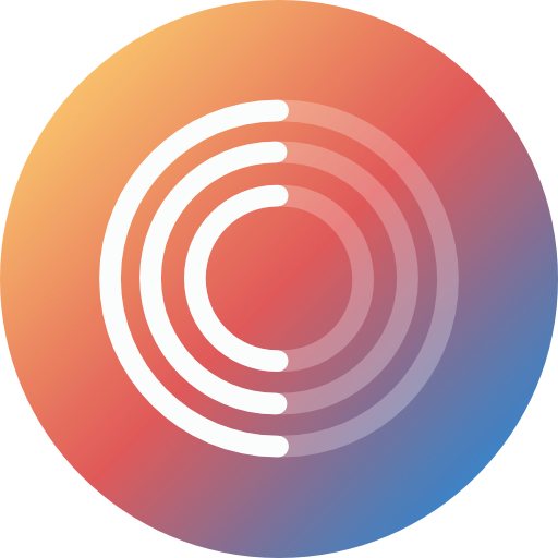
To get the latest version of library using Carthage, you can add following line to your Cartfile.
Swift 4.2
github "shndrs/EZProgressHUD" "1.4.3"Swift 5
github "shndrs/EZProgressHUD" "1.5.3"And then on your terminal run 👇🏻:
carthage updateAuthor
[email protected], [email protected], shndrs
License
EZProgressHUD is available under the MIT license. See the LICENSE file for more info.
Credit
EZProgressHUD is brought to you in iOS Swift by Sahand Raeisi - shndrs