ELTabScrollController: Easily Used Tab Scroll ViewController build with Swift 4


-
**
⚠️ ELTabScrollController requires Swift Version as 4.X -
⚠️ ELTabScrollController requires iOS Version higher than 9.0. (95% of iOS devices are higher than 9.0)
中文说明
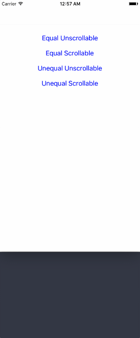
Screenshots
Easily Used Tab Scroll ViewController build with Swift 4
How to Install
Using CocoaPods
- Add this line to your
podfile:pod 'ELTabScrollController' - Swift 3.* use 3.0.0 pod version
- Swift 4.* use 4.* pod version
- Run
pod installwith Terminal - Then everything is done!
Simply add
- Open Elenionl/ELTabScrollController with browser
- Download or Clone Project:
https://github.com/Elenionl/ELTabScrollController.git - Copy
ELCustomPickerView.swiftUIKit+EL.swiftfile to your project - Enjoy
How to Use
If you want to show a Tab Scroll ViewController in your application. Simply do these two steps:
- init
class TabScrollController: ELTabScrollController {
    // MARK: - LifeCircle
    init() {
        super.init()
    }
Or spicify width and type
class TabScrollController: ELTabScrollController {
    // MARK: - LifeCircle
    init() {
        super.init(width: 200, type: .equal_scrollable)
}- add Items, who is authorized to manage a button and button's associating viewController (including view).
override func viewDidLoad() {
  super.viewDidLoad()
  let ctrl1 = ViewController(nibName: nil, bundle: nil)
  let ctrl2 = ViewController(nibName: nil, bundle: nil)
  let ctrl3 = ViewController(nibName: nil, bundle: nil)
  let ctrl4 = ViewController(nibName: nil, bundle: nil)
  let item1 = ELTabScrollItem(title: "Tab 1", image: nil, viewController: ctrl1, view: nil)
  let item2 = ELTabScrollItem(title: "Tab 2", image: nil, viewController: ctrl2, view: nil)
  let item3 = ELTabScrollItem(title: "Tab 3", image: nil, viewController: ctrl3, view: nil)
  let item4 = ELTabScrollItem(title: "Tab 4", image: nil, viewController: ctrl4, view: nil)
  items = [item1, item2, item3, item4]
}
ELTabScrollController Types
There are four types:
- equal_unscrollable
- equal_scrollable
- unequal_unscrollable
- unequal_scrollable
equal means all buttons width is equal
unequal means button width is relevant with its contentSize
unscrollable means the width of tab is equal to ELTabScrollController.width
scrollable means the width of tab can be bigger than width of ELTabScrollController. And tab is scrollable
If You Want to Use Other View of the Child ViewController
    let ctrl1 = ViewController(nibName: nil, bundle: nil)
    let item1 = ELTabScrollItem(title: "Tab 1", image: nil, viewController: ctrl1, view: ctrl1.tableView)
Handler Triggered by Switch
- Get notified when the pages switch
self.switchHandler = { (index, type) in
    print(index, type)
}- The Log is like follow:
2 buttonTap
2 buttonTap
3 buttonTap
1 buttonTap
1 buttonTap
0 scroll
0 scroll
1 scroll
Button Can Be Customized
- Button with title and image
let item4 = ELTabScrollItem(title: "Tab 4", image: UIImage(named: "image"), viewController: ctrl4, view: nil)- Custom button by your self
public init(button: UIButton, viewController: UIViewController, view: UIView?)ViewController is Easily Customizable
override func viewDidLoad() {
  super.viewDidLoad()
  self.title = "Demo"
  tab.backgroundColor = UIColor.orange
  sliderView.backgroundColor = .white
  container.backgroundColor = UIColor.lightGray
  tabButtonHeight = 66
  sliderViewHeight = 10
  buttonFont = UIFont.boldSystemFont(ofSize: 18)
  buttonSelectedTitleColor = UIColor.white
  buttonNormalTitleColor = UIColor.lightGray
  switchHandler = { (index, type) in
    print(index, type)
  }
}
Settings and Handlers Available
// MARK: - Settings

open var tabBarType: ELTabBarType = ELTabBarType.equal_unscrollable

/// Distance between buttons. Default value: 30.0 for scrollable, 0 for unscrollable.
open var tabSpacing: CGFloat

/// The zoom factor for buttons, only available in scrollable tabs. Default value: 1.05
open var buttonHorizontalZoomFactor: CGFloat = 1.05

/// Items containing buttons and viewControllers
open var items: [ELTabScrollItem]! = []

/// The width of the base view. Default value is screen width
open var width: CGFloat! = UIScreen.main.bounds.size.width

/// Triggered by switch behavior
open var switchHandler: ELSwitchHandler?

/// Height of button
open var tabButtonHeight: CGFloat = 44

/// Hight of slider
open var sliderViewHeight: CGFloat = 5

/// Font of button
open var buttonFont: UIFont?

open var buttonSelectedBackgroudColor: UIColor?

open var buttonNormalBackgroudColor: UIColor?

open var buttonSelectedTitleColor: UIColor?

open var buttonNormalTitleColor: UIColor?
Requirements
- Xcode 8.X
- Swift 4.X
- Using ARC
- iOS 9.0
TODO
✅ More Tab Style❎ More Slider Style
Author
Hanping Xu (Elenionl), [email protected]
License
ELTabScrollController is available under the MIT license, see the LICENSE file for more information.