ELPickerView 4.0.1
| TestsTested | ✗ |
| LangLanguage | SwiftSwift |
| License | MIT |
| ReleasedLast Release | Nov 2017 |
| SwiftSwift Version | 4.0 |
| SPMSupports SPM | ✗ |
Maintained by Hanping Xu.
ELPickerView 4.0.1
- By
- Hanping Xu
ELPickerView: Easily Used Picker View build with Swift 4


请点击中文说明
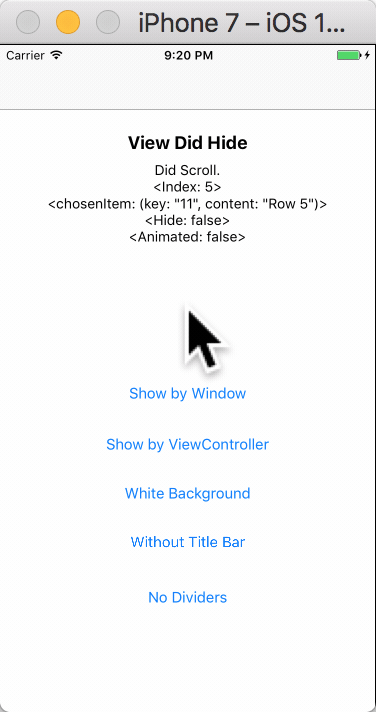
Screenshots
Easily Used Picker View build with Swift 4
How to Install
Using CocoaPods
- Add this line to your
podfile:
pod 'ELPickerView' - Run
pod installwith Terminal
Swift 3. use 3.0.0 pod version
Swift 4. use 4.* pod version - Then everything is done!
Simply add
- Open Elenionl/ELPickerView-Swift with browser
- Download or Clone Project:
https://github.com/Elenionl/ELPickerView-Swift.git - Copy
ELCustomPickerView.swiftfile to your project - Enjoy
How to Use
If you want to show a Picker View in your application. Simply do these two steps:
- init
lazy var customPickerView: ELCustomPickerView<String> = {
    return ELCustomPickerView<String>(pickerType: .singleComponent, items: [
        "Row 0"
        , "Row 1"
        , "Row 2"
        , "Row 3"
        , "Row 4"
        , "Row 5"
        ])
}- show
override func viewDidLoad() {
        super.viewDidLoad()
        customPickerView.show(viewController: self, animated: true)
}
If You Want the Translucent Background to Cover the Navigation Bar and the Tab Background
- Just let the window show Picker View like this:
    override func viewDidLoad() {
        super.viewDidLoad()
        customPickerView.show(viewController: nil, animated: true)
    }
Instead of Delegate, ELPickerView Use Closure to Handle Callback
- There are rich callbacks as follow:
Using seres of 'Set' methods
        view.setDidScrollHandler({ [weak self] (view, chosenIndex, chosenItem) -> (shouldHide: Bool, animated: Bool) in
            let hide = false
            let animated = false
            self?.logLabel.text = "Did Scroll. \n<Index: \(chosenIndex)> \n<chosenItem: \(chosenItem)> \n<Hide: \(hide)> \n<Animated: \(animated)>"
            print(self?.logLabel.text ?? "")
            return (hide, animated)
        })
set value
        customPickerView.leftButtoTapHandler = { [weak self] (view: ELCustomPickerView<String>?, chosenIndex: Int, chosenItem: (key: String, content: String)) in
            let hide = true
            let animated = true
            self?.logLabel.text = "Did Tap Left Button. <Index: \(chosenIndex)> <chosenItem: \(chosenItem)> <Hide: \(hide)> <Animated: \(animated)>"
            print(self?.logLabel.text ?? "")
            return (hide, animated)
}- And here is the define and meaning of the handler:
    /// Triggered when Left Button is tapped.
    //  view: the CustomPickerView
    //  chosenIndex: the current chosen index of row in Picker View
    //  chosenItem: the Item connected with the chosen row
    //  shouldHide: tell the Picker View whether it should be hide  Default value is true
    //  animated: tell the Picker View whether the hide action should have animation  Default value is true
    public var leftButtoTapHandler: ((_ view: ELCustomPickerView?, _ chosenIndex: Int, _ chosenItem: T) -> (shouldHide: Bool, animated: Bool))?
You Can Let Users Pick Between Instance, Struct, Enum, Tuple
- Add whatever kind of items when init:
typealias CustomView = ELCustomPickerView<(key: String, content: String)>
...
let view = CustomView(pickerType: .singleComponent, items: [
          ("00", "Row 0")
          , ("02", "Row 1")
          , ("04", "Row 2")
          , ("06", "Row 3")
          , ("09", "Row 4")
          , ("11", "Row 5")
])- Give a handler to transform item into a String kind var
view.itemConfigHandler = { (key: String, content: String) in
    return content
}- Then Done
View is Easily Customizable
        view.blackBackground = true
        view.isTitleBarHidden = false
        view.isTapBackgroundEnabled = true
        view.leftButton.setTitle("LEFT", for: .normal)
        view.rightButton.setTitle("RIGHT", for: .normal)
        view.title.text = "TITLE"
        view.foregroundView.picker.backgroundColor = UIColor.white
        view.foregroundView.bottomDivider.isHidden = true
Settings and Handlers Available
// MARK: - Settings

/// Type of Picker View
public let pickerType: ELCustomPickerViewType

/// Items used to config Picker View rows  Default value is []
public var items: [T]

/// Background of the screen  Default value is true
public var blackBackground: Bool

/// Set Title Bar hidden or not  Default value is false
public var isTitleBarHidden = false

/// Set Taping Background to hide Picker View enabled or not  Default value is true
public var isTapBackgroundEnabled = true

/// Left Button of the Title Bar, shortcut to foregroundView.leftButton
public lazy var leftButton: UIButton

/// Right Button of the Title Bar, shortcut to foregroundView.rightButton
public lazy var rightButton: UIButton

/// Title of the Title Bar, shortcut to foregroundView.title
public lazy var title: UILabel


// MARK: - Handler

/// Function used to transform Item into String. If the Item is String kind, itemConfigHandler is not necessory to be set.
public var itemConfigHandler: ((T) -> String)?

/// Triggered when Left Button is tapped.
//  view: the CustomPickerView
//  chosenIndex: the current chosen index of row in Picker View
//  chosenItem: the Item connected with the chosen row
//  shouldHide: tell the Picker View whether it should be hide  Default value is true
//  animated: tell the Picker View whether the hide action should have animation  Default value is true
public var leftButtoTapHandler: ((_ view: ELCustomPickerView?, _ chosenIndex: Int, _ chosenItem: T) -> (shouldHide: Bool, animated: Bool))?

/// Triggered when Right Button is tapped.
//  view: the CustomPickerView
//  chosenIndex: the current chosen index of row in Picker View
//  chosenItem: the Item connected with the chosen row
//  shouldHide: tell the Picker View whether it should be hide  Default value is true
//  animated: tell the Picker View whether the hide action should have animation  Default value is true
public var rightButtoTapHandler: ((_ view: ELCustomPickerView?, _ chosenIndex: Int, _ chosenItem: T) -> (shouldHide: Bool, animated: Bool))?

/// Triggered when user picked one row in Picker View.
//  view: the CustomPickerView
//  chosenIndex: the current chosen index of row in Picker View
//  chosenItem: the Item connected with the chosen row
//  shouldHide: tell the Picker View whether it should be hide  Default value is false
//  animated: tell the Picker View whether the hide action should have animation   Default value is false
public var didScrollHandler: ((_ view: ELCustomPickerView?, _ chosenIndex: Int, _ chosenItem: T) -> (shouldHide: Bool, animated: Bool))?

/// Triggered when Picker View will show
public var willShowHandler: ((_ view: ELCustomPickerView?) -> Void)?

/// Triggered when Picker View did show
public var didShowHandler: ((_ view: ELCustomPickerView?) -> Void)?

/// Triggered when Picker View will hide
public var willHideHandler: ((_ view: ELCustomPickerView?) -> Void)?

/// Triggered when Picker View did hide
public var didHideHandler: ((_ view: ELCustomPickerView?) -> Void)?

// MARK: - Views

/// The bottom view containing Title Bar and Picker
public lazy var foregroundView: ELPickerForegroundView
Requirements
- Xcode 8.0
- Swift 4.0
- Using ARC
- iOS 8.0
TODO
❌ Picker View with more than one component❌ Picker View of date and time
Author
Hanping Xu (Elenionl), [email protected]
License
ELPickerView is available under the MIT license, see the LICENSE file for more information.