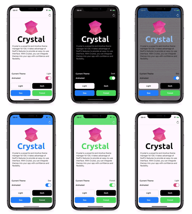
Crystal is a lightweight and intuitive theme manager for iOS. It takes advantage of Swift’s features to provide an easy-to-use interface. With Crystal, you can integrate themes into your app with confidence and flexibility.
Feature
- Flexible: Crystal is compitible with any object, not just built-in UI components. You can use Crystal anywhere.
- Friendly: Apply themes in a way you're familiar with, and no additional property APIs will make you confused and distracted.
- Simple: Adding a theme is as simple as creating an instance. It's easy to maintain your themes with Crystal.
- Type Safe: Take full advantage of swift's type safety. Apply your theme with confidence and benefit from compile-time check.
Getting Started
Usage
To use Crystal, there are three steps: Define Theme Type -> Make Compatible -> Apply Theme
Setp 1 - Define Theme Type
You can introduce your theme type by making class or struct conform to CrystalThemeType protocol. With this protocol, you have to implement a static property to return the entry theme.
public struct AppTheme {
    var textColor: UIColor
    var backgroundColor: UIColor
}

extension AppTheme: CrystalThemeType {
    static var light: AppTheme {
        return AppTheme(
            textColor: .black,
            backgroundColor: .white
        )
    }

    static var dark: AppTheme {
        return AppTheme(
            textColor: .white,
            backgroundColor: .black
        )
    }

    // Return the entry theme.
    public static var entry: CrystalThemeType {
        return Self.light
    }
}
Setp 2 - Make Compatible
In order to tell Crystal about your theme type:
- Make
Crystalconform toCrystalDetermined. - Make any type conform to
CrystalDeterminedaccording to your needs.
Use typealias to determine the concrete theme type.
// Required. Determine the concrete theme type.
extension Crystal: CrystalDetermined {
    public typealias Theme = AppTheme
}

// Optional. Make any type compatible as you need.
extension UIView: CrystalCompatible {
    public typealias Theme = AppTheme
}
extension UIBarButtonItem: CrystalCompatible {
    public typealias Theme = AppTheme
}
Any object that conforms to CrystalCompatible protocol has a cst namespace for exposing Crystal methods.
Step 3 - Apply Theme
Use the apply(_:) method to apply theme and you can do whatever you want in the closure:
// Apply theme to a button.
doneButton.cst.apply { button, theme in
    button.setTitleColor(theme.textColor, for: .normal)
}
// Apply theme to a custom view.
cardView.cst.apply { card, theme in
    card.backgroundColor = theme.backgroundColor
    card.titleColor = theme.textColor
}
// Shorthand argument names.
imageView.cst.apply { $0.tintColor = $1.textColor }
Assign a new value to Crystal.shared.theme to change theme:
// Change theme.
Crystal.shared.theme = .dark
Requirements
- Swift 5.0+
- iOS 10.0+
Installation
CocoaPods
When using CocoaPods, add the following to your Podfile:
pod 'Crystal'Carthage
For Carthage, add the following to your Cartfile:
github "yunhao/Crystal"Swift Package Manager
Add the following to the dependencies section of your Package.swift file:
.package(url: "https://github.com/yunhao/Crystal.git", from: "1.0.0")Contribution
Pull requests, bug reports and feature requests are welcome.
License
Crystal is released under the MIT License.


