A customizable circular context menu library for iOS applications. Provides an intuitive radial menu interface with support for long-press and tap gestures.
English | 한국어


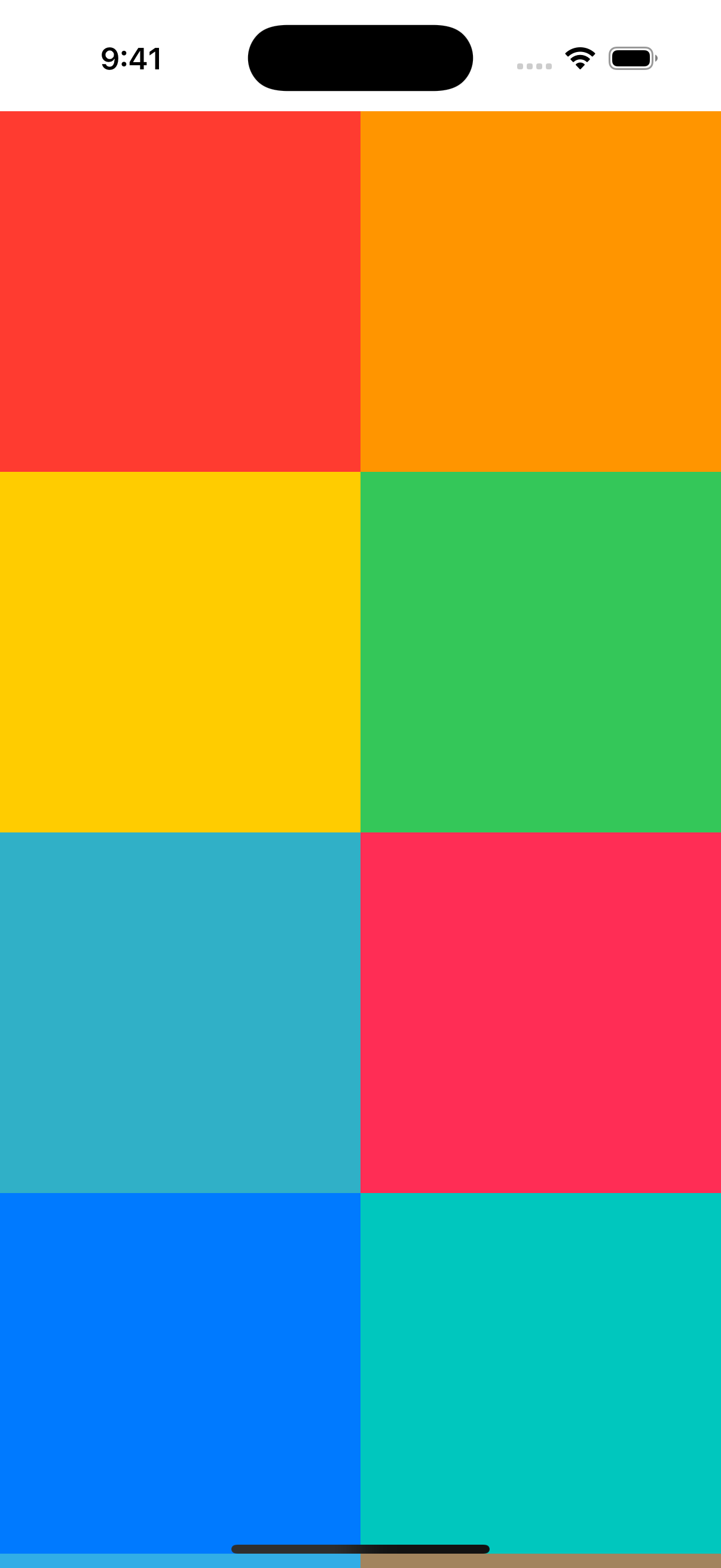
- Circular Layout: Menu items are arranged in an arc around the touch point
- Gesture Support: Both long-press (drag to select) and tap interactions
- View Highlighting: Optional visual effects when menu is displayed
- Customizable Appearance: Configure colors, sizes, animations, and more
- Pure UIKit: No external dependencies
- Smooth Animations: Polished presentation and dismissal animations
- Smart Positioning: Automatically adjusts menu position to stay on screen
- iOS 16.0+
- Swift 5.9+
- Xcode 15.0+
Add CircularContextMenu to your project via Xcode:
- File > Add Package Dependencies
- Enter the repository URL:
https://github.com/songmoro/CircularContextMenu.git - Select version requirements
Or add it to your Package.swift:
dependencies: [
    .package(url: "https://github.com/songmoro/CircularContextMenu.git", from: "0.1.0")
]Add to your Podfile:
pod 'CircularContextMenu', '~> 0.1.0'Then run:
pod installimport CircularContextMenu
// Define menu items
let items: [CircularMenuItemProtocol] = [
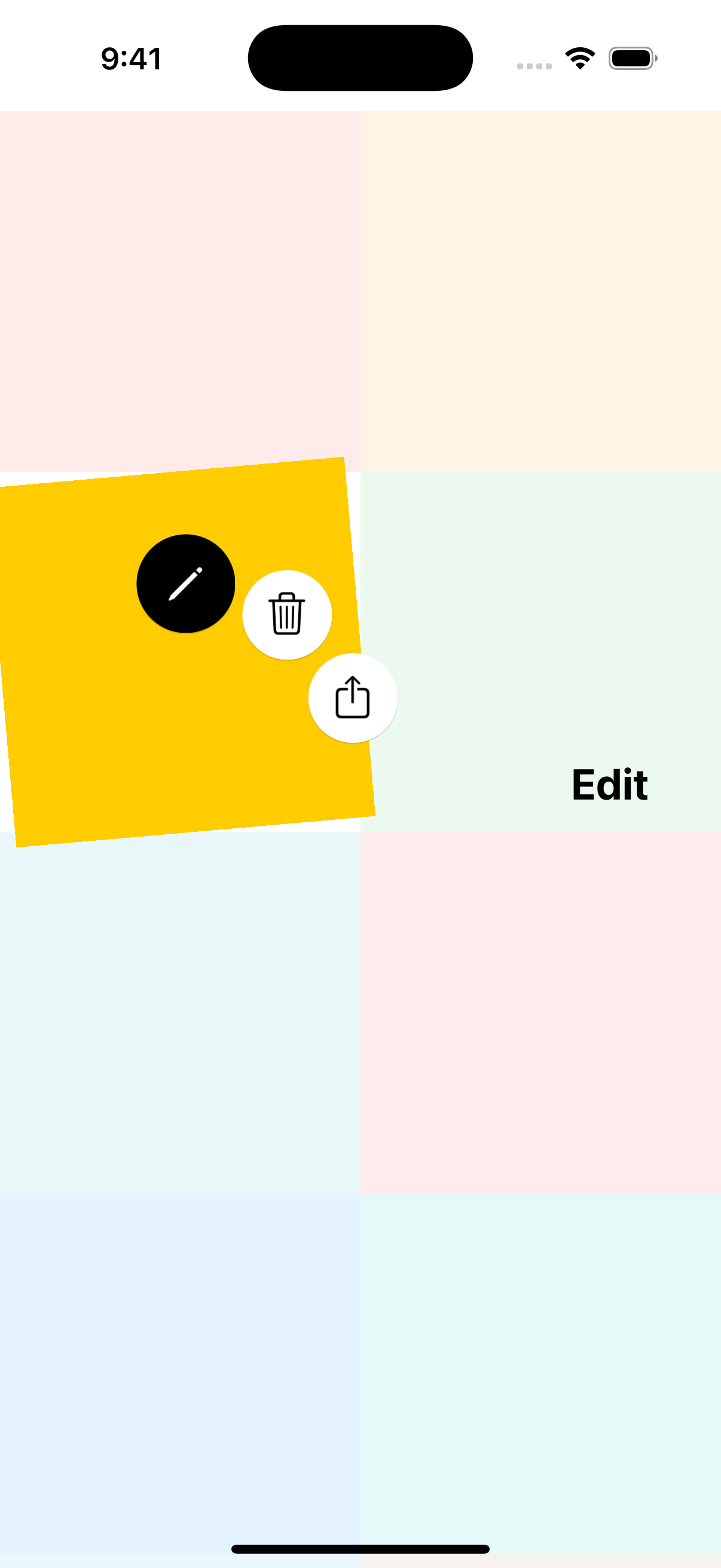
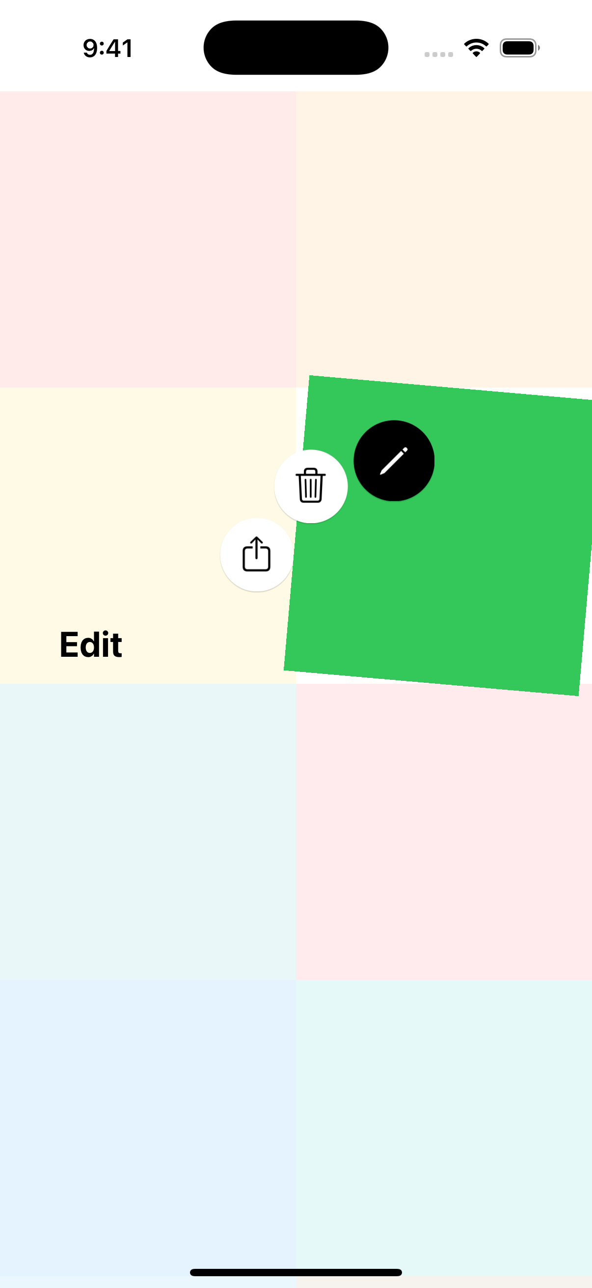
CircularMenuItem(
name: "Edit",
image: UIImage(systemName: "pencil"),
backgroundColor: .systemYellow
) {
print("Edit tapped")
},
CircularMenuItem(
name: "Delete",
image: UIImage(systemName: "trash"),
backgroundColor: .systemRed
) {
print("Delete tapped")
},
CircularMenuItem(
name: "Share",
image: UIImage(systemName: "square.and.arrow.up"),
backgroundColor: .systemBlue
) {
print("Share tapped")
}
]
// Add long-press menu to a view
CircularMenuManager.shared.addLongPressMenu(
to: myView,
targetView: myView,
items: items,
presentingViewController: self
)For a tap-based menu where users select items by tapping (instead of dragging):
CircularMenuManager.shared.addTapMenu(
    to: myView,
    targetView: myView,
    items: items,
    presentingViewController: self
)You can also manually present a menu at a specific point:
CircularMenuManager.shared.showMenu(
    at: CGPoint(x: 200, y: 300),
    selectedView: myView,
    items: items,
    from: self
)Configure how the selected view is highlighted when the menu appears:
// Contextual rotation (default)
CircularMenuManager.shared.addLongPressMenu(
    to: myView,
    targetView: myView,
    items: items,
    presentingViewController: self,
    highlightConfiguration: .withContextualRotation()
)

// Scale effect
CircularMenuManager.shared.addLongPressMenu(
    to: myView,
    targetView: myView,
    items: items,
    presentingViewController: self,
    highlightConfiguration: .withScale
)

// Custom rotation angle
CircularMenuManager.shared.addLongPressMenu(
    to: myView,
    targetView: myView,
    items: items,
    presentingViewController: self,
    highlightConfiguration: .withCustomRotation(angle: 10)
)

// No effects
CircularMenuManager.shared.addLongPressMenu(
    to: myView,
    targetView: myView,
    items: items,
    presentingViewController: self,
    highlightConfiguration: .default
)Customize menu appearance by modifying constants:
// Customize the menu view controller
CircularMenuManager.shared.addLongPressMenu(
    to: myView,
    targetView: myView,
    items: items,
    presentingViewController: self,
    customization: { menuVC in
        menuVC.buttonSize = 60
        menuVC.menuRadius = 120
        menuVC.animationDuration = 0.4
    }
)You can also modify global constants for consistent styling across your app:
// Modify constants (affects all menus)
CircularMenuConstants.Layout.buttonSize = 60
CircularMenuConstants.Layout.menuRadius = 120
CircularMenuConstants.Animation.duration = 0.4Create custom menu items by conforming to CircularMenuItemProtocol:
struct MyCustomMenuItem: CircularMenuItemProtocol {
    let name: String
    let image: UIImage?
    let backgroundColor: UIColor
    let action: (() -> Void)?

    // Add custom properties
    let priority: Int
    let isDestructive: Bool
}The library is organized into the following components:
-
Core: Protocol definitions and core utilities
CircularMenuItemProtocol: Menu item protocolViewHighlightManager: Handles view highlighting effectsViewHighlightEffect: Visual effect configurations
-
View: UI components
CircularMenuViewController: Main menu view controllerCircularMenuButton: Individual menu buttonTapMenuViewController: Tap-based menu variant
-
ViewModel: Business logic and gesture handling
CircularMenuManager: Main manager (singleton)CircularMenuGestureHandlers: Gesture recognizer handlers
-
Model: Data models and constants
CircularMenuConstants: Configuration constants
For a complete sample application demonstrating various features of CircularContextMenu, check out the example repository:
The example project includes:
- Collection view with circular menu integration
- Both long-press and tap menu demonstrations
- Various customization examples
- Real-world usage patterns
CircularContextMenu is available under the MIT license. See the LICENSE file for more info.
songmoro
Contributions are welcome! Please feel free to submit a Pull Request.