CFAlertViewController
CFAlertViewController is a library that helps you display and customise Alerts, Action Sheets, and Notifications on iPad and iPhone. It offers screen rotation as well as an adaptive UI support. CFAlertViewController’s API is almost similar to the native UIAlertController but it has a lot more functionalities than the native UIAlertController.
You can also check out this library for  Android by clicking here
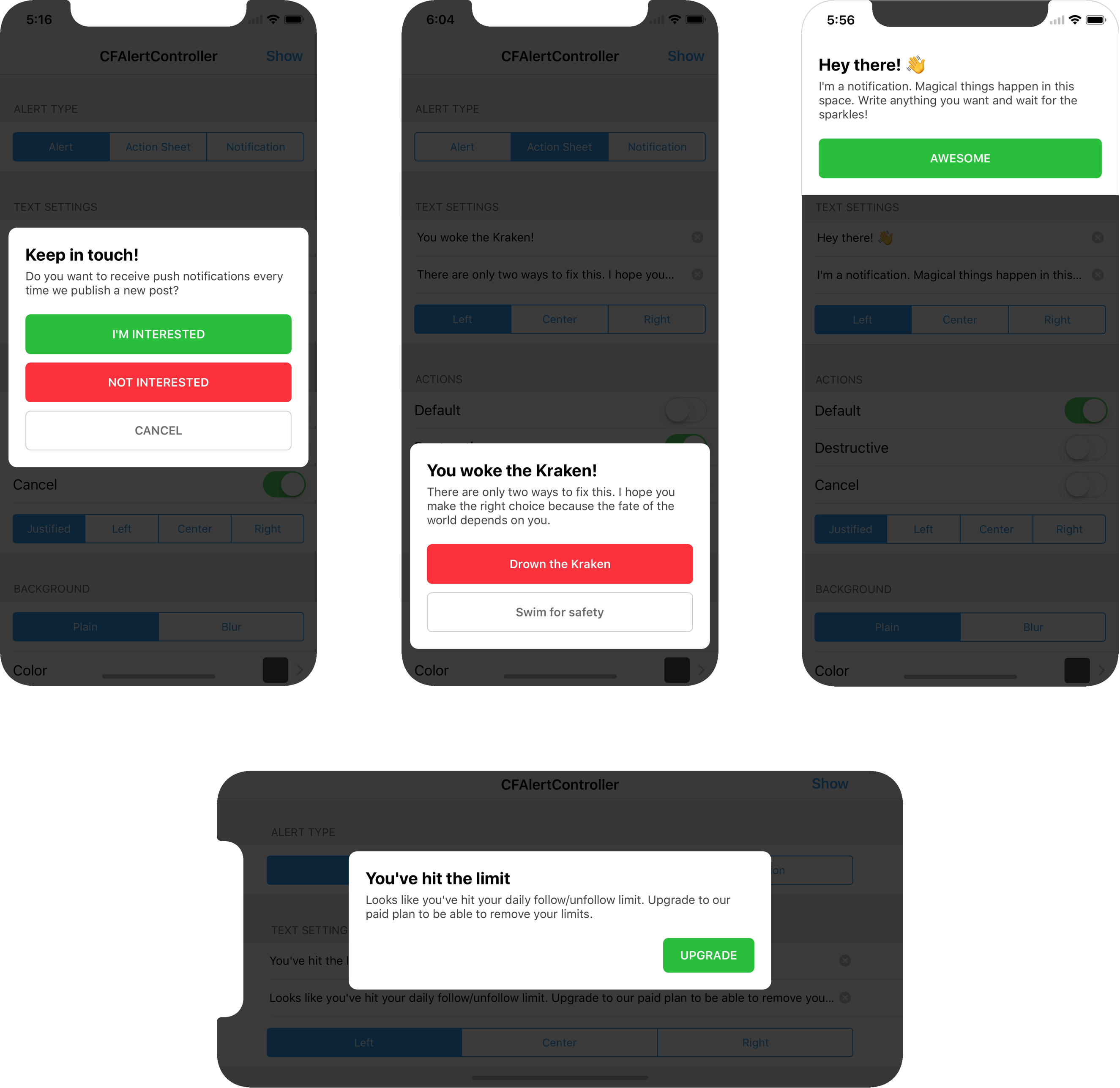
Types of use cases:
Configuration options:
Requirements :
CFAlertViewController works on devices (iPhone and iPad) with iOS 8.0+. It depends on the following Apple frameworks:
- Foundation.framework
- UIKit.framework
Install using Cocoapods (recommended)
We assume that your Cocoapods is already configured. If you are new to Cocoapods, have a look at the documentation
- Add
pod 'CFAlertViewController'to your Podfile. - Install the pod(s) by running
pod installin terminal (in folder wherePodfilefile is located).
Install using Source file
Open the downloaded project in Xcode, then drag and drop folder named CFAlertViewController onto your project (use the "Product Navigator view"). Make sure to select Copy items when asked if you extracted the code archive outside of your project.
Usage :
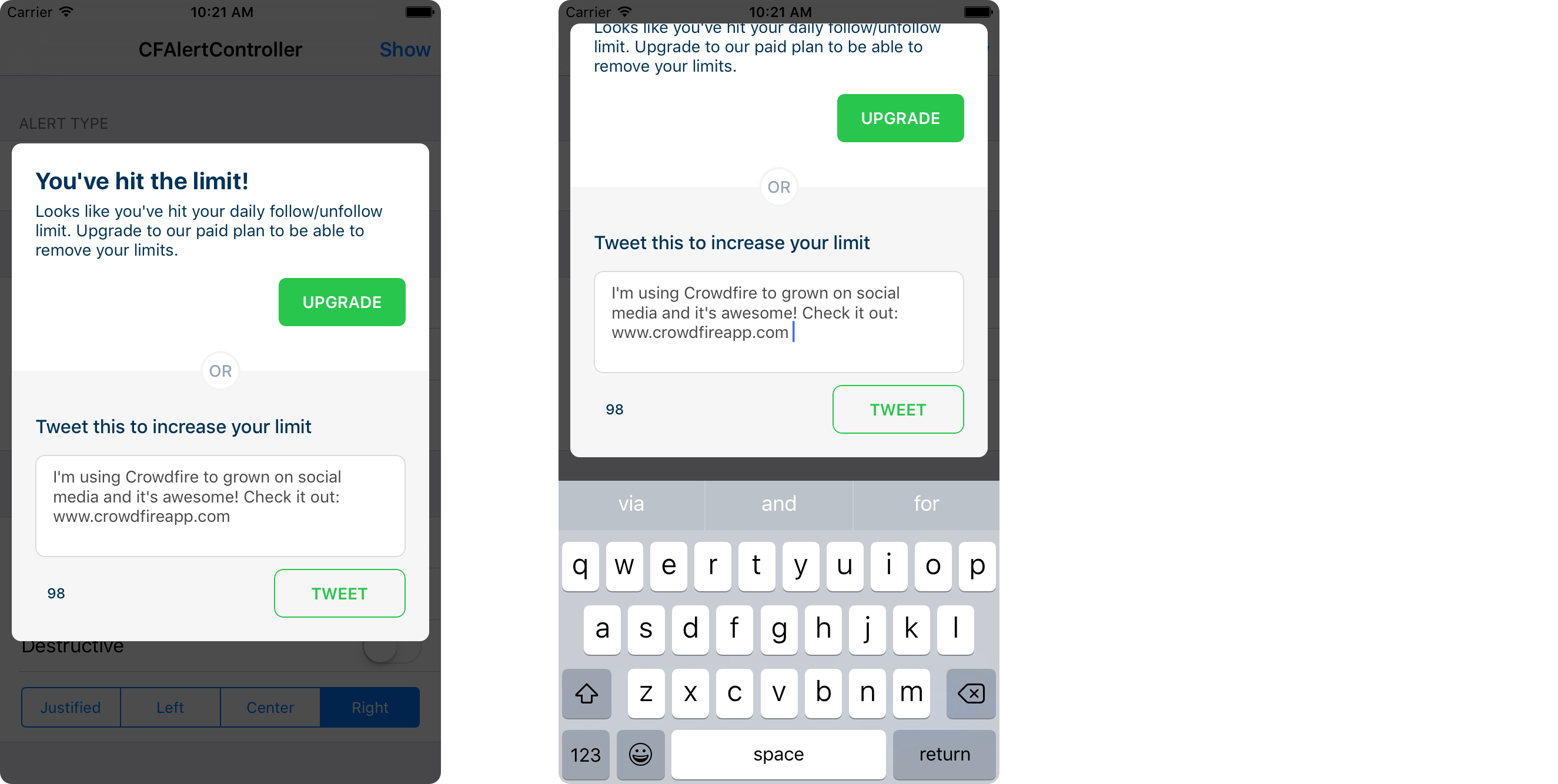
The above shown alert can easily be implemented using the code snippet:
// Create Alet View Controller
let alertController = CFAlertViewController(title: "You've hit the limit",
                                            message: "Looks like you've hit your daily follow/unfollow limit. Upgrade to our paid plan to be able to remove your limits.",
                                            textAlignment: .left,
                                            preferredStyle: .notification,
                                            didDismissAlertHandler: nil)

// Create Upgrade Action
let defaultAction = CFAlertAction(title: "UPGRADE",
                                  style: .Default,
                                  alignment: .right,
                                  backgroundColor: UIColor(red: CGFloat(46.0 / 255.0), green: CGFloat(204.0 / 255.0), blue: CGFloat(113.0 / 255.0), alpha: CGFloat(1)),
                                  textColor: nil,
                                  handler: { (action) in
                                    print("Button with title '" + action.title! + "' tapped")
})

// Add Action Button Into Alert
alertController.addAction(defaultAction)

// Present Alert View Controller
present(alertController, animated: true, completion: nil)
Customisations :
Alerts
public convenience init(title: String?,
                        titleColor: UIColor?,
                        message: String?,
                        messageColor: UIColor?,
                        textAlignment: NSTextAlignment,
                        preferredStyle: CFAlertControllerStyle,
                        headerView: UIView?,
                        footerView: UIView?,
                        didDismissAlertHandler dismiss: CFAlertViewControllerDismissBlock?)
Title and Message
You can set a custom title and message text in the alert (pass nil if you don’t need them).
Title Color and Message Color
You can set a custom title and message text color in the alert (pass nil if you want to use Default color values).
Alignment
You can customise alignment of the title and message. Set the textAlignment property with one of the following values :
NSTextAlignment.left,
NSTextAlignment.right,
NSTextAlignment.center,
NSTextAlignment.justified,
NSTextAlignment.natural
Alert Style
Presentation style of the alert can be customised as Alert or Action sheet. Just set the preferredStyle property with one of the following values :
CFAlertControllerStyle.alert,
CFAlertControllerStyle.actionSheet,
CFAlertControllerStyle.notification
Background style
Background (overlay) of alert/action sheet can be blurred (Useful for security reasons in case the background needs to be hidden). Default value is plain. You can customize the blur style using backgroundBlurView property of type UIVisualEffectView. Update backgroundStyle property with one of the following enum values:
CFAlertControllerBackgroundStyle.plain,
CFAlertControllerBackgroundStyle.blur
Background color
You can change the background (overlay) color of the alert/actionsheet using the property backgroundColor.
Dismiss on background tap
By default, the alert gets dismissed after tapping on the background (overlay). Change shouldDismissOnBackgroundTap property to false to disable it. Do remember that whenever shouldDismissOnBackgroundTap property is set to true, the user will be able to dismiss ActionSheet or Notification using interactive swipe gesture.
Header / Footer
You can add header and footer to the alert. Set properties headerView and footerView with custom views (subclass of UIView). You can pass nil to this properties to opt them out.
- Some examples where you can make the use of header in alert (the dollar image is in header)
- Some examples where you can make the use of footer in alert
Callback
A block (of type CFAlertViewControllerDismissBlock) gets called when the Alert / Action Sheet is dismissed. You can use it to handle dismiss call back. It also gives you a reason of dismiss with below mentioned enums,
CFAlertControllerDismissReason.none,
CFAlertControllerDismissReason.onActionTap
CFAlertControllerDismissReason.onBackgroundTap
CFAlertControllerDismissReason.onInteractiveTransition
Actions
public convenience init(title: String?,
                        style: CFAlertActionStyle,
                        alignment: CFAlertActionAlignment,
                        backgroundColor: UIColor?,
                        textColor: UIColor?,
                        handler: CFAlertActionHandlerBlock?)
Title
You can set the title of action button to be added.
Action Style
Configure the style of the action button that is to be added to alert view. Set style property of the above method with one of the following Action style
 CFAlertActionStyle.Default,
 CFAlertActionStyle.Cancel,
 CFAlertActionStyle.Destructive
Actions Alignment
Configure the alignment of the action button added to the alert view. Set alignment property of CFAction constructor with one of the following action types
 CFAlertActionAlignment.justified,   // Action Button occupies the full width
 CFAlertActionAlignment.right,
 CFAlertActionAlignment.left,
 CFAlertActionAlignment.center
Callback
A block (of type CFAlertActionHandlerBlock) gets invoked when action is tapped.
Container View
You can also configure the background color or layer related properties (e.g. cornerRadius, borderColor, borderWidth) in the containerView property.
License
This code is distributed under the terms and conditions of the MIT license.


