BFPaperView 2.2.6
| TestsTested | ✗ |
| LangLanguage | Obj-CObjective C |
| License | MIT |
| ReleasedLast Release | Aug 2016 |
Maintained by Bence Feher.
BFPaperView 2.2.6
- By
- Bence Feher
A flat view inspired by Google Material Design's Paper theme.
Changes
Please see included CHANGELOG file.
About
Now with smoother animations and more public properties for even easier customization!
Also New: Tap-Handler blocks!
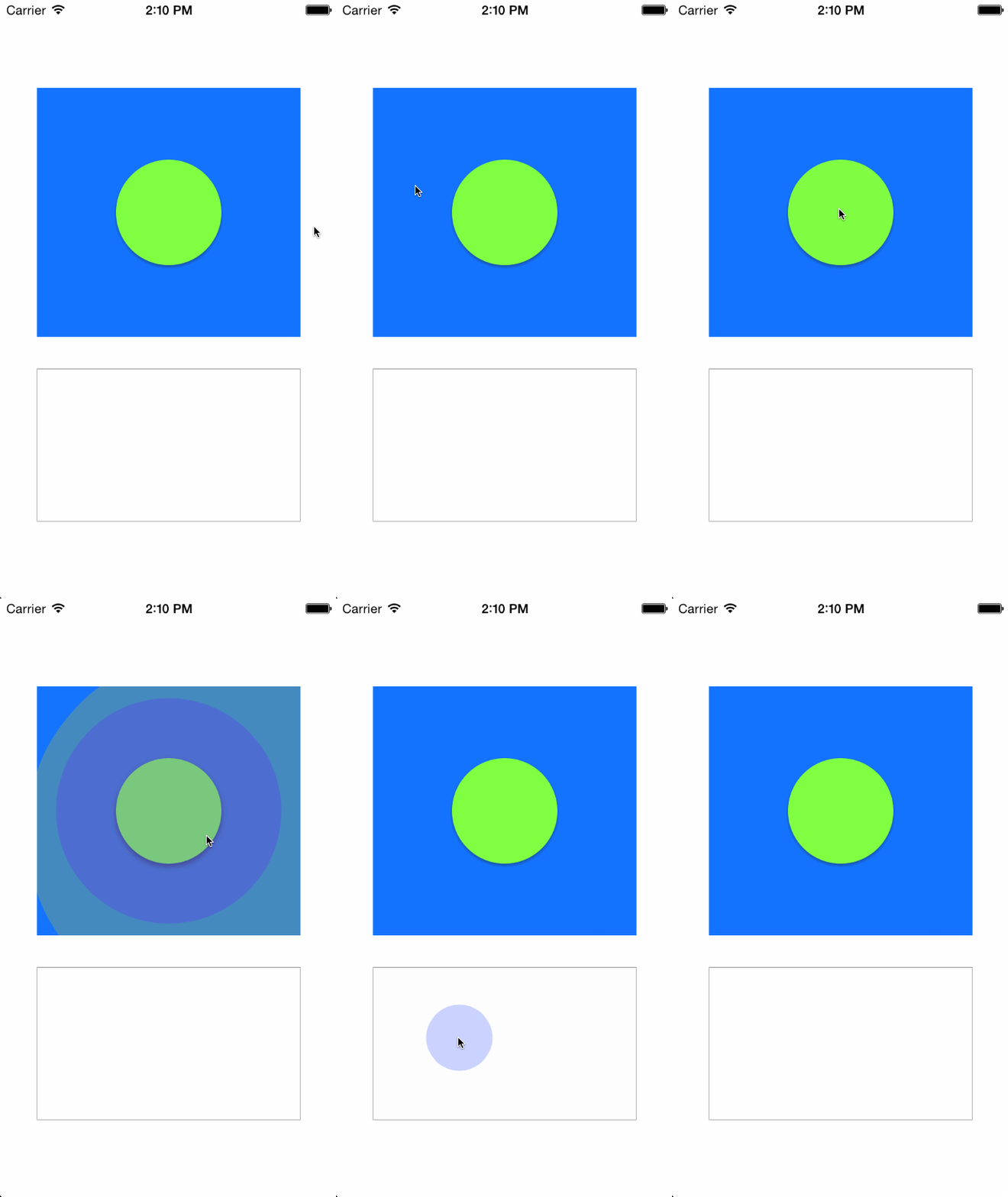
BFPaperView is a subclass of UIView that behaves much like the new paper views from Google's Material Design Labs. All animation are asynchronous and are performed on sublayers. BFPaperViews work right away with pleasing default behaviors, however they can be easily customized! Almost every aspect about this view is customizable!
BFPaperViews come in 2 flavors, Flat or Raised. Flat BFPaperViews have no shadow and will remain flat through all animations. Flat views can be transparent, in which case the background will also fade a little when tapped. Raised BFPaperViews have a drop shadow that animates along with a tap, giving it the feeling of raising up with your touch. Raised BFPaperViews do not look good with a clear background color since it will expose their shadow layer underneath.
By default, BFPaperViews use "Smart Color" which will match the tap-circle and background fade colors to the color of the titleLabel.
You can turn off Smart Color by setting the property, .usesSmartColor to NO. If you disable Smart Color, a gray color will be used by default for both the tap-circle and the background color fade.
You can set your own colors via: .tapCircleColor and .backgroundFadeColor. Note that setting these disables Smart Color.
Properties
UIColor *shadowColor
The UIColor for the shadow of a raised button. An alpha value of 1 is recommended as shadowOpacity overwrites the alpha of this color.
CGFloat loweredShadowOpacity
A CGFLoat representing the opacity of the shadow of RAISED buttons when they are lowered (idle). Default is
0.5f.
CGFloat loweredShadowRadius
A CGFLoat representing the radius of the shadow of RAISED buttons when they are lowered (idle). Default is
1.5f.
CGSize loweredShadowOffset
A CGSize representing the offset of the shadow of RAISED buttons when they are lowered (idle). Default is
(0, 1).
CGFloat liftedShadowOpacity
A CGFLoat representing the opacity of the shadow of RAISED buttons when they are lifted (on touch down). Default is
0.5f.
CGFloat liftedShadowRadius
A CGFLoat representing the radius of the shadow of RAISED buttons when they are lifted (on touch down). Default is
4.5f.
CGSize liftedShadowOffset
A CGSize representing the offset of the shadow of RAISED buttons when they are lifted (on touch down). Default is
(2, 4).
CGFloat touchDownAnimationDuration
A CGFLoat representing the duration of the animations which take place on touch DOWN! Default is
0.25fseconds. (Go Steelers)
CGFloat touchUpAnimationDuration
A CGFLoat representing the duration of the animations which take place on touch UP! Default is
2 * touchDownAnimationDurationseconds.
CGFloat tapCircleDiameterStartValue
A CGFLoat representing the diameter of the tap-circle as soon as it spawns, before it grows. Default is
5.f.
CGFloat tapCircleDiameter
The CGFloat value representing the Diameter of the tap-circle. By default it will be the result of
MAX(self.frame.width, self.frame.height).tapCircleDiameterFullwill calculate a circle that always fills the entire view. Any value less than or equal totapCircleDiameterFullwill result in default being used. The constants:tapCircleDiameterLarge,tapCircleDiameterMedium, andtapCircleDiameterSmallare also available for use.
CGFloat tapCircleBurstAmount
The CGFloat value representing how much we should increase the diameter of the tap-circle by when we burst it. Default is
100.f.
CGFloat cornerRadius
The corner radius which propagates through to the sub layers. Default is
0.
UIColor *tapCircleColor
The UIColor to use for the circle which appears where you tap. NOTE: Setting this defeats the "Smart Color" ability of the tap circle. Alpha values less than
1are recommended.
UIColor *backgroundFadeColor
The UIColor to fade clear backgrounds to. NOTE: Setting this defeats the "Smart Color" ability of the background fade. Alpha values less than
1are recommended.
BOOL rippleFromTapLocation
A flag to set to
YESto have the tap-circle ripple from point of touch. If this is set toNO, the tap-circle will always ripple from the center of the view. Default isYES.
BOOL rippleBeyondBounds
A flag to set to
YESto have the tap-circle ripple beyond the bounds of the view. If this is set toNO, the tap-circle will be clipped to the view's bounds. Default isNO.
(nonatomic, copy) void (^tapHandler)(CGPoint location)
A block to run on touch up, if the touch up is witin the bounds of the view. Basically turning the view into a button.
BOOL isRaised
A flag to set to
YESto CHANGE a flat view to raised, or set toNOto CHANGE a raised view to flat. If you used one of the provided custom initializers, you should probably leave this parameter alone. If you instantiated via storyboard or IB and want to CHANGE from riased to flat, this is the parameter for you! Default isYES.
Notes on RAISED vs FLAT:
RAISED
Has a shadow, so a clear background will look silly. It has only a tap-circle color. No background-fade.
FLAT
Has no shadow, therefore clear backgrounds look fine. If the background is clear, it also has a background-fade color to help visualize the view and its frame.
Usage
Add the BFPaperView header and implementation file to your project. (.h & .m)
Creating a Flat BFPaperView
BFPaperView *flatPaperView = [[BFPaperView alloc] initWithFrame:rect raised:NO];Creating a Raised BFPaperView
BFPaperView *raisedPaperView = [[BFPaperView alloc] initWithFrame:rect raised:YES];Creating a Raised BFPaperView with a Tap-Handler block (could also be flat, just change raised flag to NO)
BFPaperView *raisedPaperViewWithATapHanlder = [[BFPaperView alloc] initWithFrame:rect raised:YES tapHandlerBlock:someBlockToRunOnTapUp];Customized Example
BFPaperView *paperView = [[BFPaperView alloc] initWithFrame:CGRectMake(116, 468, 86, 86) raised:YES tapHandlerBlock:someBlockToRunOnTapUp];
paperView.backgroundColor = [UIColor colorWithRed:0.3 green:0 blue:1 alpha:1];
paperView.tapCircleColor = [UIColor colorWithRed:1 green:0 blue:1 alpha:0.6];  // Setting this color overrides "Smart Color".
paperView.cornerRadius = paperView.frame.size.width / 2;
paperView.rippleFromTapLocation = NO;
paperView.rippleBeyondBounds = YES;
paperView.tapCircleDiameter = MAX(paperView.frame.size.width, paperView.frame.size.height) * 1.3;
[self.view addSubview:paperView];
License
BFPaperView uses the MIT License:
Please see included LICENSE file.
