AlignedCollectionViewFlowLayout 1.1.2
| TestsTested | ✗ |
| LangLanguage | SwiftSwift |
| License | MIT |
| ReleasedLast Release | Jan 2018 |
| SwiftSwift Version | 3.0 |
| SPMSupports SPM | ✗ |
Maintained by Mischa Hildebrand.
- By
- Mischa Hildebrand
AlignedCollectionViewFlowLayout
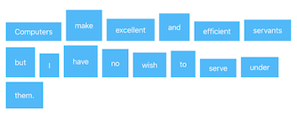
A collection view layout that gives you control over the horizontal and vertical alignment of the cells. You can use it to align the cells like words in a left- or right-aligned text and you can specify how the cells are vertically aligned within their rows.
Other than that, the layout behaves exactly like Apple’s UICollectionViewFlowLayout. (It’s a subclass.)
ℹ️ Important:
AlignedCollectionViewFlowLayout was developed with a “tag view” in mind, i.e. a collection view that displays a limited number of items with a relatively simple layout. It works perfectly for this use case. While it also does its job for a large number of items and more complex cell layouts scrolling might become laggy in this case. This is due to the fact the layout needs to recursively obtain layout attributes from its superclass and cannot be avoided. If you experience unacceptable lagginess please consider other alternatives.
Available Alignment Options
You can use any combination of horizontal and vertical alignment to achieve your desired layout.
Horizontal Alignment:
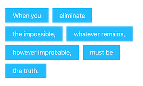
horizontalAlignment = .left
horizontalAlignment = .right
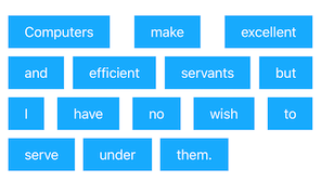
horizontalAlignment = .justified
Vertical Alignment:
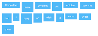
verticalAlignment = .top
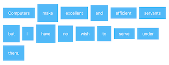
verticalAlignment = .center
verticalAlignment = .bottom
Installation
Manual installation:
Just add the file AlignedCollectionViewFlowLayout.swift to your Xcode project and you’re ready to go.
Example
To run the example project, clone the repo, and run pod install from the Example directory first.
Usage
Setup in Interface Builder
-
You have a collection view in Interface Builder and setup its data source appropriately. Run the app and make sure everything works as expected (except the cell alignment).
-
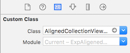
In the Document Outline, select the collection view layout object.
-
In the Identity Inspector, set the layout object’s custom class to
AlignedCollectionViewFlowLayout. -
Add and customize the following code to your view controller’s
viewDidLoad()method:let alignedFlowLayout = collectionView?.collectionViewLayout as? AlignedCollectionViewFlowLayout alignedFlowLayout?.horizontalAlignment = .left alignedFlowLayout?.verticalAlignment = .topIf you omit any of the last two lines the default alignment will be used (horizontally justified, vertically centered).
💡 Pro Tip: Instead of type-casting the layout as shown above you can also drag an outlet from the collection view layout object to your view controller.
Setup in code
-
Create a new
AlignedCollectionViewFlowLayoutobject and specify the alignment you want:let alignedFlowLayout = AlignedCollectionViewFlowLayout(horizontalAlignment: .left, verticalAlignment: .top) -
Either create a new collection view object and and initialize it with
alignedFlowLayout:let collectionView = UICollectionView(frame: bounds, collectionViewLayout: alignedFlowLayout)or assign
alignedFlowLayoutto thecollectionViewLayoutproperty of an existing collection view:yourExistingCollectionView.collectionViewLayout = alignedFlowLayout -
Implement your collection view’s data source.
-
Run the app.
Additional configuration
For the left and right alignment AlignedCollectionViewFlowLayout distributes the cells horizontally with a constant spacing which is the same for all rows. You can control the spacing with the minimumInteritemSpacing property.
alignedFlowLayout.minimumInteritemSpacing = 10
Despite its name (which originates from its superclass UICollectionViewFlowLayout) this property doesn’t describe a minimum spacing but the exact spacing between the cells.
The vertical spacing between the lines works exactly as in UICollectionViewFlowLayout:
alignedFlowLayout.minimumLineSpacing = 10
Enjoy! 😎
Author
Mischa Hildebrand, [email protected]
License
AlignedCollectionViewFlowLayout is available under the MIT license. See the LICENSE file for more info.
