MSProgressSlider 0.1.0
| TestsTested | ✗ |
| LangLanguage | SwiftSwift |
| License | MIT |
| ReleasedLast Release | Mar 2016 |
| SPMSupports SPM | ✗ |
Maintained by messeb.
MSProgressSlider 0.1.0
- By
- messeb
MSProgressSlider
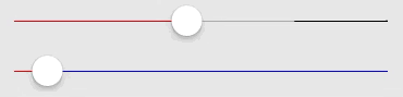
The MSProgressSlider extends the UISlider with a second value, progressValue. This value is displayed as a line behind the value line. It can be used to show a loading progress.
Usage
To run the example project, clone the repo, and run pod install from the Example directory first.
You can configure the progress over progressValue, like the value
let progressSlider = MSProgressSlider()
progressSlider.minimumValue = 0.0
progressSlider.maximumValue = 1.0
progressSlider.progressValue = 0.5
progressSlider.value = 0.25
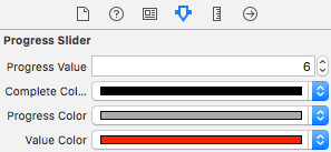
UI
The colors can be configured with UIAppearance protocol properties
- completeColor
- progressColor
- valueColor
and over the Interface Builder via IBInspectable
Installation
MSProgressSlider is available through CocoaPods. To install it, simply add the following line to your Podfile:
pod "MSProgressSlider"Author
messeb
License
MSProgressSlider is available under the MIT license. See the LICENSE file for more info.