Delirium 2.2.2
| TestsTested | ✗ |
| LangLanguage | SwiftSwift |
| License | MIT |
| ReleasedLast Release | Oct 2017 |
| SwiftSwift Version | 3.0 |
| SPMSupports SPM | ✓ |
Maintained by Leroy Jenkins, Jelle Vandebeeck.
Delirium 2.2.2
- By
- Jelle Vandebeeck
- icapps
Delirium contains a set of UI components that can be reused during development.
TOC
Installation
Delirium is available through CocoaPods. To install it, simply add the following line to your Podfile:
pod 'Delirium', '~> 2.2'Features
Animations
Blurred Transition
Add some custom modal transitions to your application. Here is an example of what this transition looks like:
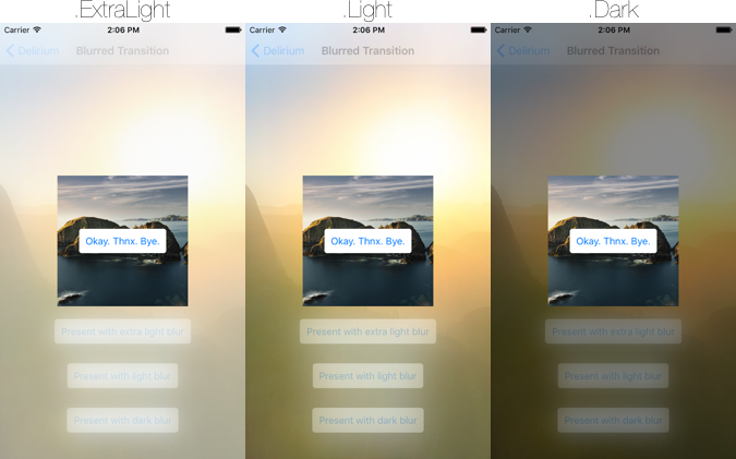
You can pass all the values of UIBlurEffectStyle to the ActionTransitioningDelegate class. And here is how you implement this transition.
let transitionDelegate = ActionTransitioningDelegate()

required init?(coder aDecoder: NSCoder) {
  super.init(coder: aDecoder)

  transitionDelegate.blurEffectStyle = .Light
  transitioningDelegate = transitionDelegate
  modalPresentationStyle = .Custom
}
This transition will only work on iOS 9.
Shake
You can shake a UIView with this handy shake function.
let view: UIView = ...

// Shake the view with the default `duration` of 0.07 seconds and a `repeatCount` of 4.
view.shake()

// You can also pass a custom `duration` or `repeatCount` is wanted.
view.shake(repeatCount: 10, duration: 1.0)
Controllers
Alert
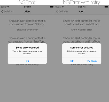
You can present an NSError from your UIViewController instance. This will present a UIAlertController with a title translated by the ‘delirium.alert.button.ok’ key. And with a description localizedDescription from NSError.
Here is an example of how it looks:
And here how to implement:
let error: NSError = ...
presentAlertController(with: error)
When you want to present an ‘ErrorType’ than you’ll have to conform to the AlertError protocol. This will make sure that the ErrorType has a title and a description to show in the alert.
struct SomeError: AlertError {
  var title: String { return "Some error occured" }
  var description: String { return "This is the reason why some error occured." }
}

let error: SomeError = ...
presentAlertController(with: error)
The presentAlertController function can have a retry closure. When implementing this closure you will get a ‘Try again’ button in the alert. When tapping this button the closure will be triggered.
let error: NSError = ...
presentAlertController(withError: error) {
  // Tapped retry.
}
The presentAlertController function can also have an ok closure. This callback will be triggered when you press the ‘ok’ button.
let error: NSError = ...
presentAlertController(withError: error, retry: {
  // Tapped retry.
}, ok: {
  // Tapped ok.
})
Views
Pie Chart
Show a basic pie chart that has a simple overlay that breaks the pie chart and gives it a clean design.
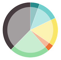
You can easily integrate the PieChartView by just extending a UIView in your storyboard. But for the hardcore fans, you can also create the view manually. (like an animal)
When the view is created you can add some slices to it. A slice contains a value and a color.
let pieChartView = ...

pieChartView.add(slice: PieChartSlice(value: 12.0, color: UIColor.redColor()))
pieChartView.add(slice: PieChartSlice(value: 8.0, color: UIColor.greenColor()))
This will result in a pie chart that has two slices. The red slice will take 60% of the pie chart, and the green slice will contain 40% of the pie chart.
Next to the slices you can also pass some minor configuration options to the view.
// This is the overlay color of the circle that is drawn over the center of the pie chart. When giving this color an alpha value the pie chart is broken nicely.
pieChartView.overlayColor = UIColor.blueColor()

// This stroke color is the color that is displayed between the slices.
pieChartView.strokeColor = UIColor.blueColor()

// This is the size of the padding from where the overlay circle will be displayed.
pieChartView.overlayPadding = 20.0
Pin
Present a pin view is really easy with Delirium.
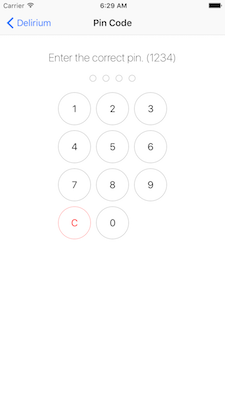
Subclass a UIView in your storyboard and set it to PinView. This view will automatically calculate it’s own intrinsic content size. So when using the pin view in you Storyboard you don’t have to set a width or a height manually. Make sure that the pin view isn’t to strictly pinned to it’s super view.
pinView.delegate = selfWhen you set the delegate to be the current controller. Than this controller needs to conform to PinViewDelegate. Which means that the following method should be implemented.
func pinView(view: PinView, didEnterPin pin: String) {
    // This method is called whenever your pin code is complete.
    // So when the `numberOfDigitis` matched the pin count.
}
You can pass a custom configuration to the PinView. Here are some of the options that can be configured:
    @IBOutlet weak var textField: UITextField!
    @IBOutlet weak var keyboardConstraint: KeyboardConstraint! {
        didSet {
            keyboardConstraint.offsetFromKeyboardHeight = 25
        }
    }

    @IBAction func tapOutsideTextfield(_ sender: UITapGestureRecognizer) {
        textField.resignFirstResponder()
    }
Below is an overview of all the different configuration options available.
/// Define the size of the buttons.
configuration.buttonSize: CGFloat = 60.0
/// Define the font of the buttons.
configuration.buttonFont = UIFont.systemFont(ofSize: 18.0)
/// Define if you want to see the touch down highlight color.
configuration.allowSelectionFeedback = true
// Define the number of digits you want to enter.
configuration.numberOfDigits = 4
// The title to be displayed in the navigation bar.
configuration.title = "Enter your pin"
// The color of the filled dot at the top of the pin view.
configuration.dotColor = UIColor(red:0.11, green:0.68, blue:0.93, alpha:1.00)
// The color of the stroked dot at the top of the pin view.
configuration.dotStrokeColor = UIColor(red:0.73, green:0.77, blue:0.81, alpha:1.00)
// The color of the stroked pin number button.
configuration.numberStrokeColor = UIColor(red:0.75, green:0.79, blue:0.83, alpha:1.00)
// The color of the highlighted background in the pin number button.
configuration.selectionBackgroundColor = UIColor(red:0.90, green:0.91, blue:0.93, alpha:1.00)
// The color of the background in the pin number button.
configuration.backgroundColor = UIColor.whiteColor()
// The color of the text in the pin number button.
configuration.numberTextColor = UIColor(red:0.01, green:0.13, blue:0.28, alpha:1.00)
/// The color of the stroked clear button.
configuration.clearStrokeColor = UIColor.red
/// The color of the highlighted background in the clear button.
configuration.clearSelectionBackgroundColor = UIColor.lightGray
/// The color of the text in the clear button.
configuration.clearTextColor = UIColor.red
You can set the configuration by passing the configuration instance to the pinView instance.
let configuration = PinConfiguration()
pinView.configuration = configuration
Keyboard
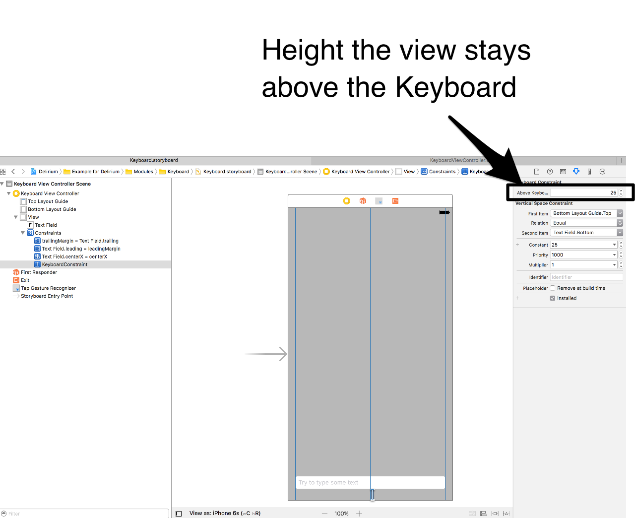
Simply animate any view with the keyboard by setting the class of a layout constraint.
Take a look at the example. You do not need to implement the viewcontroller like below or sublcass it. Just use the KeyboardConstraint class.
Credits to Stefan Adams form iCapps!
class KeyboardViewController: UIViewController {

    @IBOutlet weak var textField: UITextField!

    @IBAction func tapOutsideTextfield(_ sender: UITapGestureRecognizer) {
        textField.resignFirstResponder()
    }

}

extension KeyboardViewController: UITextFieldDelegate {

    func textFieldShouldEndEditing(_ textField: UITextField) -> Bool {
        textField.resignFirstResponder()
        return true
    }
}
The amount of space beteen the keyboard and your view can be set in storyboard when you select the constraint of class KeyboardConstraint
Font
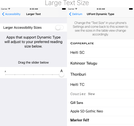
Easily use UIKit’s Dynamic Type and Text Styles with a custom font family. When using Dynamic Type in your apps, your apps will respond to users changing their preferred text size in their iOS device’s settings.
Text Styles are a set of styles that make it easier to implement different font sizes and font weights into your app. For example, a headline would default to a semi-bold weight and a 17pt point size while a body would default to a regular weight and a 17pt point size.
The default Dynamic Type when no changes are done by the user is Large. Dynamic Types vary from xSmall to xxxLarge.
Available parameters:
-
family: The name of the font family to be used as returned byUIFont.familyNamesor a custom font embedded in the app. -
style: The font text style to be used. (e.g.UIFontTextStyle.headline)
Example Usage:
// Without using TraitCollection:
let fontFamilyHeitiSC = "Heiti SC"
let font = UIFont.preferredFont(with: fontFamilyHeitiSC, for: .body)

// Using TraitColletion:
let fontFamilyThonburi = "Thonburi"
let anotherFont = UIFont.preferredFont(with: fontFamilyThonburi, for: style, compatibleWith: traitCollection)

// For a list of available fonts use:
print(UIFont.familyNames)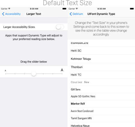
More information regarding Dynamic Type and Typography in general can be found at Apple.
Bucket List
Here is an overview what is on our todo list.
- [ ] Add
UIViewWiggle.
Author
Jelle Vandebeeck, [email protected]
License
Delirium is available under the MIT license. See the LICENSE file for more info.