

Storybook for iOS
Storybook for iOS is a library to gains the speed of UI development.
It brings us to preview the component independently each state that UI can display.
This library enables us to develop the UI without many times to rebuild in a big application and we could build them fully without missing an exception case.
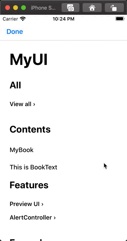

Features
- Previewing any component each state and dynamically updates
- Presenting any view controller
- Creating nested pages infinitely
- Mark the components up with organized typography
- Declarative syntax like SwiftUI
Basic Usage
Setting up your book*
Use this example component MyComponent for demo.
It's just a box that filled with purple color.
public final class MyComponent: UIView {

  public override func layoutSubviews() {
    super.layoutSubviews()

    backgroundColor = .systemPurple
  }

  public override var intrinsicContentSize: CGSize {
    .init(width: 60, height: 60)
  }
}
Book indicates a root of Storybook.
Book can have a name describes itself, and we can declare the contents inside trailing closure.
StorybookKit module.
This module only provides the symbol to describe a book.
import StorybookKit

let myBook = Book(title: "MyBook") {
  ...
}
For now we put a preview of MyComponent with BookPreview.
let myBook = Book(title: "MyBook") {
  BookPreview {
    let myComponent = MyComponent()
    return MyComponent()
  }
}
To display this book, present StorybookViewController on any view controller.
StorybookUI module.
This module provides the feature to display the book.
import StorybookUI

let controller = StorybookViewController(book: myBook) {
  $0.dismiss(animated: true, completion: nil)
}

present(controller, animated: true, completion: nil)
Adding the name of the component
BookPreview can have the name label with like this.
BookPreview {
  let component = MyComponent()
  return component
}
.title("MyComponent")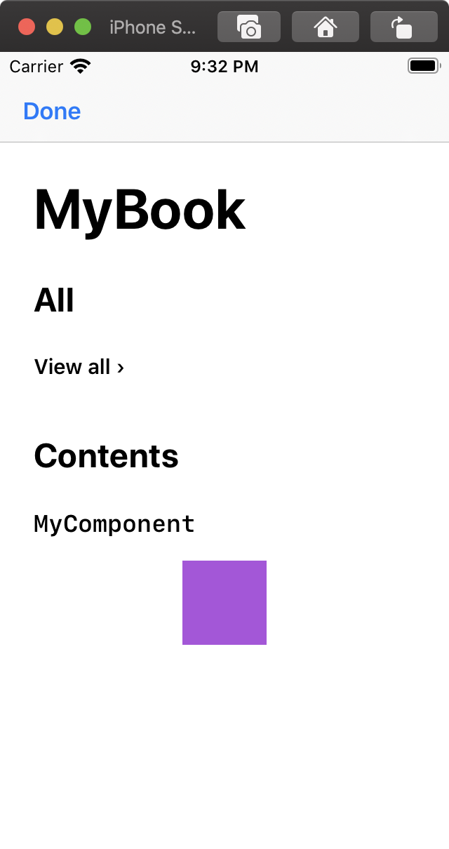
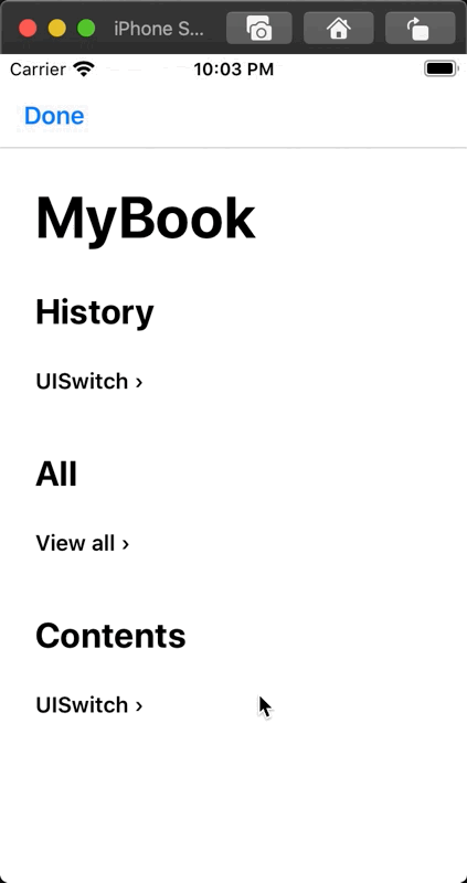
List the state of the component
A UI component would have several states depends on something. We can list that components each state with following.
let myBook = Book(title: "MyBook") {
  BookPreview {
    let button = UISwitch()
    button.isOn = true
    return button
  }
  .title("UISwitch on")

  BookPreview {
    let button = UISwitch()
    button.isOn = false
    return button
  }
  .title("UISwitch off")
}
Of course, you can interact with these components.
Update a state of the components dynamically
UI Components should have a responsibility that updates themselves correctly with the new state.
For example, resizing itself according to the content.
In order to check this behavior, BookPreview can have the button to update something of the component.
BookPreview<UILabel> {
  let label = UILabel()
  label.text = "Initial Value"
  return label
}
.addButton("short text") { (label) in
  label.text = "Hello"
}
.addButton("long text") { (label) in
  label.text = "Hello, Hello,"
}
Present ViewController
When we need to check a popup, we use BookPresent declaration.
BookPresent(title: "Pop") {
  let alert = UIAlertController(
    title: "Hi Storybook",
    message: "As like this, you can present any view controller to check the behavior.",
    preferredStyle: .alert
  )
  alert.addAction(.init(title: "Got it", style: .default, handler: { _ in }))
  return alert
}

BookPresent(title: "Another Pop") {
  let alert = UIAlertController(
    title: "Hi Storybook",
    message: "As like this, you can present any view controller to check the behavior.",
    preferredStyle: .alert
  )
  alert.addAction(.init(title: "Got it", style: .default, handler: { _ in }))
  return alert
}
Advanced Usage
Creating a link to another pages for organizing
Increasing the number of the components, the page would have long vertical scrolling.
In this case, Storybook offers you to use BookNavigationLink to create another page.
let myBook = Book(title: "MyBook") {
  BookNavigationLink(title: "UISwitch") {
    BookPreview {
      let button = UISwitch()
      button.isOn = true
      return button
    }
    .title("UISwitch on")

    BookPreview {
      let button = UISwitch()
      button.isOn = false
      return button
    }
    .title("UISwitch off")
  }
}
Markup
We can add some descriptions and headlines to clarify what the component is for.
let myBook = Book(title: "MyBook") {
  BookNavigationLink(title: "UISwitch") {
    BookPage(title: "UISwitch variations") {

      BookHeadline("This page previews UISwitch's state.")

      BookParagraph("""
Mainly, UISwitch has 2 states that are `on` or `off`.
This page shows you how it presents appearances in each state.
""")

      BookPreview {
        let button = UISwitch()
        button.isOn = true
        return button
      }
      .title("UISwitch on")

      BookPreview {
        let button = UISwitch()
        button.isOn = false
        return button
      }
      .title("UISwitch off")
    }
  }
}
You can use following declarations to mark up.
BookPageBookSectionBookParagraphBookHeadlineBookText
Separates the declarations
With increasing the number of the components and many descriptions, the declarations of the Book also have many lines of the code.
In this case, we can separate the code with several functions.
let myBook = Book(title: "MyBook") {
  uiswitchPage()
}

func uiswitchPage() -> BookView {
  BookNavigationLink(title: "UISwitch") {
    BookPreview {
      let button = UISwitch()
      button.isOn = true
      return button
    }
    .title("UISwitch on")

    BookPreview {
      let button = UISwitch()
      button.isOn = false
      return button
    }
    .title("UISwitch off")
  }
}
Make patterns of UI component
To check the appearance of UI component that changes depends on input parameters, we can generate that patterns with BookForEach and BookPattern.
BookForEach(data: BookPattern.make(
  ["A", "AAA", "AAAAAA"],
  [UIColor.blue, UIColor.red, UIColor.orange]
)) { (args) in
  BookPreview {
    let (text, color) = args
    let label = UILabel()
    label.text = text
    label.textColor = color
    return label
  }
}
Project structure to get faster developing UI
Especially, in UIKit based application, it takes many times to build to check the changes for UI.
The best way to reduce that time, create a separated module that contains UI components only which are used by the application.
And create a new application target for running Storybook only.
Finally, link the main app and the storybook app with that separated module.
While you're tuning them up, you can only build with the storybook app.
- UIComponent (Dynamic or Static library/framework)
- MainApp (Executable)
- StorybookApp (Executable)
Requirements
- iOS 10.0+
- Xcode 11.4+
- Swift 5.2+
Installation
CocoaPods
CocoaPods is a dependency manager for Cocoa projects. For usage and installation instructions, visit their website. To integrate Alamofire into your Xcode project using CocoaPods, specify it in your Podfile:
pod 'StorybookKit'pod 'StorybookUI'License
Storybook-ios is released under the MIT license.