


RMHCalendarView is intended to be added to a container view that you pass in the initialization methods provided. To add a calendar to your container, user either of the methods below:
Using a custom configuration (or the default style):
RMHCalendarView.instantiateOnto(calendarContainer,
withDelegate: self,
withSelectionStyle: .multi,
withRange: dateRange,
withStyle: StyleConfigProtocolYouProvide(),
canSelectPastDates: true,
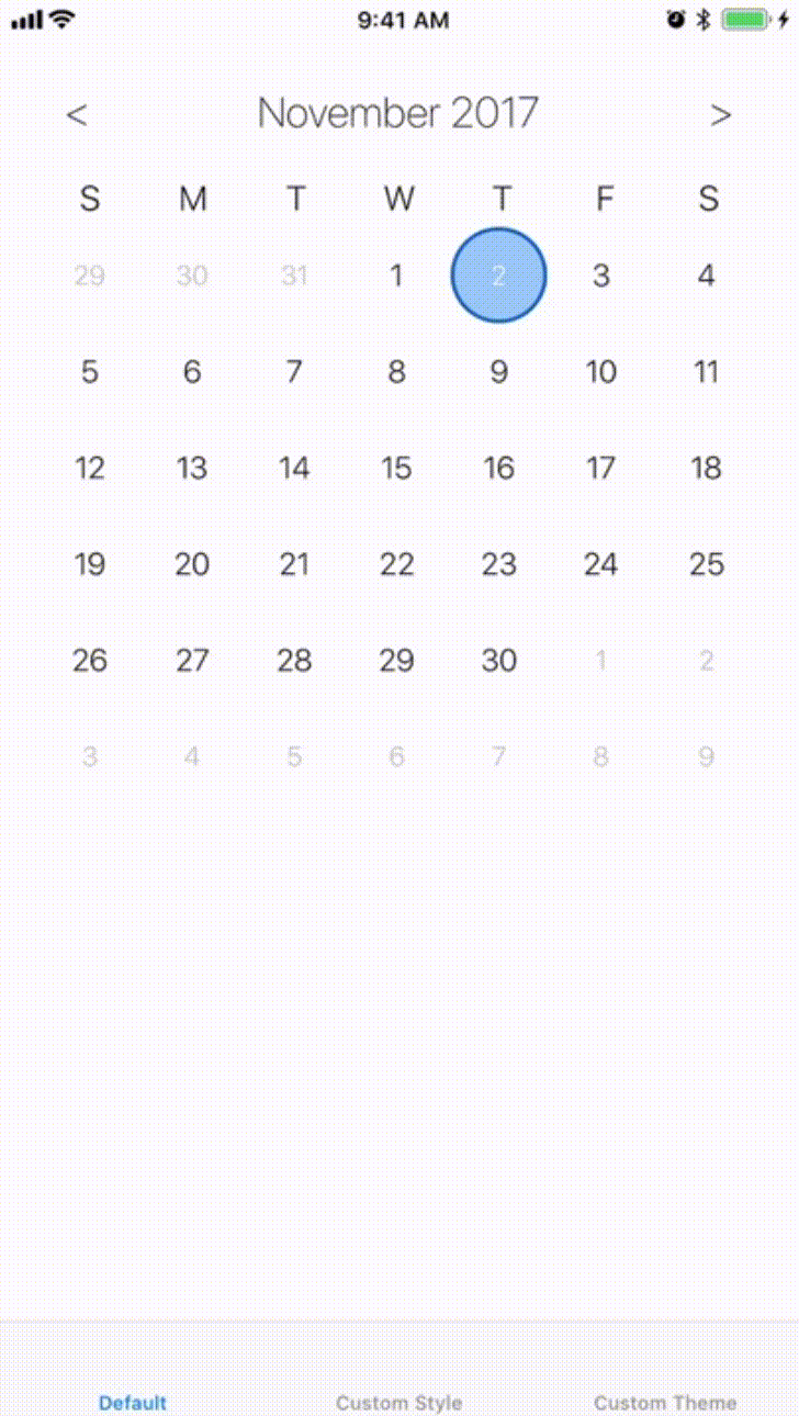
startingAt: Date())The delegate is an implemtation of the RMHCalendarViewDelegate protocol. Selection styles can either be .multi or .single. The date range determins the bounds of the selectable dates (inclusive of the day provided). The DateRange object takes two dates, a start and an end. The style param is an implementation of the StyleConfigProtocol. To customize your calendar, impelement this protocol with your own style and pass it in. canSelectPastDates determines whether users can select dates before today. The starting date defaults to today, and determines what date the calendar first displays.
Using a custom theme:
RMHCalendarView.instantiateOnto(calendarContainer,
                                withDelegate: self,
                                withSelectionStyle: .multi,
                                withRange: dateRange,
                                withTheme: ThemeConfig(), //pass in theme instance
                                canSelectPastDates: true,
                                startingAt: Date())
This function is much like the other, execpt you can pass in your implementation of the ThemeProtocol to change the colors of the default style.
The RMHCalendarViewDelegate should implement the below function to recieve updates about the dates the user selects.
func selectedDateRange(_ dateRange: DateRange) {
    //do stuff with the selected date range
}To completely customize how your calendar looks, you can implement the StyleConfigProtocol. There are default values for everything (default values are used in the default style...), so you can implement only parts of the protocol you want to look different. The below example of a fully custom style is taken from the example project.
Below is an implementation of the StyleConfigProtocol. The textConfig is provided next, and determines what the dateLabel's look like for different selection states. A XibConfig describes your implementation of a DateCell instance for the calendar to consume. The selection state of a date cell can either be a leftCap, rightCap, middle, singleSelection, or a plan dateCell. These states are used to display the full selection on the calendar. To create your own DateCell, design one in a xib (make sure it is a DateCell or subclass of a DateCell) for each state. Dont forget to hook up the dateLabel UILabel on DateCell, and to also set the module on the xib to RMHCalendarView.
class ExampleStyleConfig: StyleConfigProtocol {
    var textConfig: TextConfigProtocol {
        return ExampleTextConfig()
    }

    public var leftCapXibConfig: XibConfig {
        return XibConfig(name: "ExampleLeftCap", resuseIdentifier: "ExampleLeftCap")
    }

    public var rightCapXibConfig: XibConfig {
        return XibConfig(name: "ExampleRightCap", resuseIdentifier: "ExampleRightCap")
    }

    public var middleXibConfig: XibConfig {
        return XibConfig(name: "ExampleMiddleView", resuseIdentifier: "ExampleMiddleView")
    }

    public var singleSelectionXibConfig: XibConfig {
        return XibConfig(name: "ExampleSingleSelection", resuseIdentifier: "ExampleSingleSelection")
    }

    func todayView(cellSize: CGSize) -> UIView? {
        return nil //returning nil shows nothing for the today view
    }
}
The TextConfigProtocol describes how the dateLabels on DateCells and the header portion of the calendar should look. Each var is a TextStyle, which takes a font and color for the appropriate text.
class ExampleTextConfig: TextConfigProtocol {
    var currentMonthTextStyle: TextStyle {
        return TextStyle(font: .systemFont(ofSize: 18), color: .black)
    }

    var nonCurrentMonthTextStyle: TextStyle {
        return TextStyle(font: .italicSystemFont(ofSize: 16), color: .lightGray)
    }

    var todayTextStyle: TextStyle? {
        return nil //prevent today's text style from being different
    }

    var selectectDateRangeStyle: TextStyle? {
        return TextStyle(font: .systemFont(ofSize: 18, weight: .bold), color: .white)
    }

    var monthTextStyle: TextStyle {
        return TextStyle(font: .systemFont(ofSize: 24, weight: .bold), color: .black)
    }

    var weekDayTextStyle: TextStyle {
        return TextStyle(font: .systemFont(ofSize: 18), color: .black)
    }
}When desinging a custom date cell, you should account for a variable height and width. However, given a fixed container size, the date cell size can be computed. The header of the calendar will always have a height of 90, the calendar will always display 7 days across, and the calendar will always display 6 rows of dates. Therefore, the daeCell's height is (container's height - 90)/6 and the dateCell's width is container's width/7.
To run the example project, clone the repo, and run pod install from the Example directory first.
iOS9+
RMHCalendarView is available through CocoaPods. To install it, simply add the following line to your Podfile:
pod 'RMHCalendarView'rhogan11, reed.hogan.11@gmail.com
RMHCalendarView is available under the MIT license. See the LICENSE file for more info.