BPBarButtonItem 0.0.3
| TestsTested | ✗ |
| LangLanguage | Obj-CObjective C |
| License | MIT |
| ReleasedLast Release | Dec 2014 |
Maintained by Unclaimed.
BPBarButtonItem 0.0.3
- By
- Cory Imdieke
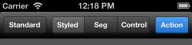
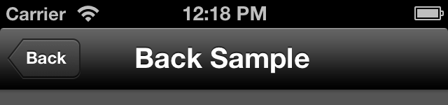
BPBarButtonItem is a tool for making awesome looking custom UIBarButtonItems on the fly. BPBarButtonItem is NOT a subclass of UIBarButtonItem but an NSObject which creates skinned plain UIBarButtonItems for use however you want. BPBarButtonItem can also be used to skin UIBarButtonItems which have already been created, like in a nib or Storyboard. Generated buttons have support for both orientation styles, and automatically show up properly for back buttons.


Installation
From Source
- Drag the
BPBarButtonItem/folder to your project (make sure you copy all files/folders) #import "BPBarButtonItem.h"
How to Use
There are 3 main ways to use BPBarButtonItem:
Creating a brand new button in code
This will allow you to create a brand new UIBarButtonItem on the fly. You can use any of the predefined styles or set your own tint color.
self.navigationItem.rightBarButtonItem = [BPBarButtonItem barButtonItemWithStyle:BPBarButtonItemStyleAction title:@"Action" target:self action:@selector(buttonAction:)];self.navigationItem.rightBarButtonItem = [BPBarButtonItem barButtonItemWithTintColor:[UIColor redColor] title:@"Red" target:self action:@selector(buttonAction:)];Styling an existing button (often from a nib or Storyboard)
This will style any existing UIBarButtonItem. The title, action, and any other attributes are not modified. This works from an IBOutlet or by accessing the navigationItem's right and left button properties directly.
[BPBarButtonItem customizeBarButtonItem:self.navigationItem.rightBarButtonItem withStyle:BPBarButtonItemStyleStandardDark];[BPBarButtonItem customizeBarButtonItem:self.navigationItem.rightBarButtonItem withTintColor:[UIColor colorWithRed:0.048 green:0.169 blue:0.458 alpha:1.000]];Styling ALL the buttons using an Appearance Proxy
Want to style all the buttons in your app to be consistent, but don't want to set them all individually? Setting the default button style is almost identical to styling an existing button, except you pass in nil for the button item. You'll generally want to do this as part of your application:didFinishLaunchingWithOptions: method.
[BPBarButtonItem customizeBarButtonItem:nil withStyle:BPBarButtonItemStyleStandardDark];Note that with the Appearance Proxy method, you can still override individual buttons using the existing button styling method above.
You can also get complex and pass in a specific Appearance Proxy as well. For example, this may be used to stylize buttons in a UINavigationBar but not those in a UIToolbar.
[BPBarButtonItem customizeBarButtonItem:[UIBarButtonItem appearanceWhenContainedIn:[UINavigationBar class], nil] withStyle:BPBarButtonItemStyleStandardLight];Styling Segmented Controls
You can style a UISegmentedControl directly or using an Appearance Proxy. The syntax is similar to UIBarButtonItems as shown above.
[BPBarButtonItem customizeSegmentedControl:mySegmentedControl withStyle:BPBarButtonItemStyleStandardDark];[BPBarButtonItem customizeSegmentedControl:nil withStyle:BPBarButtonItemStyleStandardDark];Things BPBarButtonItem Can't Do
BPBarButtonItem makes standard, plain-old UIBarButtonItems, and as such they have the same limitations. You can't use them outside of a navigation bar or a toolbar. If you're looking for a nicely styled UIButton alternative, check out BButton.
License
Copyright (c) 2013 Cory Imdieke
Permission is hereby granted, free of charge, to any person obtaining a copy of this software and associated documentation files (the "Software"), to deal in the Software without restriction, including without limitation the rights to use, copy, modify, merge, publish, distribute, sublicense, and/or sell copies of the Software, and to permit persons to whom the Software is furnished to do so, subject to the following conditions:
The above copyright notice and this permission notice shall be included in all copies or substantial portions of the Software.
THE SOFTWARE IS PROVIDED "AS IS", WITHOUT WARRANTY OF ANY KIND, EXPRESS OR IMPLIED, INCLUDING BUT NOT LIMITED TO THE WARRANTIES OF MERCHANTABILITY, FITNESS FOR A PARTICULAR PURPOSE AND NONINFRINGEMENT. IN NO EVENT SHALL THE AUTHORS OR COPYRIGHT HOLDERS BE LIABLE FOR ANY CLAIM, DAMAGES OR OTHER LIABILITY, WHETHER IN AN ACTION OF CONTRACT, TORT OR OTHERWISE, ARISING FROM, OUT OF OR IN CONNECTION WITH THE SOFTWARE OR THE USE OR OTHER DEALINGS IN THE SOFTWARE.
Contact and Attribution
Attribution is nice, but not necessary.
https://twitter.com/CoryImdieke
Thanks to Brian Gilham for help with the design details.
https://twitter.com/bgilham